Sunburst Chart
Sunburst charts represent hierarchical data through a series of rings, or concentric circles. Each ring corresponds to a level in the hierarchy. The central or innermost circle represents the root node, or the top-level category. Moving outwards, each subsequent ring represents a subcategory, where the outermost ring is the leaf node. The size of each arc in the ring is proportional to the value of the data. This makes it easy to compare the relative proportions of different segments within the hierarchy.
On this Page
- When to use a Sunburst Chart
- Data Requirements
- Creating a Sunburst Chart
- Customizing the Sunburst Chart
When to use a Sunburst Chart
Sunburst charts are ideal for visualizing the nested relationship between the data. Businesses can use sunburst to visualize market segmentation and for financial analysis like budget allocations and revenue breakdowns. It can be used to classify ticket categorization.
Data Requirements
A minimum of two dimensions and one measure column are required to create a sunburst, and a maximum of six levels can be created.
Creating a Sunburst Chart
Columns should be added in the following order to create a sunburst chart.
- Color Shelf: The top most category in the data should be added to this shelf.
- X-axis: The second level category should be added to this shelf.
- Y-axis: A Measure Column.
- Text: The third level category in the data.
- Tooltip: The fourth level category in the data.
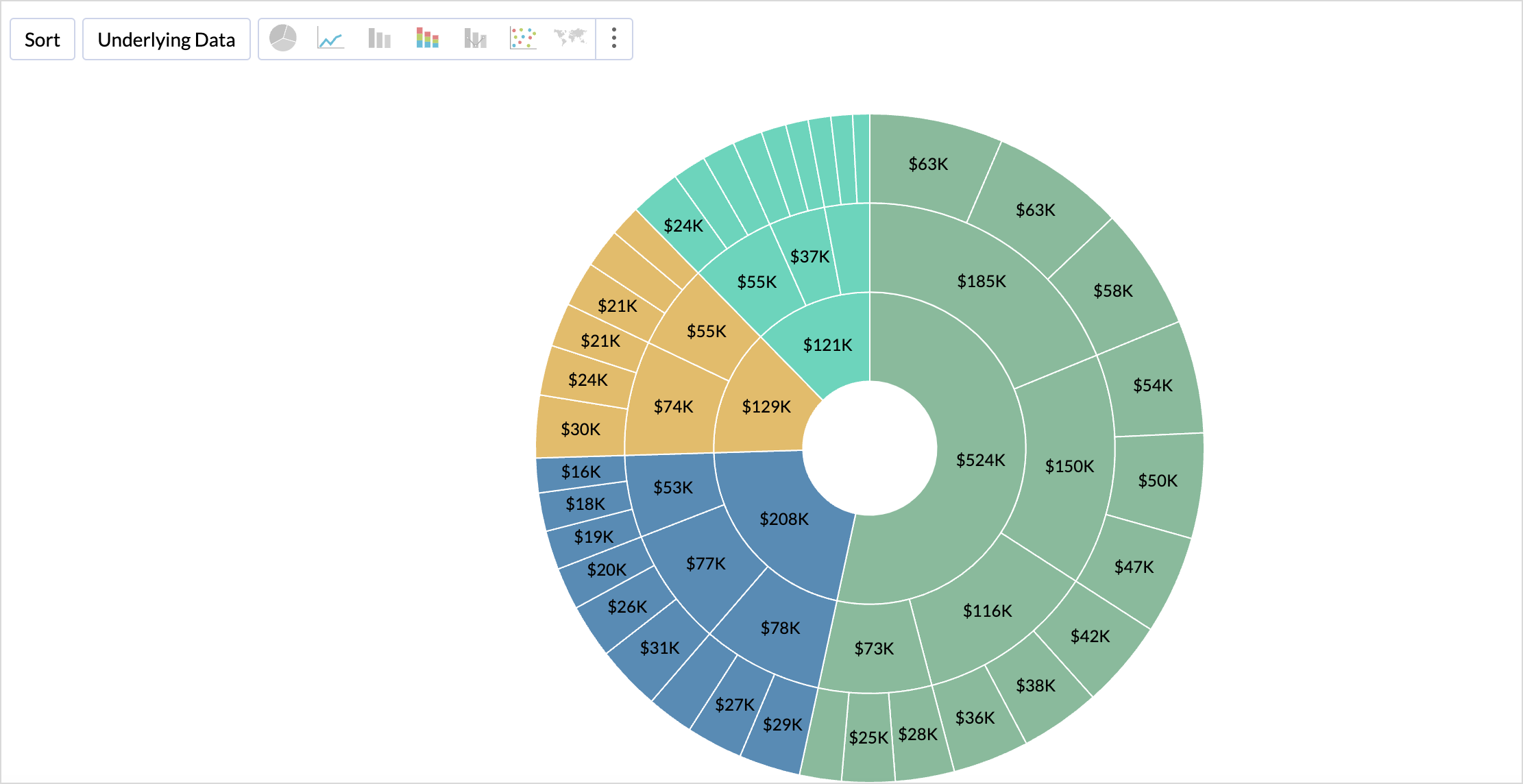
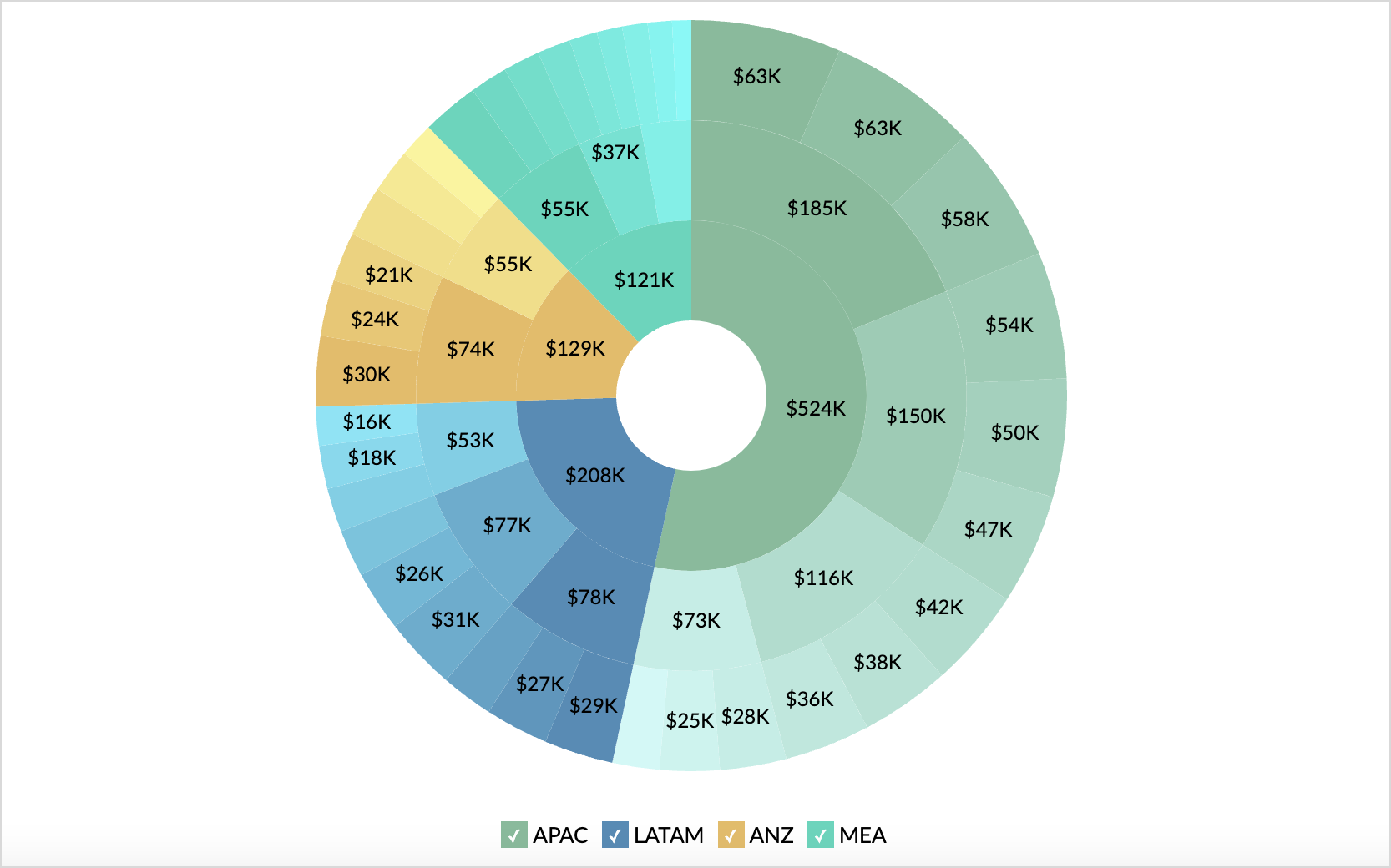
Let's see how to visualize the Revenue breakdown of a company with the sunburst chart. This sample data taken for illustration includes information about Region, Country, Purchase Type, Solution type, and the sales details.
- Access the Chart Designer.
- Drag and drop the columns as shown below
- Color: Drop the column Region.
- X-axis: Drop the column Country
- Y-axis : Drop the column Sales
- Text: Drop the column Purchase Type
- Click Generate Graph. A scatter plot will be created.
- Change the chart type to Sunburst.
A sunburst chart showing the breakdown of revenue will be generated.

Customizing Sunburst Chart
Zoho Analytics offers extensive options to customize any chart. This section explains the customization options specific to the sunburst chart. Refer to Customizing Charts article to learn more. Access the Settings tab to customize the chart settings.
Show Data Label
Show Data Label allows you to choose and customize the chart labels. You can choose to display the data values of each segment or category, or the Percentage of each category relative to its parent category.

Legend Settings
Access the Legend tab to customize the appearance of the sunburst chart.

- Enable Tint: This makes differentiating the segments in each level easier.
- Enable Stroke: This defines boundaries for levels by applying an outline to each segment of the sunburst chart.