Overview and Scroll Bar effect in Charts
The Overview and Scroll Bar effect in charts allows you to visualize reports with large data sets. With this, you can select the subset of data in the chart to focus on a particular region in reports, which visualizes the leaps and bounds clearly.
Dynamic and more interactive scroll charts can be used to replace filters which are traditionally used in reports with large data sets. Adding filters to the reports makes them less interactive and you have to change them manually to compare the data.
The main advantages of using scroll charts are:
- Get in-depth analysis by focusing on a specific region.
- Visually compare data by moving the slider or scroll bar.
- Makes interactive reports and can be used as filters.
Zoho Analytics allows you to add an overview slider or scroll bar to the charts in the following two ways, they are
- Overview Effect - The Overview Effect adds an overall preview chart (also known as an overview chart) to the bottom of the regular chart. You can adjust the slider in the overview chart to get more focused on a particular region of the chart for in-depth analysis.
- Scroll Bar Effect - The Scrollbar Effect allows you to scroll across the reports using the scroll bar. You can also modify the thickness of the scroll bar based on the volume of your data. The Scroll Bar effect is more suitable for vast data sets comparatively.
You can also use the Brush Effect in the chart to select and focus on a particular area, which adjusts the slider or scroll bounds in the report.
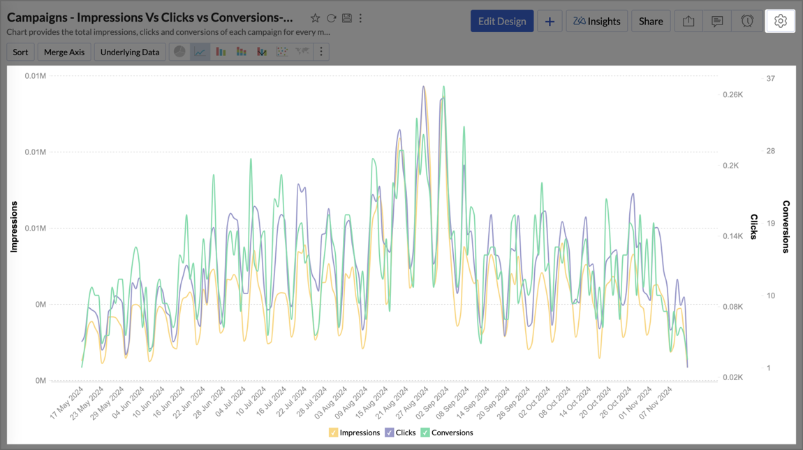
For example, take a report analyzing the Campaigns data - Impressions vs Clicks vs Conversion. To enable the overview or scrollbar effect in the above report,
- Open the report to which you want to add the Overview Effect.
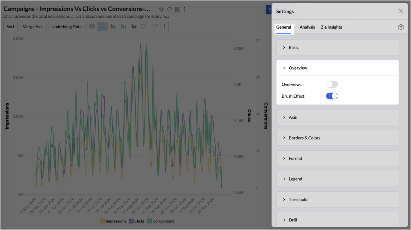
- Select the Settings icon at the top right corner of the report. The Settings pane will open.

- Under the General tab, select the Overview dropdown.
- Enable the Overview toggle button from the Overview dropdown.

- The Effect section has two options - Overview and Scrollbar.
- To apply the Overview Effect,
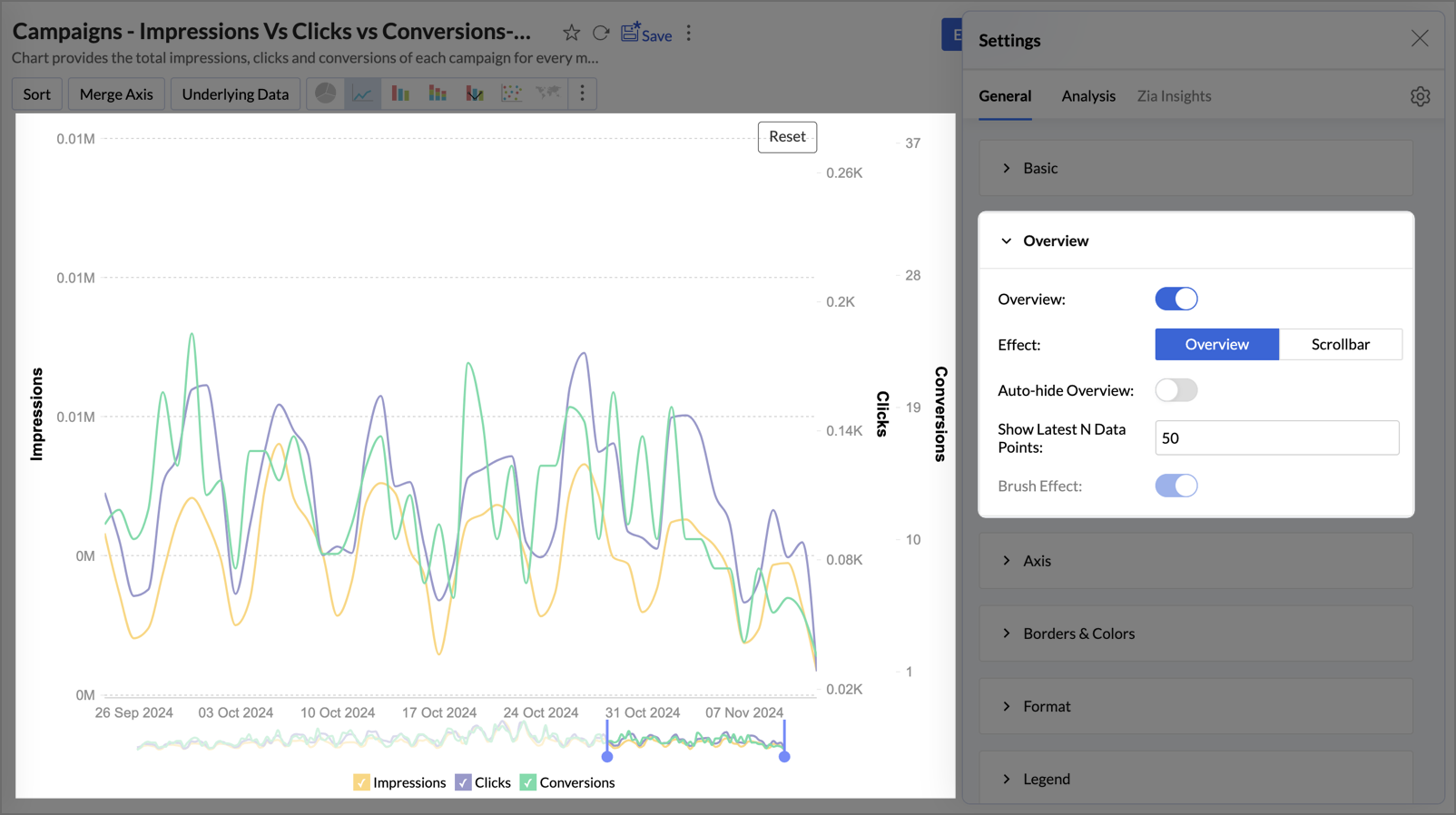
- Select Overview in the Effect section.

- Auto-hide Overview: Enable this option to hide the overview chart, which becomes visible when you hover at the bottom of the report.
- Show Latest N Data Points: Enter a specific number (e.g., 10, 25, 50) to automatically display and focus on the most recent data points. This option is available only when the date is used in the report.
- Brush Effect: Enables you to click and drag over a specific section of the chart to zoom in and focus on that area. The Brush effect is enabled by default for the Overview Effect.
- Sample report with Overview effect is given below. The overview chart is added below the main chart with a slider. Select an area to zoom in, and adjust the slider to focus on specific regions for comparison.
- Select Overview in the Effect section.
- To apply the Scroll bar Effect,
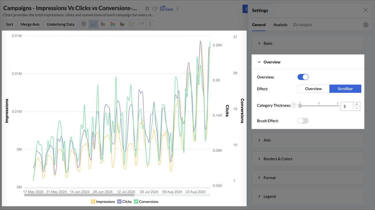
- Select Scrollbar in the Effect section.

- Category Thickness: Adjust the thickness of the scroll bar by modifying the Category Thickness value. The thickness will vary depending on the volume of your data.
- Brush Effect: Enables you to click and drag over a specific section of the chart to zoom in and focus on that area.
- Sample report with Scrollbar effect is given below. you can use the scroll bar at the bottom to navigate through the report. Adjust its thickness in Settings for detailed analysis across different sections.
- Select Scrollbar in the Effect section.
