


Customizing a pivot table
- General Settings
- Applying Themes
- Show Missing Values
- Formatting options
- Show/Hide
- Show Total As
- Sorting a pivot table
- Conditional formatting
When designing a pivot table, Zoho Analytics offers a wide range of options to customize it and improve the overall appearance in different ways. In this section we will discuss about various options provided by Zoho Analytics to customize a pivot table that you create.
General Settings
The General Settings tab helps you modify the Title, add a short description of the data, and configure the settings for the Missing values. Follow the below steps to customize the settings,
- Click the Settings icon in the top left corner.
- The General Settings Tab will open.
- Modify the settings as required and click Apply.
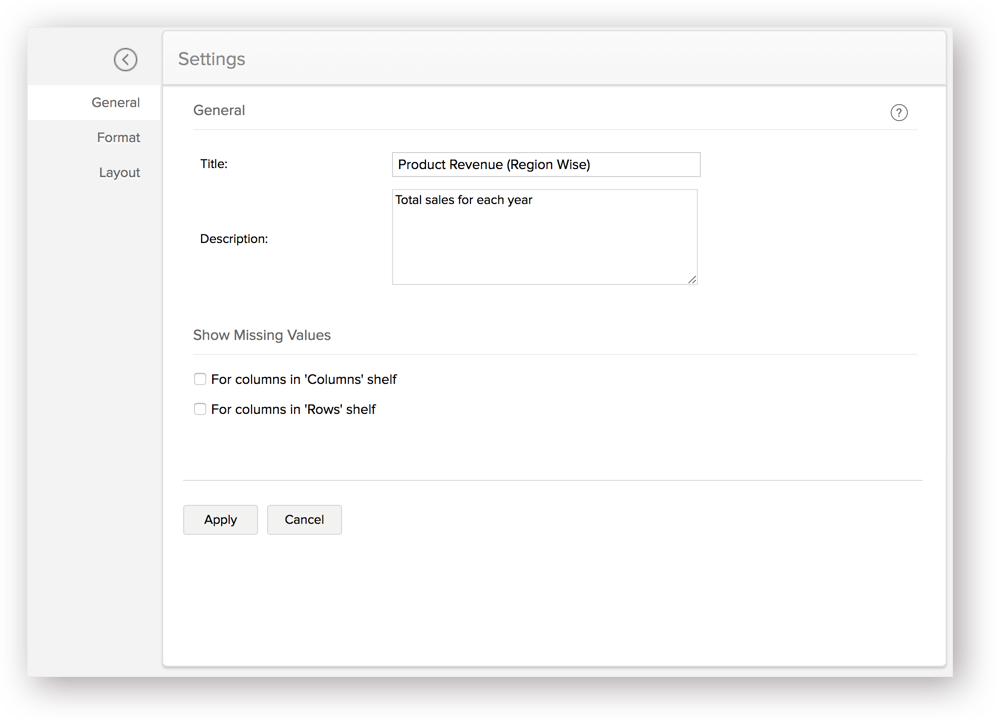

Show Missing Values
Show missing values feature is used to display the missing/empty values in a Pivot. This can be applied to a Date or a Category column. When creating a Pivot, if a particular data point does not have any value, then the Pivot will skip displaying that data point. With this option, you can choose to display the record even if the point does not contain a value.
- For columns in the 'Columns' shelf: You can choose to display the filtered columns in the 'Columns' shelf by selecting/deselecting the check box. By default, this value will not be selected.
- For columns in the 'Rows' shelf: You can choose to display the filtered columns in the 'Rows' shelf by selecting/deselecting the check box. By default, this value will not be selected.
Layout settings
Zoho Analytics allows you to customize the layout and various display options in the pivot table.
Layout options
Zoho Analytics supports the following two layouts.
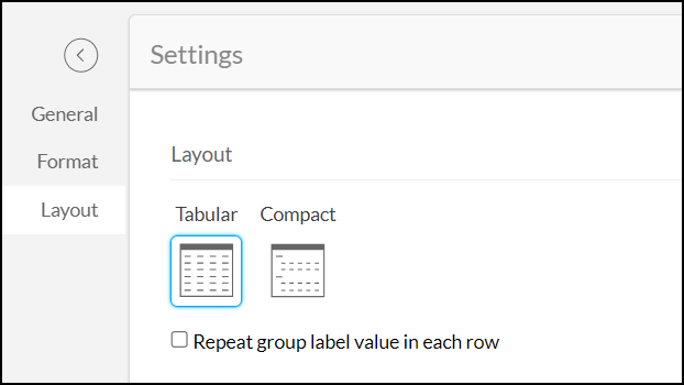
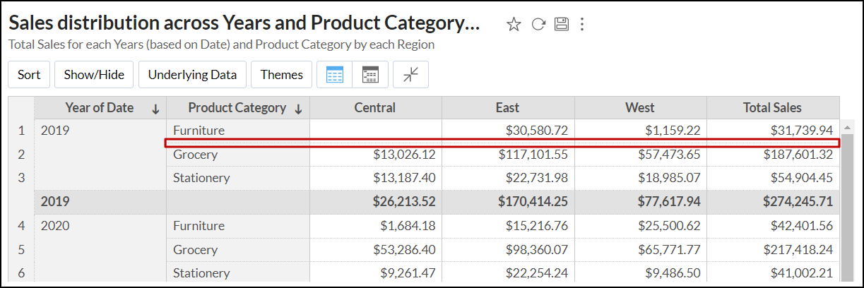
Tabular: The tabular layout is the default layout of the pivot table. It displays the values in the Rows shelf as separate columns in the pivot table.
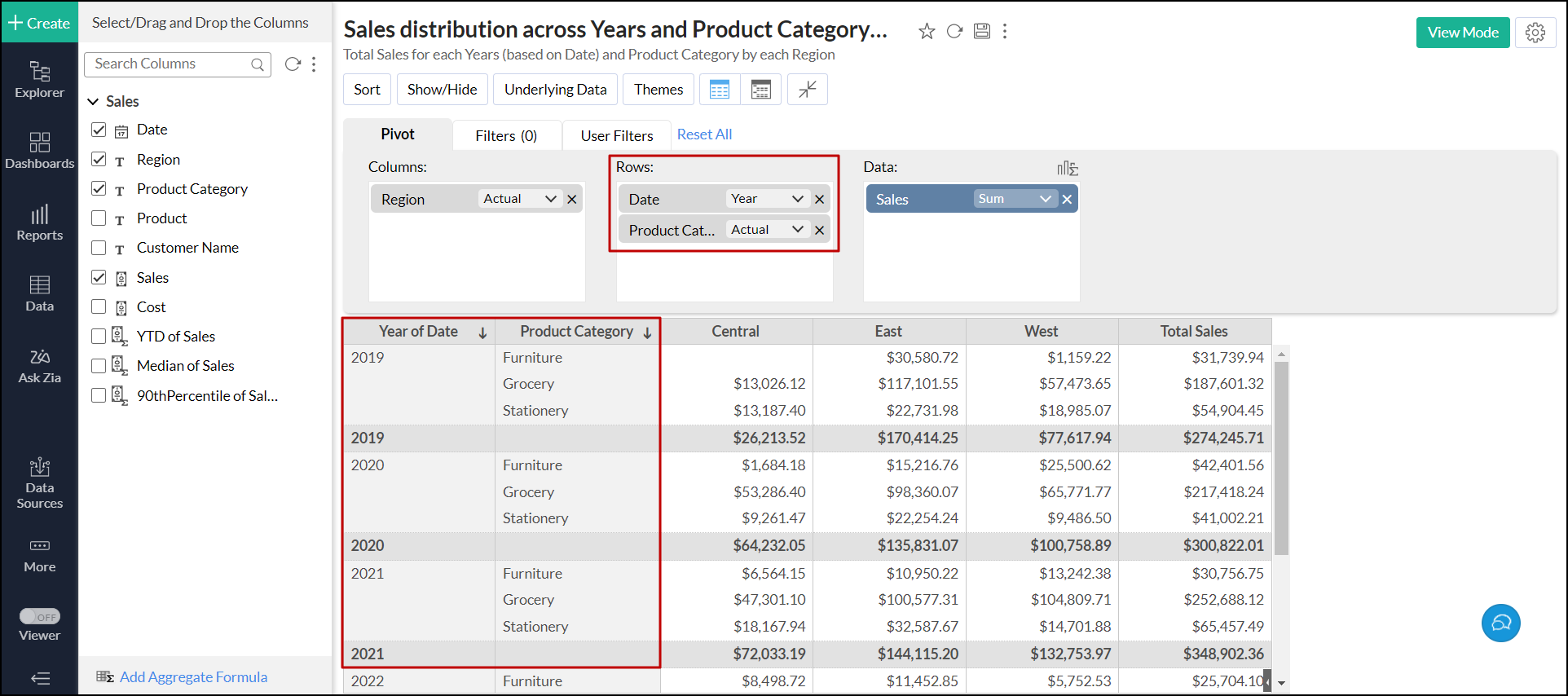
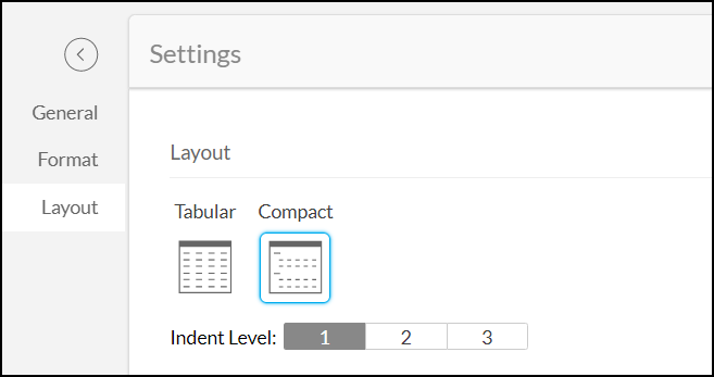
Compact: This is the close-packed view of the pivot table. This layout groups and displays the values in the Rows shelf as a single column in the pivot table.
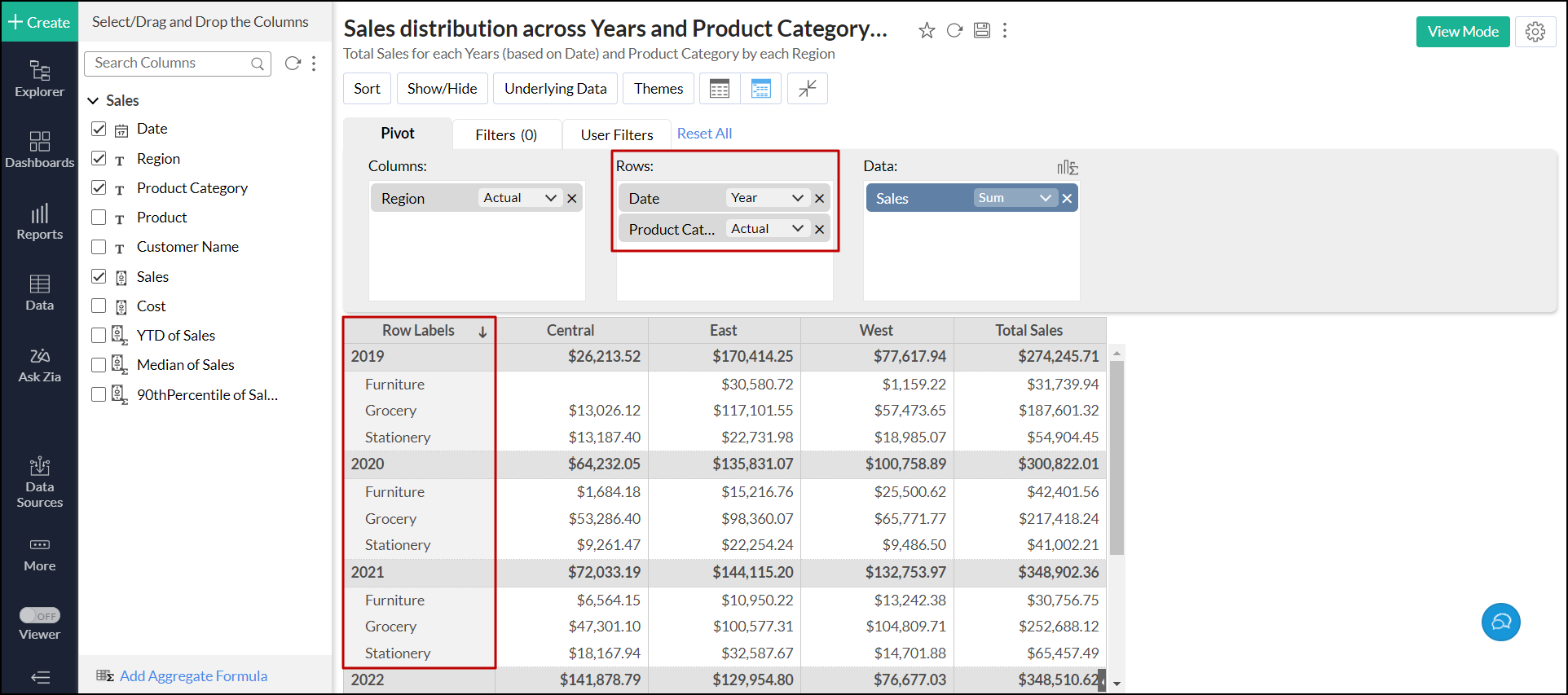


You can switch between layouts in two ways, either from Edit Design/View mode or Settings.
From Edit Design or View mode
- Open the required pivot table.
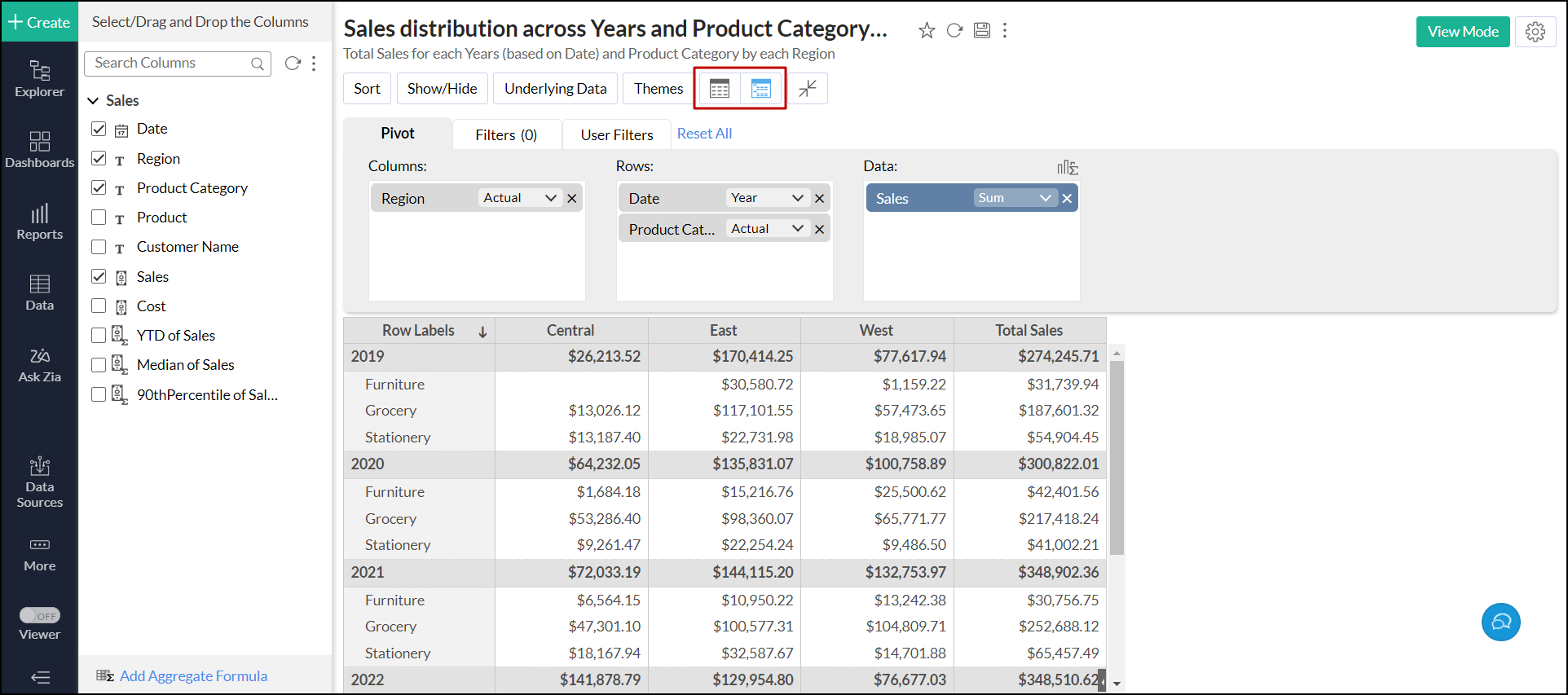
Click the corresponding Tabular or Compact icon in the toolbar.
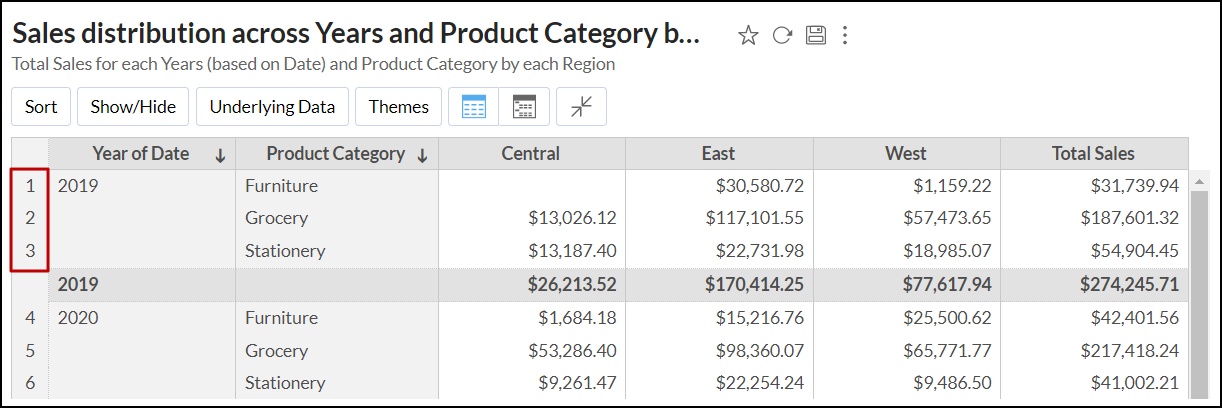
For Compact layout, the values dropped in the Rows shelf are named Row Labels. To modify this, open the pivot table in Edit Design mode, head to the Row Label column, and click the Edit icon that appears on mouse over the column name. Modify the name as needed, and press Enter.
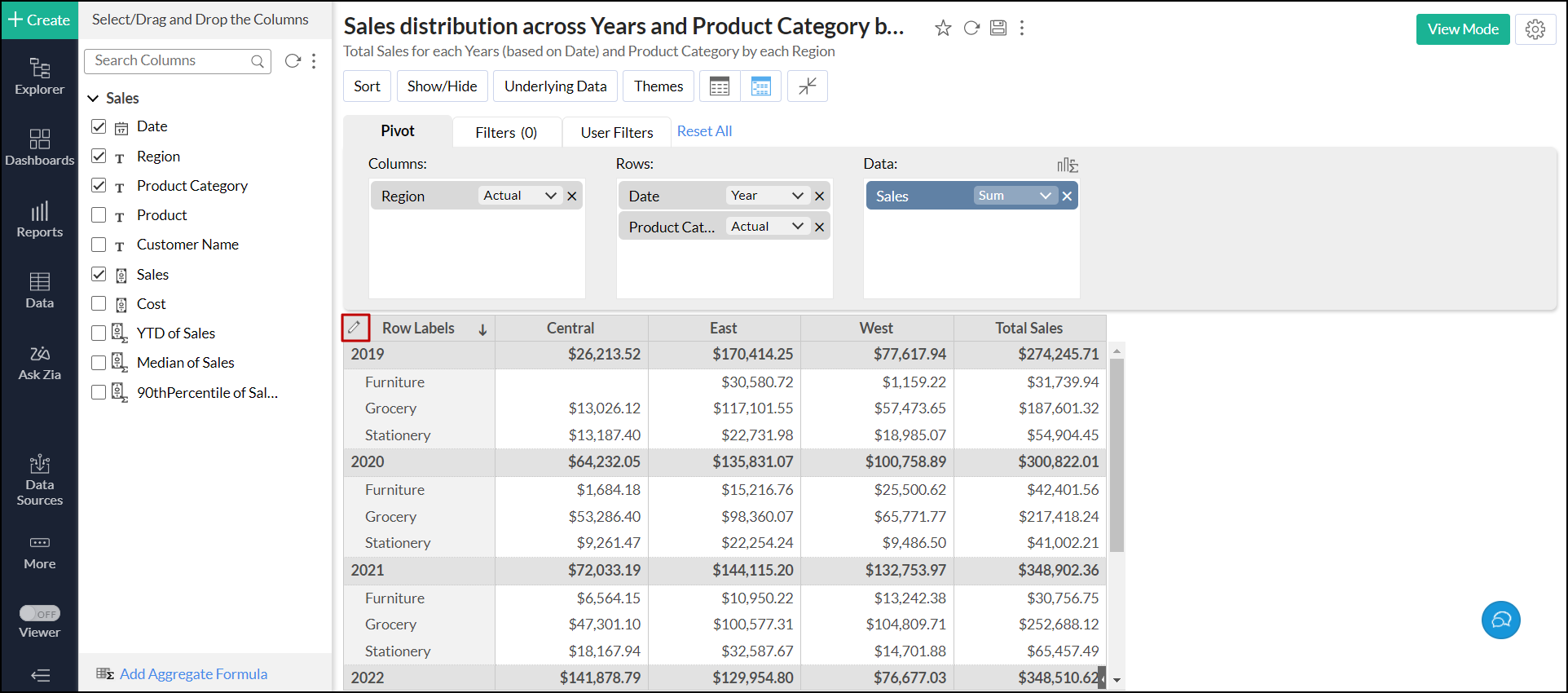

From settings
- Open the required pivot table, and click the Settings icon.
- Head to the Layout tab and choose the required layout.
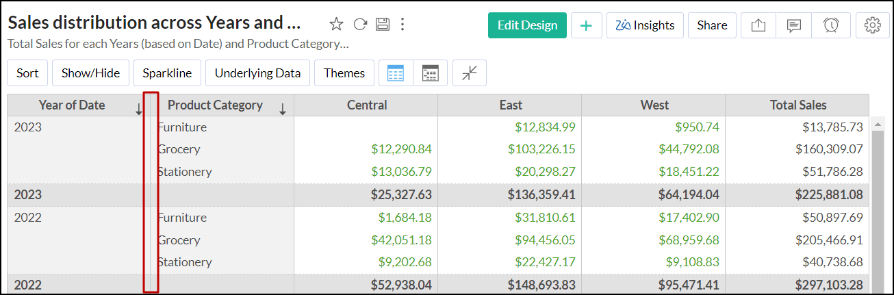
For tabular layout, you can select the Repeat group label value in each row checkbox to display the group label for each row listed in the pivot table.
For compact layout, you can change the Indent Level of the data displayed. By default, the pivot table uses indent level 1.
- Click Apply.


Display options
Zoho Analytics lets you specify how to display the data in the pivot table. Follow the steps below to modify the display options.
- Open the required pivot table, and click the Settings icon.
- Head to the Layout tab > Display section, and choose the required options. Refer to the following section to learn about each display option in detail.
- Click Apply.

The following are the available display options:
Show row numbers: This option allows you to display row numbers in the pivot table.
Show Vertical Line between Each Column: Enable this option to add a vertical line between each column. This option is enabled by default. Removing vertical lines can be helpful while preparing financial statements.
Show Horizontal Line between Each Row: Enable this option to add a horizontal line between each row that helps you to separate rows in the pivot table.
Wrap text in Column Headings: This option allows you to wrap column headers and display them in multiple lines within the same cell in the pivot table.
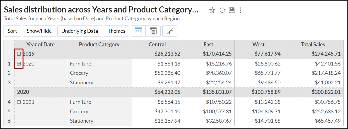
Show Expand/Collapse icons: This option allows you to show the Expand/Collapse (+/-) icons in the pivot table. By default, the +/- icons are displayed in line with the cell name when you perform the expand or collapse operation using the Expand/Collapse icon in the toolbar.
- Column Width: Choose one of the following options:
Compact: This option allows you to tightly pack the columns in the pivot table, to save horizontal space and improve readability without the need to scroll sideways.
Fit to Screen: This option enables you to scale up the pivot table that fits the entire screen on which you are viewing it.
Equal: This option allows you to set a uniform width to all the columns in the pivot table.
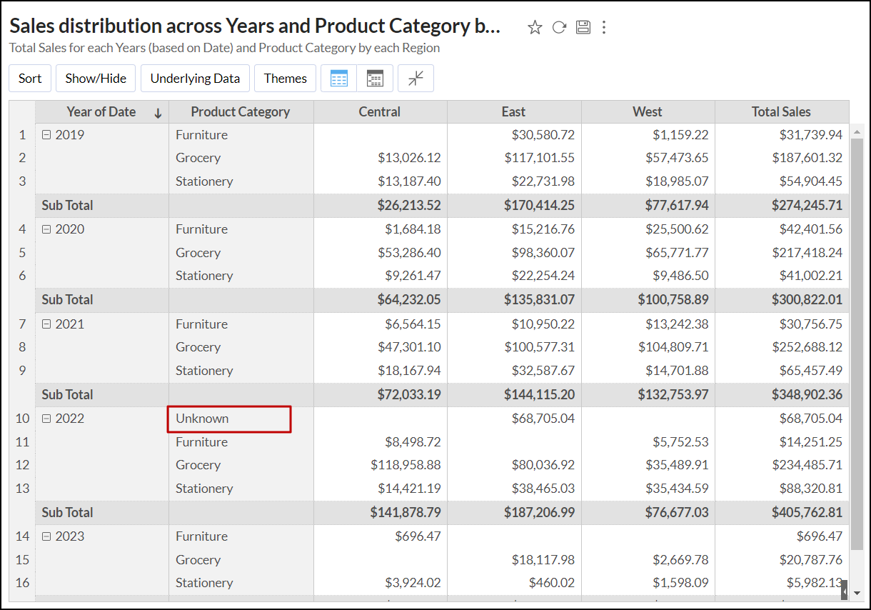
Display 'Unknown' value as: This option allows you to specify a label to be displayed when the columns dropped in the Rows and Columns shelf have empty values. By default, the pivot table displays -No Value-.
Sub-total Label: This option enables you to specify a label for the row displaying the subtotal in the pivot table.


Applying Themes
Zoho Analytics allows you to customize the look and feel of your Pivot table using colorful and attractive themes. You can customize your pivot table using the options provided to suit your taste. Please do note that this option is available only as a part of the new charting library that was released recently.
Follow the steps below to change a pivot table's theme:
- Open the required pivot table, and click the Themes button. The Themes dialog will open as shown below.
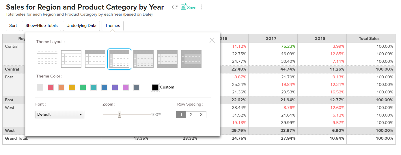
- You can select an appropriate theme to suit your needs and customize it using the options available. The Themes dialog allows you to select the,
- Theme Layout: You can choose a layout from the available set of seven layouts.
- Theme Color: Select a color that you wish to apply.
- Font: Select the font for the text in your Pivot.
- Zoom: You can Zoom in or Zoom out. This will increase or decrease the size of your pivot table.
- Row spacing: You can alter the row spacing using the predefined options available.
- As you choose the themes, the changes will be dynamically applied in the background.
- If you wish to undo the changes click Reset.
- If you want to reset the theme to the default theme click the Reset to default option.
- Save the pivot table.
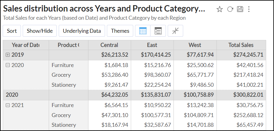
Show Missing Values
Show missing values feature is used to display the in-between missing values in a Pivot. This can be applied on a Date or a Category column. When creating a Pivot, if a particular data point does not have any value, then the Pivot would skip displaying that data. With this option, you can choose to display the record even if a point does not contain a value.
Let us say that you are the manager of a team and would like to view your employee`s attendance details every week. In case an employee is not available for a particular day, his data will not be available for that day. Our database looks as shown below.

Lets now create a pivot as shown in the below snapshot to view the number of employees present in the given week. To do that, drag and drop the Date and Employee Name column in the Rows shelf and Clock-in hours column in the Data shelf.

This Pivot does not contain any record of the employees who were not available (absent). To view the name of the employees who were not available for a particular day, you can enable show missing value function for the Employee Name column.
You can either right click on the column name and choose Show Missing Values or click Settings option on the toolbar.
In the settings tab that appears, Under the Show Missing Values section, click Choose Columns link next to For columns in the "Rows" shelf. You can choose the columns for which you wish to show the missing values.
The Pivot that is generated now, will contain the data of the employees who were absent.

In case you wish to view the details of the employees based on their location, we will be making a small change in the existing pivot. Drag and drop the Location column under the Rows shelf.
Our Pivot will look as shown in the below snapshot. If you take a closer look, you will notice that this might not be the best way to display the data as it displays the name of all employees across all locations.

In this case, you can choose to apply hierarchy function while listing missing values.
- Click Settings in the tool bar and in the Settings tab that appears, click Choose Columns link next to For columns in the "Rows" shelf (Under Show Missing Values).
- Select the column (in our case Location)
- Check Apply hierarchy while listing missing values
- Click Apply
The Pivot will now look as shown below.

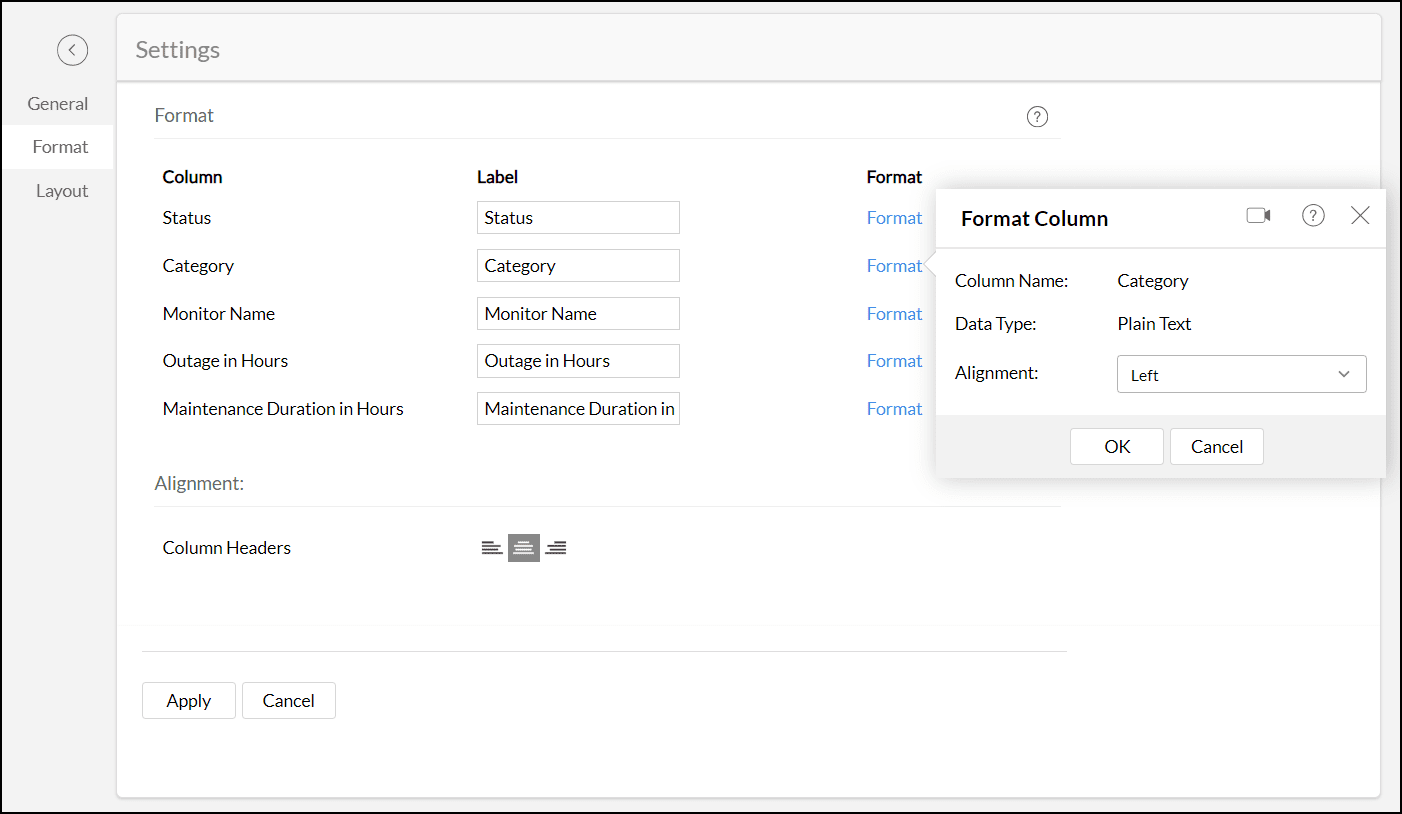
Formatting Options
Zoho Analytics enables you to change the display label, the format of the data columns, and header alignment in the pivot table. To do this, follow the steps below:
- Open the required pivot table and click the Settings icon.
- Head to the Format tab and change the column display Labels as required.
- Click the Format link adjacent to each label to change the data format in the pivot table. The options displayed in the Format Column dialog vary depending on the columns' data type and are similar to the table column formatting. Click here to learn more about formatting a table column.
Choose the desired Alignment (Left, Right, or Center) for the Column Headers. Center alignment is applied by default.

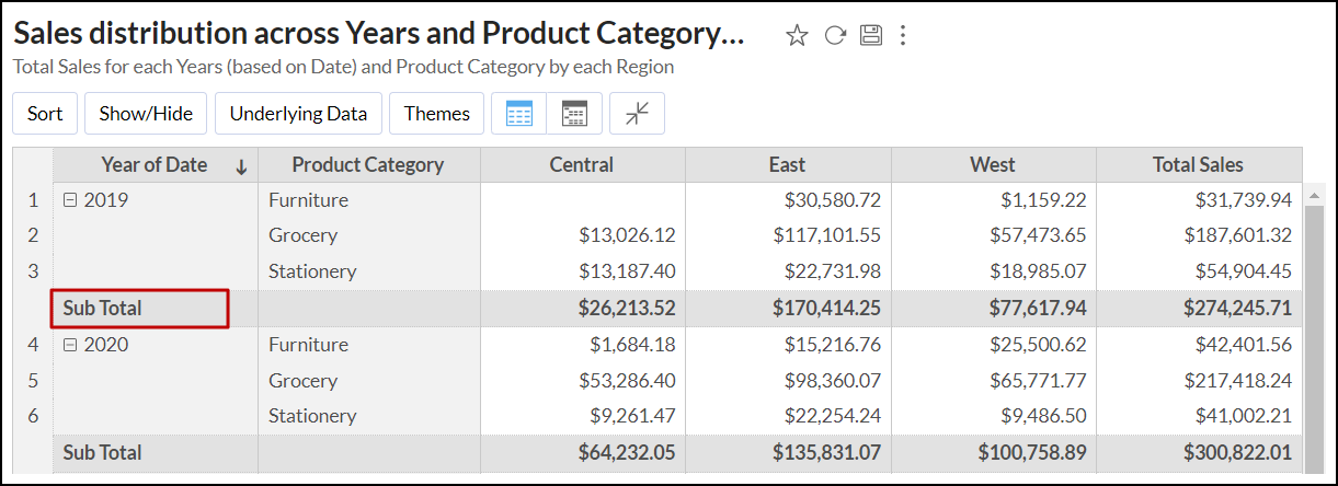
Show/Hide
By default, subtotals of individual rows and columns, and the grand total of all the rows and columns will be displayed in the Pivot table. You can choose to change the position of these totals, or turn them off. You can choose to hide specific columns in a pivot table, and display only the required columns.
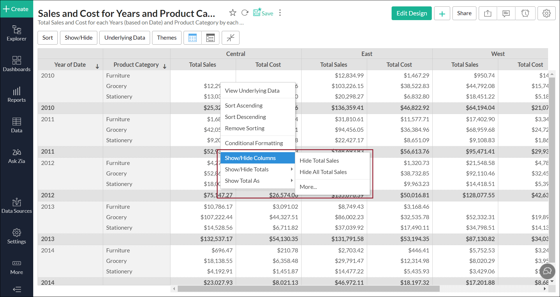
Show/Hide columns
When you create a pivot table, every column will be displayed automatically. However, you can choose to hide certain columns and display only the rest as required. Follow the steps below to do this:
- Open the required pivot table, click the Show/Hide option in the toolbar and select Columns.

- The Show/Hide Columns popup appears, listing all the columns in the pivot table. Select the columns you wish to hide, and click OK.
- The Empty Columns checkbox allows you to show or hide the empty columns in the Pivot. Select this checkbox to display the empty columns, and unselect this checkbox to hide the empty columns.

- You can also right click a particular cell, and select the Show/Hide Columns option. The following options are available:
- Hide column-name: This option allows you to hide the selected column.
- Hide all column-name: This option is applicable only when repetitive columns are present in the pivot table, and allows you to hide all columns with the same name.
- More: Select this option to access the Show/Hide Columns screen, which displays every column in the pivot view.
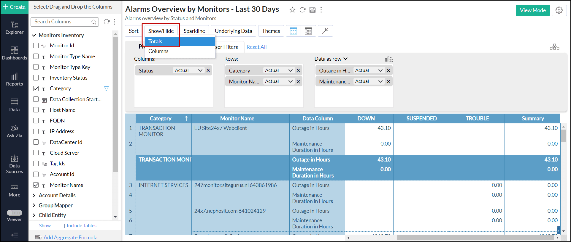
Show/Hide Totals
When creating pivot tables, Zoho Analytics automatically adds the sub-totals of individual columns and the grand total of all the rows and columns. However, you can turn off these totals or change their positions. Zoho Analytics allows you to hide the totals when they are displayed in Data as row or Data as column format.To do this, follow the steps below.
- Open the required pivot table.
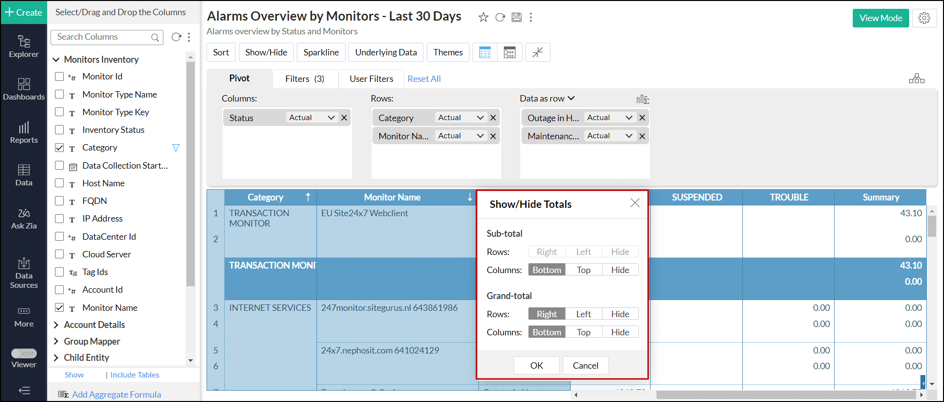
Click the Show/Hide option in the toolbar and choose Totals from the drop-down. You can also right-click any cell/column and choose the Show/Hide Totals > More option.
- In the pop-up that appears, choose the corresponding option to customize the rows and columns in the Sub-total and Grand-total sections.
- Rows: This option allows you to select the Right or Left position to display the sub-total or grand-total. You can also choose Hide to hide the row displaying the sub-total or grand-total.
- Columns: This option allows you to select the Bottom or Top position to display the sub-total or grand-total. You can also choose Hide to hide the column displaying the sub-total or grand-total.
- Click OK.

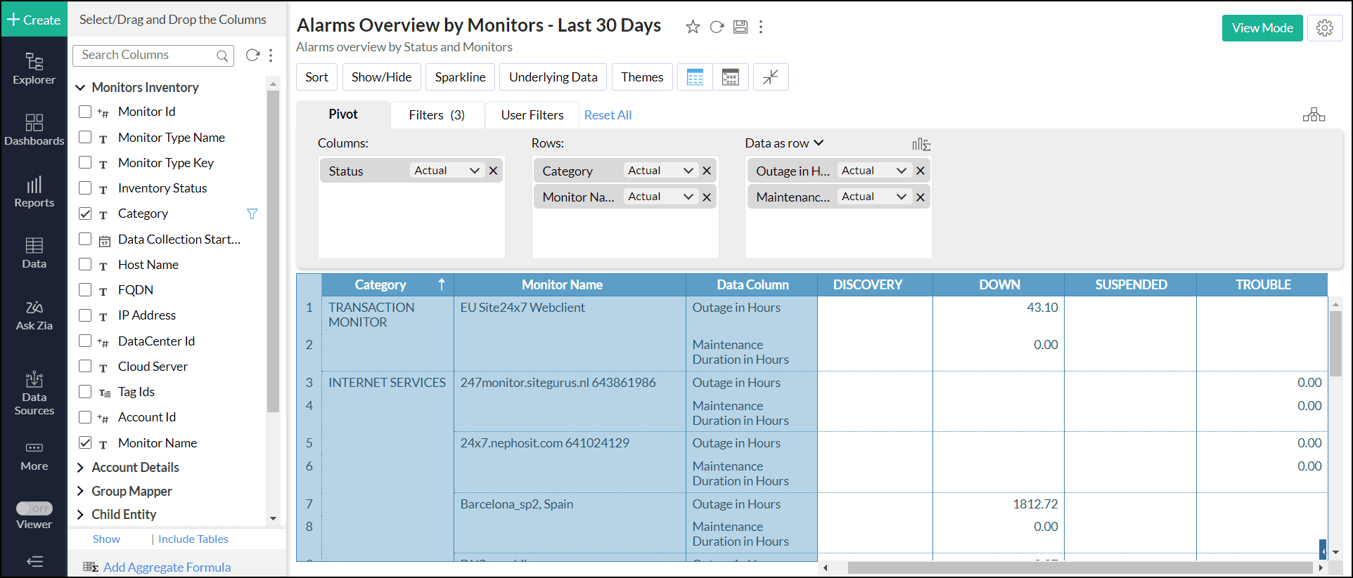
The below image shows the total outage in hours and maintenance duration in hours for each monitor based on it's category in the Data as row format.
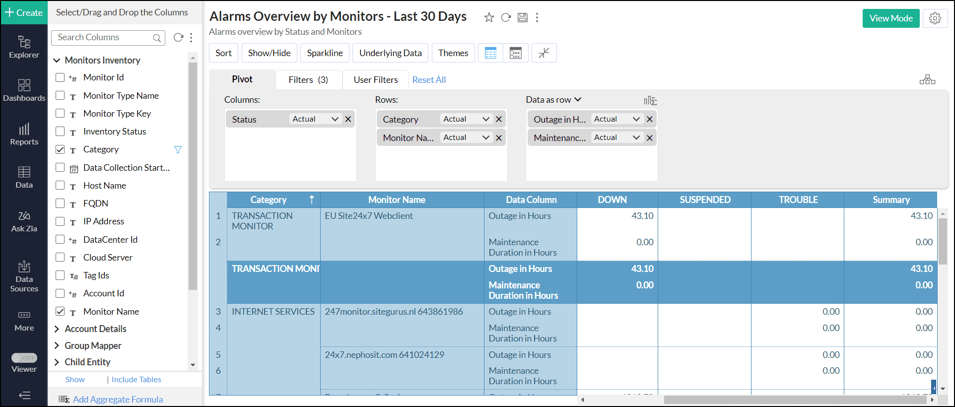
The sub-total of outage and maintenance in hours for each monitor and the grand total are hidden.
Show Total As
In Zoho Analytics, by default, the summary function used to display the subtotals and the grand total will be the same as that of the summary function applied to the corresponding data column. You can customize this and apply other summary functions such as sum, average, min and max on the sub-total that is displayed.
To change this,
- Right-click anywhere on the Pivot table
- Select Show Total As and then, select the function that you wish to apply.
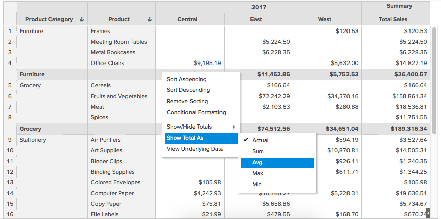
In our example, we have applied the average function. Shown below is the Pivot with the Average function applied to the Subtotal and Grand Total.
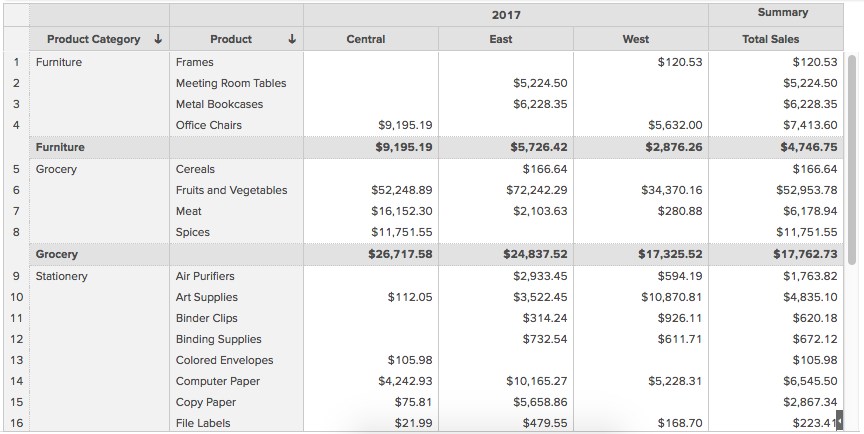
Please do note that the Show Total As feature is customizable for each data column.
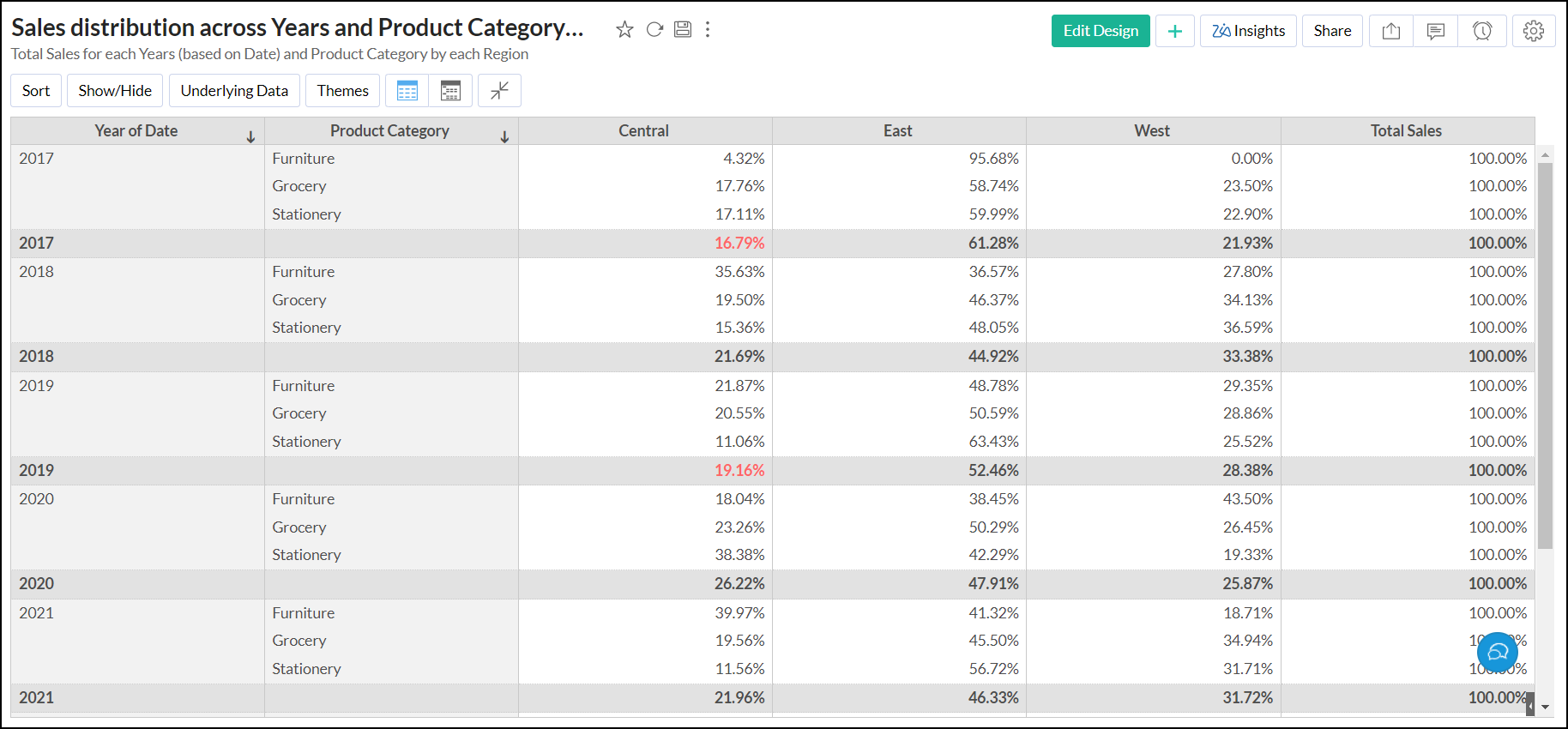
Sorting a pivot table
In Zoho Analytics, by default, a pivot table data will be sorted in ascending order by the values of the columns from the source table that you assign to Row orientation in a pivot table. Zoho Analytics allows you to change this default sort order in lot of different ways. Below is a brief description of various ways to sort a pivot table.
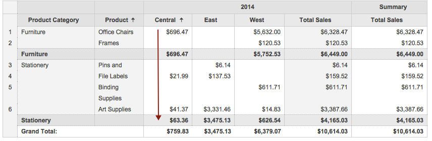
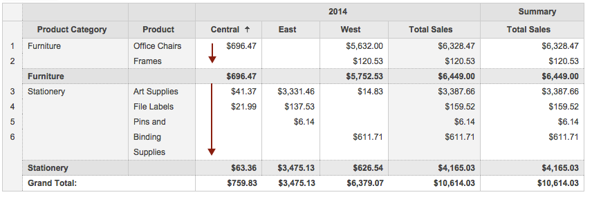
Sorting a Pivot column by its values (by the values of the columns in Row shelf): This option allows you to sort pivot table column data in ascending or descending order by its actual values.
To sort a pivot table by its column values:
- Right-click the column header or on any cell of the corresponding pivot table column whose values has to be sorted.
- In the pop-up menu, select the required sort order and then By Column (column specific) option.
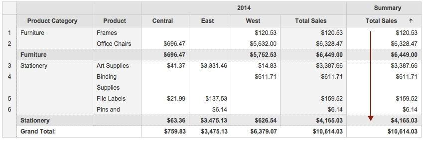
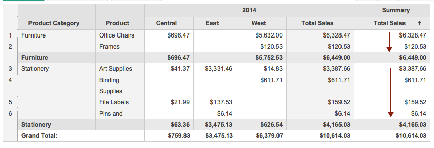
For example if a pivot table has Product category and Productcolumns in Row shelf (Row Orientation), initially the Product Categories and Products will be ordered alphabetically in ascending order. When corresponding columns are sorted in descending order as described above, Pivot data will be rearranged as shown in the screen shots below.

Sorting a pivot table column by its corresponding data values(by values of the column in Data shelf): This option allows you to sort pivot table columns based on data values corresponding to each pivot column value.
To sort a pivot table based on its data values:
- Right-click the data value column header or on any data value cell corresponding to a pivot table column value.
- In the pop up menu, select the required sort order and then select the column based on which you want to sort data values as shown below.
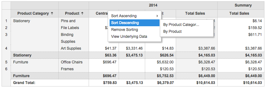
In the above example, when you right click Central region and select Sort Descending -> By Product Category, Sales values in Central region corresponding to Product Category column will be sorted in descending order as shown below.
When you select Sort Descending -> By Product, Sales values in Central region corresponding to Product column will be sorted in descending order as shown below.
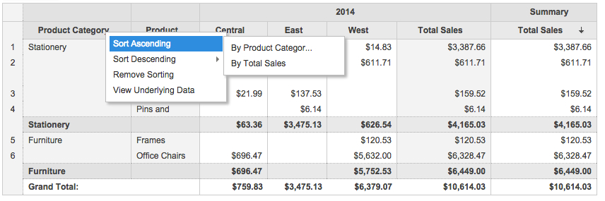
Sorting pivot table columns by its corresponding summary values: This option allows you to sort pivot table columns based on summary values corresponding to pivot column values.
To sort a pivot table based on its summary values:
- Right-click the summary column's header.
- In the pop up menu, select the required sort order and then select the column based on which you want to sort summary values as shown below.
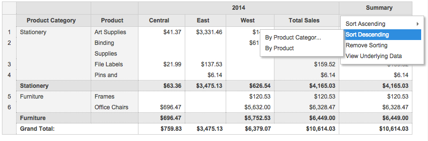
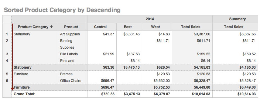
When you right click Summary Column and select Sort Descending -> By Product Category, Sales values in Summary column corresponding to Product Category column will be sorted in descending order as shown below.
When you select Sort Descending -> By Product, Sales values in Summary column corresponding to Product column will be sorted in descending order as shown below.
You can also sort rows by column values by clicking on the arrow icon(![]() ) at the heading of the corresponding column. A down arrow indicates that the column is sorted in ascending order. An up arrow indicates the column is sorted in descending order.
) at the heading of the corresponding column. A down arrow indicates that the column is sorted in ascending order. An up arrow indicates the column is sorted in descending order.
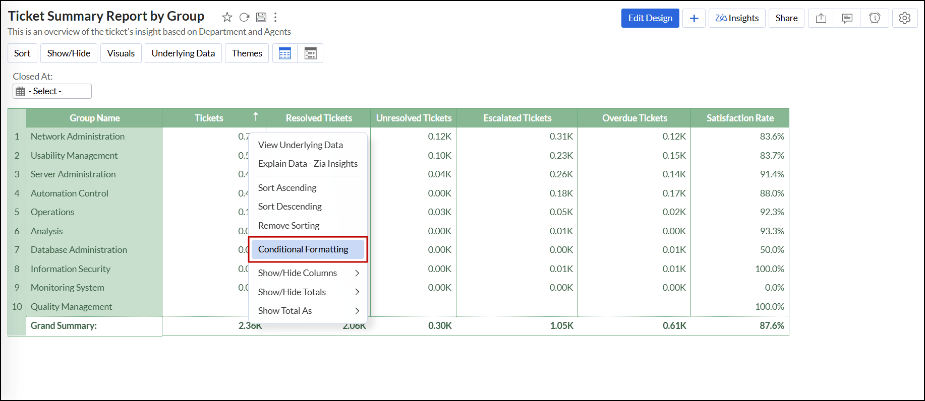
Conditional formatting
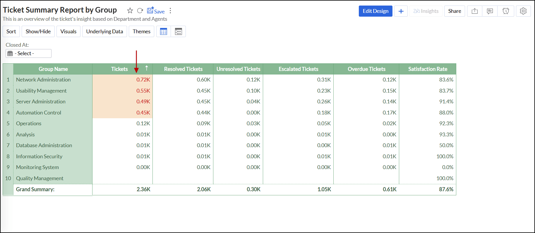
Zoho Analytics allows you to highlight cells in pivot tables based on specific conditions. You can apply different styles and colors to highlight and emphasize critical information such as deadlines, targets, stock levels, and task completion. Conditional formatting can be applied based on the data values of the same or other columns used in the pivot view.
Zoho Analytics allows you to visually highlight columns that match the conditional formatting criteria in the following ways:
Conditional formatting - Rule Based
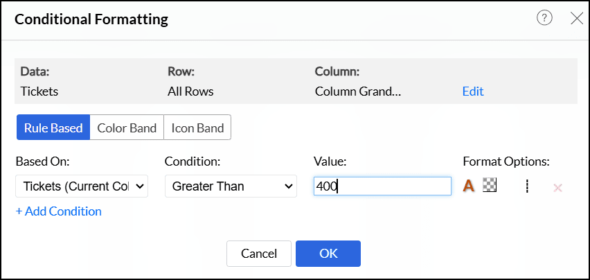
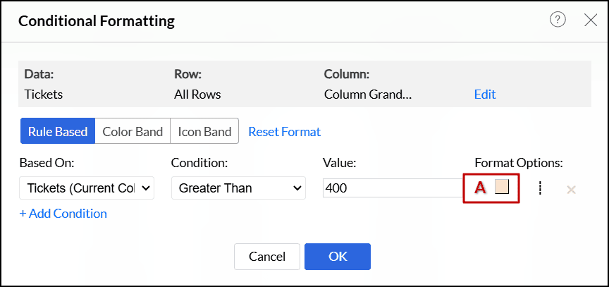
Follow the steps below to apply rule-based conditional formatting,
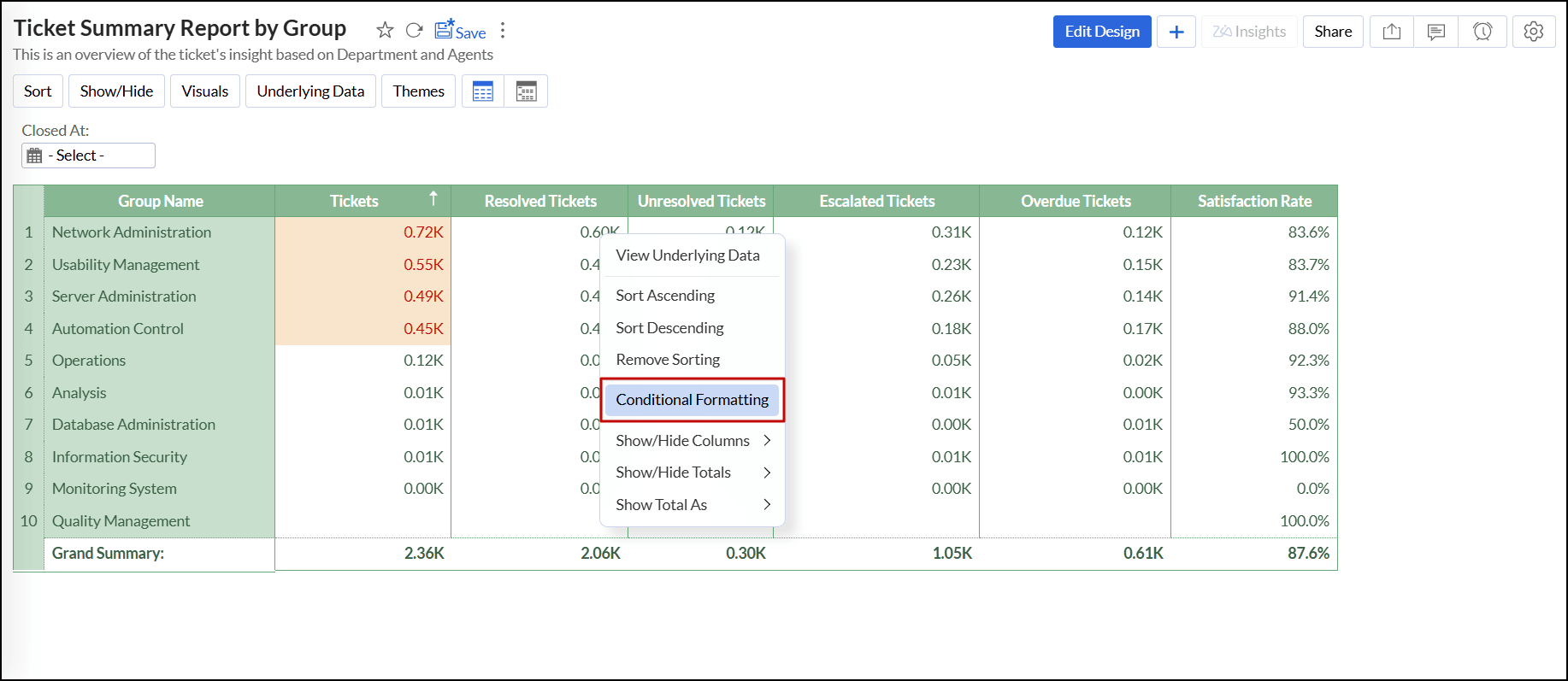
- Open the desired pivot view in View mode or Edit Design mode.
Right-click the data you wish to format in your pivot table and select the Conditional Formatting option.
In the popup that appears, you can format the data values based on the current selected column or choose another column from the Based on drop-drop menu.
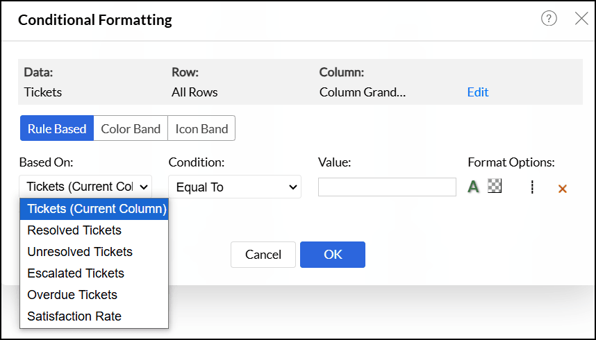
In the popup that appears, select the required condition from the Condition drop-down. The available conditions vary based on the type of data being formatted.
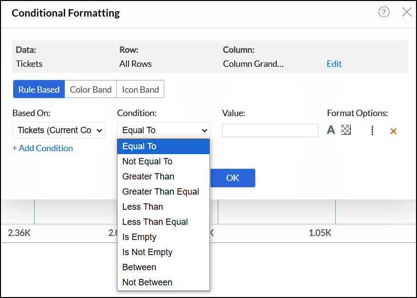
Enter the threshold value in the Value section. Any data cell that meets this condition gets highlighted.
- Select the desired Format Options to apply. Click here to learn more.
- Click the Edit link if you want to modify the data, rows, or columns over which the conditional formatting applies.
Click the +Add Condition link to add more conditions. The conditions are evaluated from top to bottom, and the appropriate formatting is applied to the data cells that meet each condition.
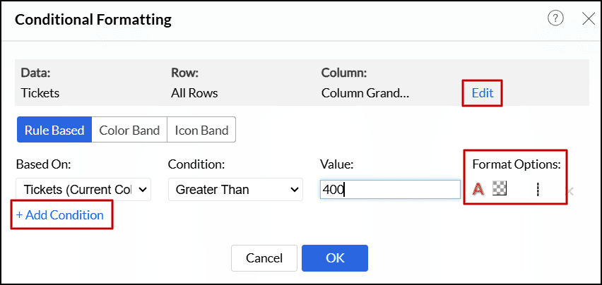
Click OK to apply the specified formatting over the pivot table.


Formatting options
The following are the available formatting options:
- Font Color: This will apply the chosen color to data that meets the specified conditions.
Background Color: This will apply the chosen color to the background of the cells that meet the specified condition.
Text: This allows you to include Prefix or Suffix to the existing data value or change the existing data values with custom text using the Text Replacement option.
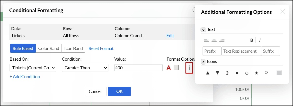
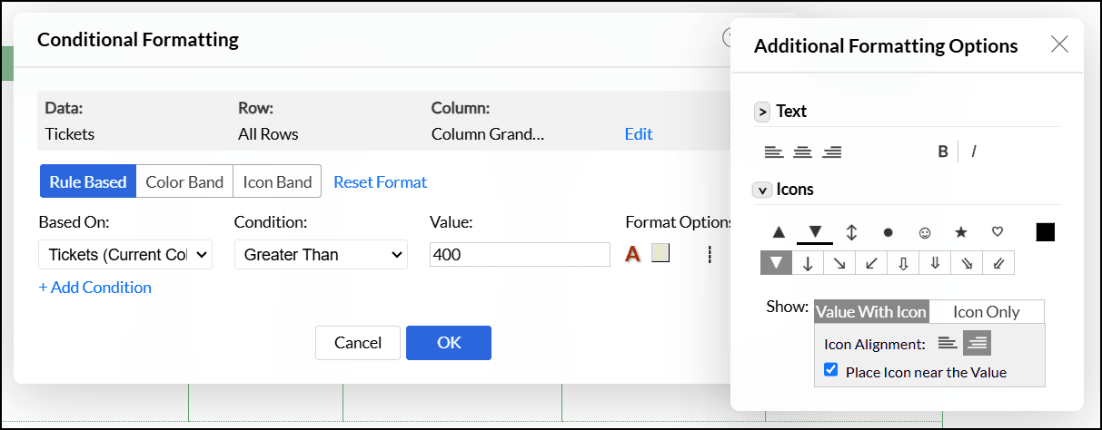
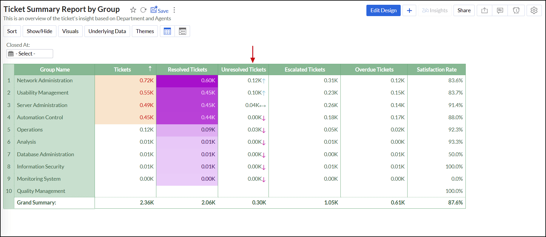
Icon: This provides a quick visual representation to highlight trends in data, making it easier to identify areas of improvement and areas of excellence.
- Choose the icon that represents the information in the data better.
- Click the Icon color to choose the preferred color for the icon.
- Select the way to display the icon, either Values with Icon or Only the Icon.
- Choose the Icon Alignment, Align left, or Align right.
- The Place Icon near the Value checkbox helps to position the icon closer to the corresponding value. This option is enabled by default. Disable it to position the icon farther from the value.


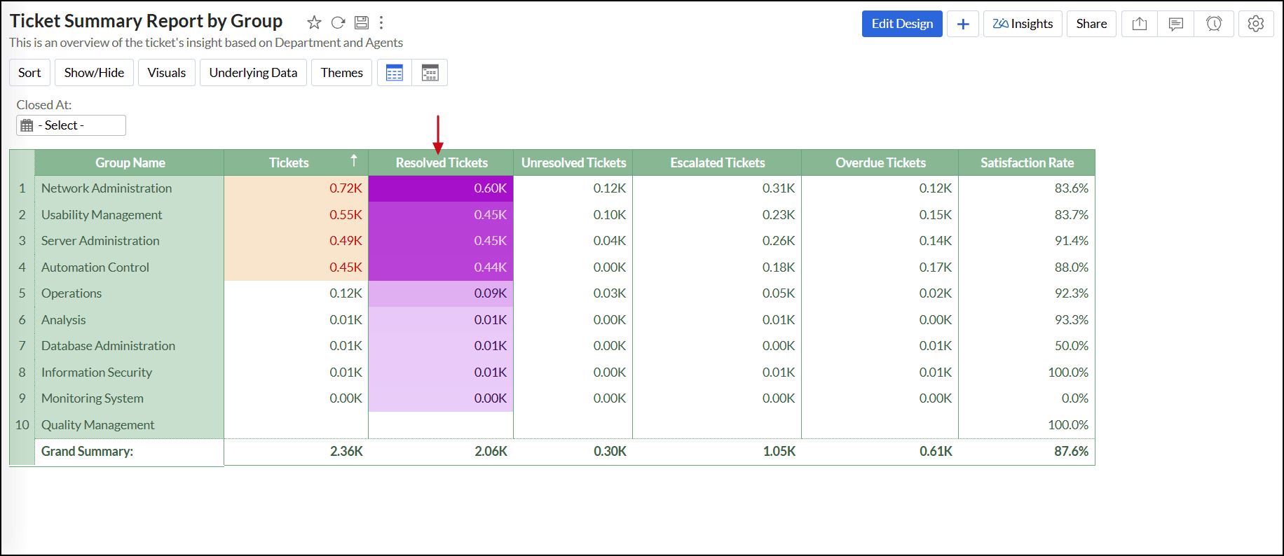
Conditional formatting - Color Band
The Color Band feature lets you apply a gradient of colors across your data range. It helps to highlight variations in data, such as a gradual increase or decrease in values.
- Open the desired pivot view in View mode or Edit Design mode.
Right-click the data you wish to format in your pivot table and select the Conditional Formatting option.
In the popup that appears, you can format the data values based on the current selected column or choose another column from the Based on drop-drop menu.
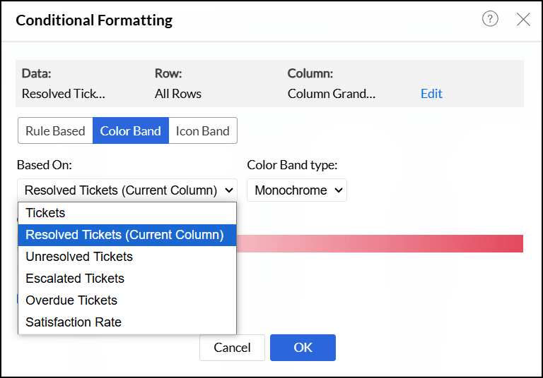
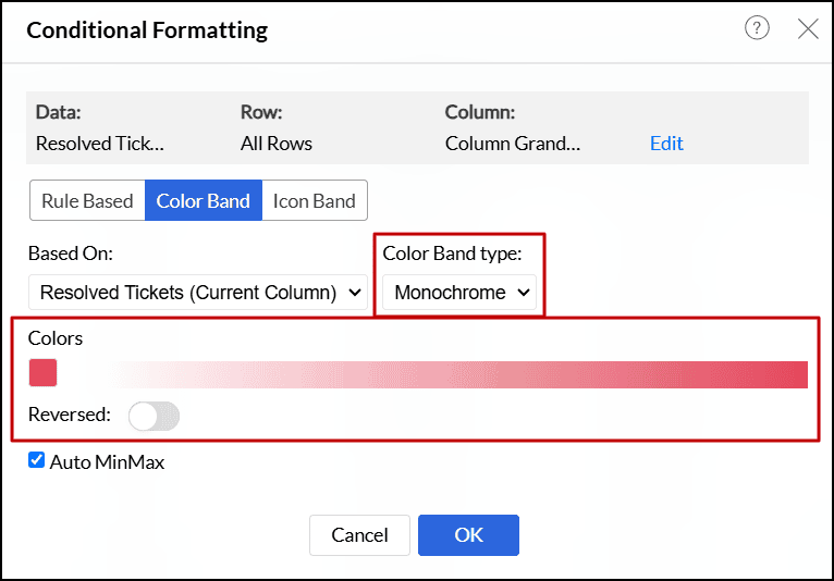
- Select the type of color band, either Monochrome or Gradient, from the Color Band Type drop-down.
Monochrome: It allows you to apply gradients using shades of a single color to represent the data range.
Click the Reversed toggle button if you want to invert the color intensity across your data range, with the lightest shade becoming the darkest and vice versa.
Gradient: This feature enables you to create a smooth transition between two or three colors in your pivot table.
- Start color: Applied to the minimum data values.
- End color: Applied to the maximum data values.
- Middle color (Optional): Click the + icon to add a third color, which applies to the middle of the gradient. You can adjust the position using a slider that ranges from 0% to 100%.
- Delete Colors: Click the link to remove any of the selected colors. This option applies only when you choose a third color.
Merge Colors: This option blends two selected colors into a smooth, unified gradient. Unchecking it will give you a separate gradient for each color.
Note: The Merge Color option is applicable only if two colors are selected. It is not available if a third color is added to the gradient.
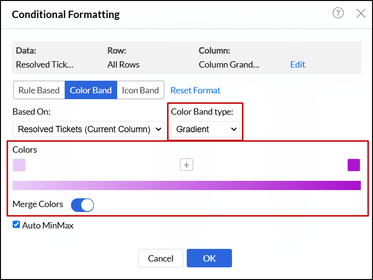
- The Auto MinMax checkbox allows the minimum and maximum values for the color band to be set automatically. Unchecking this box lets you manually define the minimum and maximum values, giving you control over the range that the gradient spans.
Click OK.


Conditional formatting - Icon Band
The Icon Band feature allows you to represent your data with icons such as arrows, emojis, circles, hearts, stars, etc. It helps to identify high and low values or performance indicators.
- Open the desired pivot view in View mode or Edit Design mode.
Right-click the data you wish to format in your pivot table and select the Conditional Formatting option.
In the popup that appears, you can format the data values based on the current selected column or choose another column from the Based on drop-drop menu.
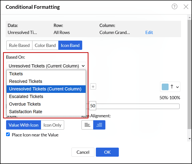
Choose the icons and their colors. You can choose two to five icons. The middle three icons are optional, and their positions can be adjusted using a range slider that spans from 0 to 100%.
Note: Zoho Analytics automatically adjusts the ranges as you add or remove icons.
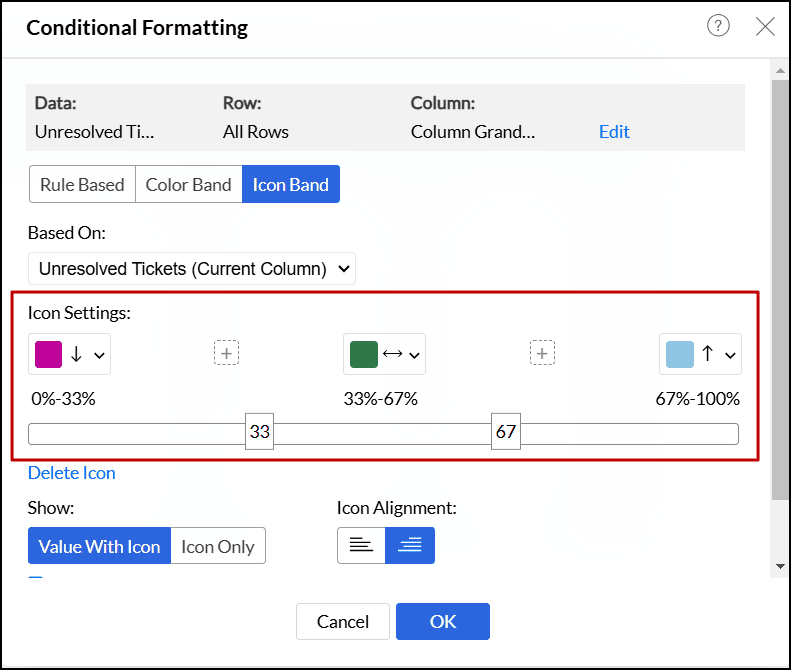
- Select desired format settings to adjust the icon display options:
Value With Icon: This option displays both the data value and the corresponding icon. You can align the icon either to the left or right of the value. The Place Icon near the Value checkbox helps to position the icon closer to the corresponding value. This option is enabled by default. Disable it to position the icon farther from the value.
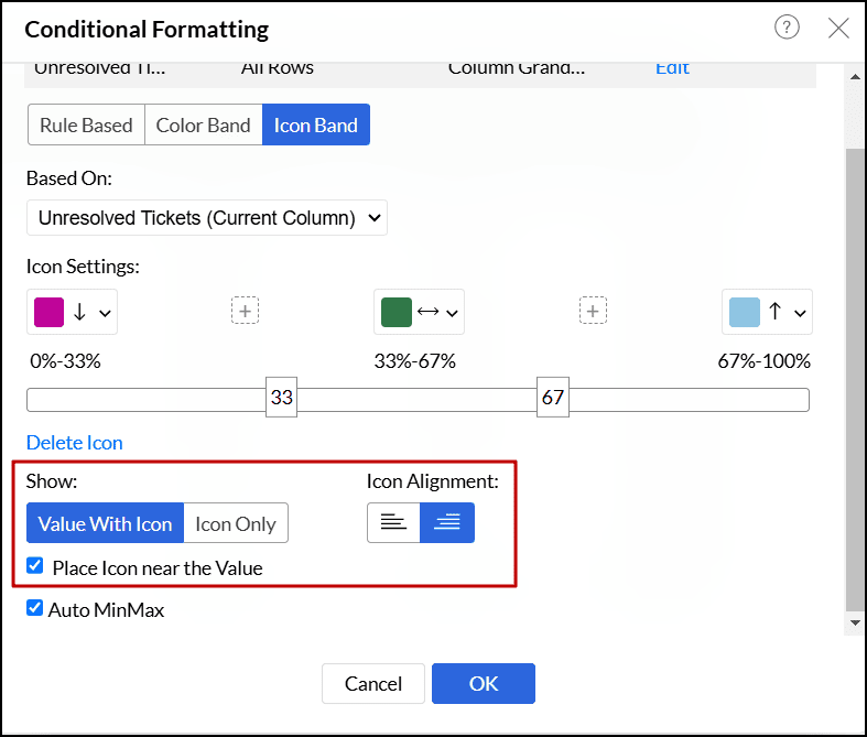
Icon Only: This option displays only the icon without the data value. You can align the icon to the left, middle, or right within the cell.
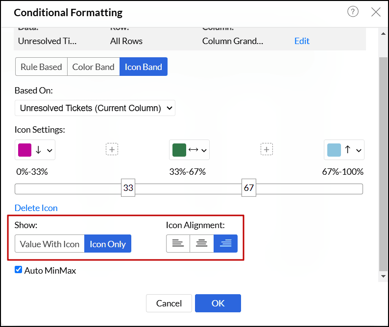
- The Auto MinMax checkbox allows the minimum and maximum values for the color band to be set automatically. Unchecking this box lets you manually define the minimum and maximum values, giving you control over the range that the gradient spans.
Click OK.
From settings
Zoho Analytics lets you view and modify the conditional formats applied over the pivot view, from the Conditional Format tab of the Pivot's Settings page. Click the required data to view the corresponding conditional formats applied over it. Modify the conditions as required, and click Apply.
