Single select option
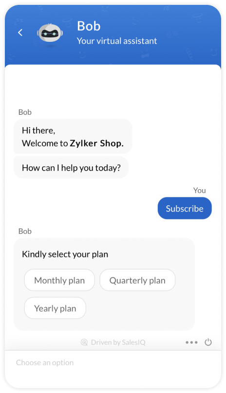
This card helps to get input from an options list. You can present the visitors with multiple options to get their responses. The main difference between a single select option card and a suggestion is that the suggestion can create multiple flows based on the visitors' response, whereas the options can be used to collect information from the visitors.
| Attribute | Mandatory | Description | Values |
| type | Yes | The type of input to be displayed to the visitor | select |
| options | Yes | An array of strings you would like to display as options | A maximum of 20 options in the array with a character limit of 80 each can be given. |
Channel compatibility and limitations
![]()
![]()
![]()
![]()
![]()
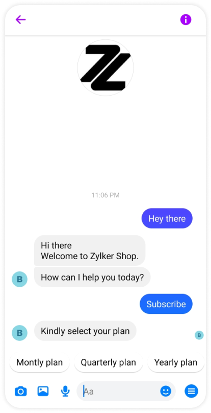
Facebook Messenger:
- The card is supported on Facebook.
- A maximum of 13 buttons (20 characters each) will be provided in a horizontal scrolling format.
- When more than 13 suggestions are provided, only the first 13 will be displayed.
- The characters exceeding more than 20 will be trimmed and only the first 20 characters will be displayed.
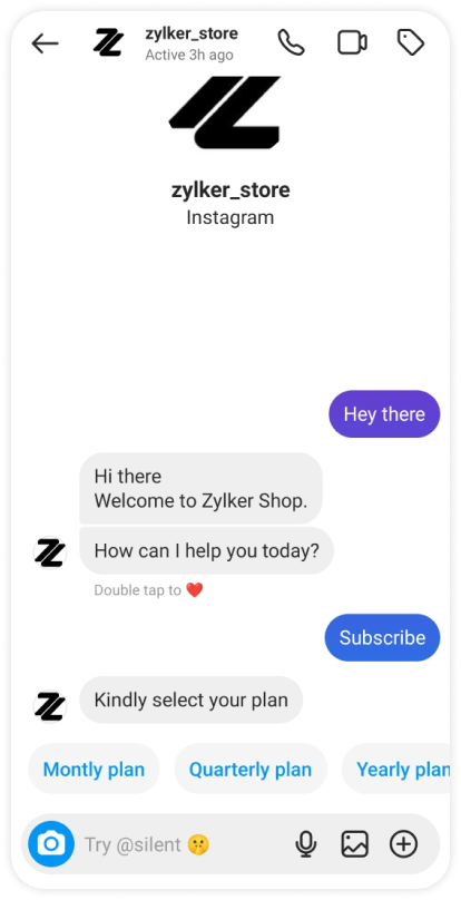
Instagram:
- The card is supported on Instagram.
- A maximum of 13 buttons (20 characters each) will be provided in a horizontal scrolling format.
- When more than 13 suggestions are provided, only the first 13 will be displayed.
- The characters exceeding more than 20 will be trimmed and only the first 20 characters will be displayed.
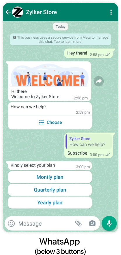
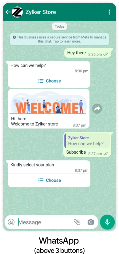
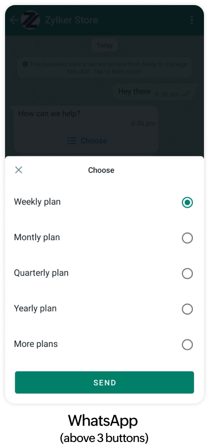
WhatsApp:
- The card is supported on WhatsApp.
- A maximum of 10 options (20 characters each) will be provided in a list format.
- If the option number is lesser than or equal to 3, all options will be listed as buttons.
- When more than 10 options are provided, only the first 10 will be displayed.
- The characters exceeding more than 20 will be trimmed and only the first 20 characters will be displayed.
Sample code
Copied{
  "platform": "ZOHOSALESIQ",
  "replies": [
      "Kindly select your plan"
    ],
  "input": {
    "type": "select",
    "options": [
    "Monthly Plan",
    "Quartey Plan",
    "Yearly plan"
    ]
  }
}