What exactly is form accessibility?
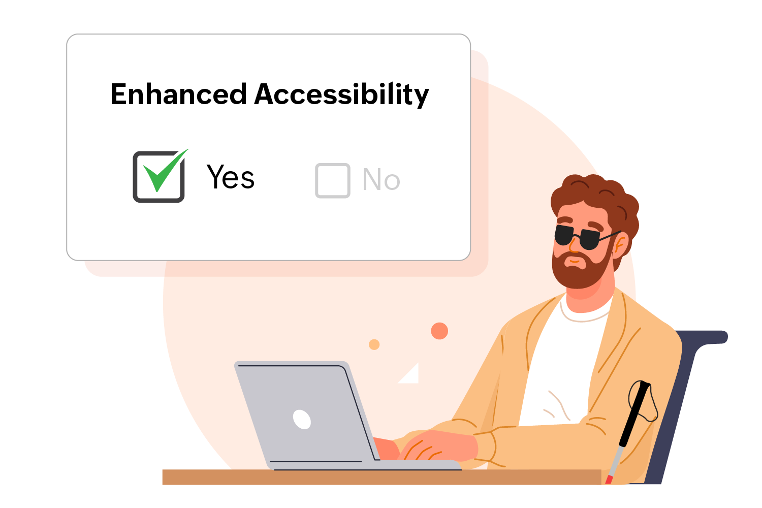
Accessibility for forms refers to designing forms in a way that all users, regardless of their abilities, can easily understand, navigate, and interact with them. A significant portion of the internet still falls short in catering to users with varied disabilities with form accessibility often being neglected. Many individuals, especially those using assistive technology, frequently encounter frustrating experiences while trying to navigate forms online. If you've landed on this page, it's likely because you're determined to improve this situation. With Zoho Forms, there's no need to download extra widgets to create accessible submission forms; Zoho Forms has it all built in.
Learn how to make forms accessible

User-friendly form builder
Our easy-to-use form builder requires no great technical expertise or coding knowledge to create accessible online forms that cater to a wide audience. Enhance the accessibility of your forms today by making them compatible with screen readers. These are vital tools for respondents with visual impairments, which help them navigate and interact with your forms smoothly by converting text into speech. This helps promote an inclusive and user-friendly experience for all.
Features to promote web form accessibility
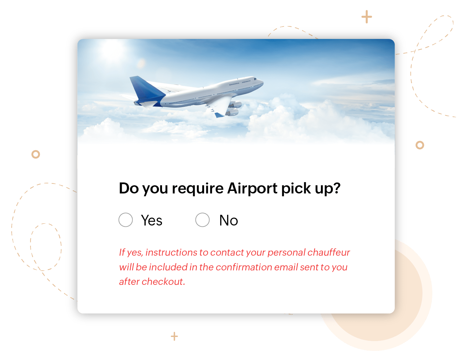
Many of our form features are designed to encourage creating accessible forms, particularly for respondents with cognitive disabilities. You can include instructions to build accessible form fields and guide users on how to complete the form. You have the option to customize the default error messages to clearly outline what went wrong and how the user can fix it, too.


Form accessibility best practices
In addition to enabling the accessibility feature in Zoho Forms, here are some practices to help you design forms that cater to everyone.
- Avoid relying on the placeholder to convey important information. Vital details necessary for successful form submission should be included in a label or provided as an instruction below the field.
- If you have mandatory form fields, mark the field with the "Required" label so it is clear for screen readers to convey that to the user. Position labels above fields rather than beside them to enhance accessibility for users who rely on screen readers.
- If you have a long form, break it into sections with clear headers and group the related fields together under them. Well-structured sections provide clear navigation points, enhancing accessibility.
- Test your form with real users, especially with individuals who have disabilities or use assistive technologies, to understand the experience of using tools like screen readers while interacting with your form.
- Avoid symbols and special characters, for individuals who rely on screen readers or other assistive technologies.
- Additionally, keep the form simple and clean to create a clear and straightforward user experience for all respondents.


