- HOME
- Know Your Tech
- How to build a custom app: Designing the user interface
How to build a custom app: Designing the user interface
- Last Updated : August 30, 2024
- 980 Views
- 5 Min Read
In our last blog from the "How to build a custom app" series, we discussed planning app development. Now, let's dive deeper into designing the user interface.
The user interface (UI) is how people interact with your app, so it needs to be designed thoughtfully and with a focus on usability. This stage involves converting requirements into an intuitive visual/navigation experience that engages users.
Wireframing and prototyping
Before one line of code is written, you need to create wireframes to determine your app’s layout and structure. This gives you a bird's-eye view that can catch any early flow issues without having to worry much about the design aspects of the app. Then, through prototypes, you can add interactive elements that simulate the functioning and experience of the app.
Digital wireframes are created using software tools, such as Figma or Adobe XD, which not only accelerate the development process of your project but also allow easy sharing with your colleagues and business partners.
What you need to know
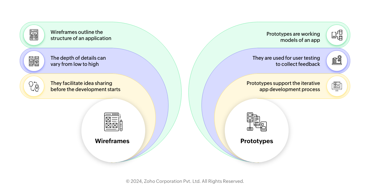
Purpose of wireframes: As a blueprint for your application, wireframes are like floor plans for buildings. They help outline how the app should be structured, what features should be included in it, and where content will be placed, among other things, all without worrying about the color scheme or design elements. For instance, if it were a restaurant app, a wireframe could detail where the menu, reservation system, and user reviews sections might appear.
Wireframe fidelity levels: These range from low-fidelity hand-drawn sketches that quickly lay out a concept to high-fidelity wireframes that closely resemble the final product. With the high-fidelity wireframe of a social media app, for example, there would be no actual design elements in place.
Useful communication: Before development starts, wireframes are vital for sharing ideas between developers, designers, and stakeholders. They act as visual aids that can assist a non-technical stakeholder, for instance, in understanding how an e-learning platform dashboard might look and work.
Prototyping: A prototype is an interactive model of the app that simulates user experiences and journeys. An example of this could be a prototype of an ecommerce website, where users can select different categories of products and add them to their shopping cart, before going through a pretend checkout process.
Tools for prototyping: Products like InVision or Axure RP enable designers to create prototypes that aren't coded but feel exactly like the final app. For example, these tools may be used when creating a travel booking application’s prototype, to check how easy it is to move from the flight booking section to hotel reservations and later rental car services.
User testing: Prototypes encourage user testing, which allows collecting the feedback required for improving the app. This is evident when you take into account fintech apps’ users trying prototypes to evaluate the ease or difficulty of navigating through processes like opening new bank accounts or sending wire transfers.
Iterative design process: Wireframing, as well as prototyping, are both iterative processes. At first, they’re designed by multiple teams, in response to feedback and test results. For example, a fitness tracker app would go through many rounds of prototyping before the UI is perfect at synchronizing with other devices.
From wireframe to prototype to development: The transition between wireframes, prototypes, and final products is a critical path in application development. Each version iterates over various screens, testing and polishing the app’s functionality and design. As an example, the initial wireframe for a music streaming app would set up the basic layout, followed by a prototype for playing and managing playlists, which will then be the basis for the final development.
Create a visually appealing UI/UX
Your UI should do more than just look beautiful—it should support intuitive UX to help guide interactions. This means that you need to think about color schemes and visual hierarchy, where elements of importance are highlighted to contribute to the successful creation of the app.
Employ design principles, like consistency in button styles, alignment, and font choices, and remember to create contrast between elements that require action and those that provide feedback or information. Regularly test your design with actual users to ensure it meets their needs.
Real-world example: Spotify
The Spotify mobile app's user interface is simple yet uncluttered, featuring a consistent dark theme that allows album covers and artist images to stand out. The navigation is seamless, with a bottom bar populated by important functions positioned at their fingertips.
Guiding users through its screens, the application is highly optimized for typography and the use of icons, helping users easily locate essential features. A good example is the prominent shuffle play button on each album page, which gets listeners started right away. This ensures that playlists are more geared to personal preferences, with this individualized tweaking enhancing music discovery and making it both fun and easy.
Accessibility for all users
A good UI/UX design should be accessible to everyone, no matter what their abilities are. This means creating a design that can be used by users with disabilities and various mobile devices and screen sizes.
With features like high resolution, text-to-speech, and well-designed touch response areas, the app can appeal to more users. Accessibility testing tools, such as Axe for Android apps, and web or native apps with OS-native accessibility features can help you test through the design and development of powerful mobile applications.
Apple: A real-world example
Another real-world example of advanced UI/UX design is seen in Apple’s line-up of products. Steve Jobs believed that products should be designed from the point of view of the user, aimed at marrying technology and aesthetics to give an intuitive and delightful user experience. He believed that design was not only about how things looked but also about how they worked.
An instance to illustrate this is when one looks at the iPhone interface; it's extremely easy to use, with minimalistic styling that avoids cluttering it up, to make it more usable. The simplicity of the home screen, the intuitiveness of the touch interface, and the responsiveness of system gestures matter.
In our next blog in the "How to build a custom app" series, we deep dive into the considerations when developing mobile apps. Click on the link below to check it out.
 Pranesh
Pranesh is a serial entrepreneur and the Founder of Studio 31, a 12 year old, deep tech enabled, wedding photography and film company that has been recognized by many publications for its zero inventory model and unique culture in the unorganised sector.
Zoho Creator has helped Studio 31 redefine its business model by automating over 37 processes and save three hours every single day. He is also a growth consultant for Zoho Creator and helps the team address real-world challenges from a customer's point of view.