- KPIs: What to look out for
- Qualitative vs. quantitative
- Important customer experience metrics
- Important market research metrics and analytics options
- Analyzing qualitative data
- Classifying reports for effective analysis
- Custom reports
- Cross-tab reports
- Custom Filters
- Collectors
- The convenience of dashboards
- Conclusion
KPIs: What to look out for
KPIs, or key performance indicators, are metrics that help you evaluate your performance over a period of time. They can also help you determine how well your company is doing compared to your competitors. The type of metrics you should track depends on your research goals. In this post, we’ll cover the major analysis types you can perform using Zoho Survey. But before we dive into that, let’s look at the difference between quantitative and qualitative data.
Qualitative vs. quantitative
Quantitative data is, as the name suggests, data that can be quantified or measured. It is usually statistical data obtained from close-ended questions.
Qualitative data is obtained from open-ended questions. Simply put, qualitative data is any information entered by a respondent in their own words. This can include their name, DOB, or the answer to an open-ended question.
Pro tip: Always analyze quantitative data first. Qualitative data is often enormous, and going through paragraphs of content from multiple respondents is time-consuming. Analyzing your quantitative data first will help you know where to concentrate while examining your qualitative data.
Now, let’s expore the different types of qualitative data.
Important customer experience metrics
A CSAT score (customer satisfaction score) is used to determine how satisfied a customer is with your product or service. This information can be obtained by asking a single question to learn about a customer’s overall experience, or a series of questions that ask the customer to rate different aspects of a product/service.
Representation: If the question asks respondents to rate different aspects of a product, it is a good idea to use a spider chart or a stacked bar graph.
A CES (customer effort score) is an indicator of how easy it was for the customer to interact with your brand—to make a purchase, look for a specific product, or to understand product instructions. A likert scale is usually used for these questions.
Representation: A CES is usually represented by a standard bar graph.
An NPS (net promoter score) helps you measure the loyalty your customers feel towards your brand.
Representation: In Zoho Survey, NPS and average NPS is represented by a meter gauge.
Important market research metrics and analytics options
Market research is used to get a feel for the market when your business is expanding or entering a new segment. You can use market research to learn about consumers’ willingness to pay, brand awareness, customer acquisition cost (CAS), likelihood that customers will switch from their current brand (LTS), customer demographics, and more.
A total unduplicated research and frequency (TURF) analysis is an important tool in market research. It reveals the combination of products/services your customers are most likely to purchase.
Pro tip: It is a good idea to consider the LTS when making decisions, as a positive NPS or CSAT score doesn’t necessarily mean that the customer is ready to switch from their existing brand.
Representation: Matrix type questions are frequently used for market research, because they allow you to evaluate multiple parameters of multiple products at once. Depending on whether they’re representing two-dimensional or three-dimensional data, reports employ stacked bar graphs or a clustered bar graph.
In Zoho Survey, you will find the TURF Analysis option at the top of the standard bar graph. Enter the number of simulation counts you want to carry out, and voila—the TURF Analysis report is generated.
Here’s an example that shows why TURF analysis is important: Two soft drink flavors, A and B, might seem to be the favorite among your customers. However, a TURF analysis shows you that the majority of people who enjoy B are the same people who enjoy A. By providing this information, TURF analysis helps you in determining which combination is effective on separate levels.
Demographical/geographical data is usually represented by a simple pie chart.
Analyzing qualitative data
Since it calls for respondents to use their own words to describe their experience with a product/service, qualitative data can help researchers get to the bottom of “why” customers do what they do, and analyze consumer behavior more thoroughly.

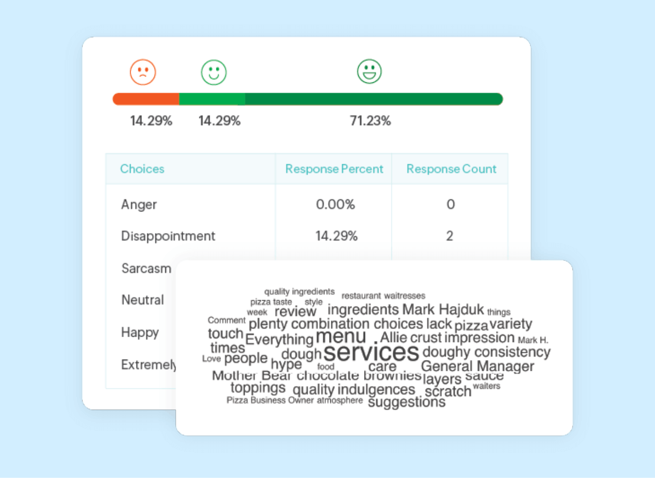
Sentiment analysis : Sentiment analysis helps you quickly understand your respondent’s state of mind. It is useful when working to interpret qualitative survey data. Based on the words used by your respondents, different sentiments, like happiness, anger, disappointment, and excitement are evaluated.
Word cloud : A word cloud is useful when you're analyzing large quantities of open-ended data. The words used by your respondents are displayed in a cluster resembling a cloud, and the words used most often appear in the largest font. Word clouds can help you understand the collective opinion of your respondents.
Classifying reports for effective analysis
Now that we know what kind of data to look at, let’s discuss some ways to organize reports for more effective analysis.
Custom reports
Custom reports, as the name suggests, are data reports that zero in on the unique or specific information you want to analyze. You can create custom reports to analyze data that is most useful for an individual study or project.
Cross-tab reports
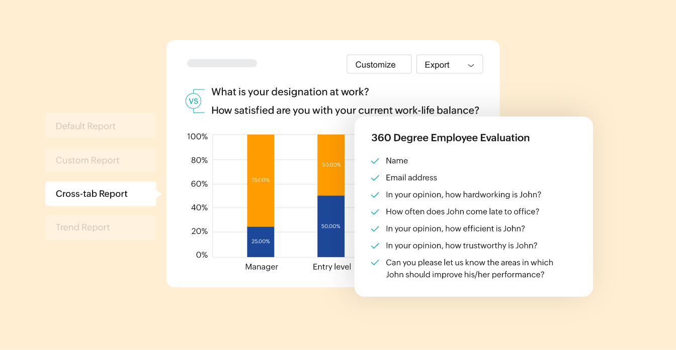
Cross tabbing is useful when you want to see if there’s a correlation between two questions. For example, you could see if there is a relationship between the age of a customer and the beverage flavor they prefer.

Pro tip: Learn more about causation vs correlation.
Your stats might show that people in the 20-30 age range are interested in buying a particular fruity drink from one of your stores. You might be inclined to believe that there is a correlation between age group and preferred drink. However, further investigation might reveal that the reason this drink is a hit is because there is a sports complex near your store, and most 20-30 year olds that visit you are coming from the complex for a refreshing, post-workout drink. This is causation.
Custom Filters
Filters help you scrutinize your data even further. Let’s say you made a cross-tab report about a particular age group and the price they are willing to pay for your products. To see how geographical region impacts this data, simply add a location filter. Adding dates to your filters will help you analyze data within a particular time period.
Pro tip: Selecting “completed responses” while adding filters will eliminate data that is not useful, and will help reduce the amount of data you need to analyze.
Collectors
Collectors give you the flexibility of using multiple URLs for the same survey. This is particularly helpful in situations when you need to collect responses from multiple sources. For example, collecting responses from different departments within an organization, or different districts of a state.
The convenience of dashboards
Dashboards help you choose the data you want to look at when you open your Analysis tab. For example, you can display two custom reports that compare customer locations and likeliness to convert scores (LTS) for the current year and the previous one. This will help you compare or “benchmark” your growth.
Conclusion
Comprehending survey data is significantly easier if you have the right set of tools. Zoho Survey is a comprehensive platform for experience management. It helps you effortlessly slice and dice data and keep all your information organized. If you want to take data analysis one step further, you can take advantage of the Survey-Analytics integration. This integration helps you analyze your survey data with a powerful business intelligence platform that offers interactive charts, data cleansing, forecasting, and a lot more. Happy researching!


