What is a website heatmap?
The importance of understanding visitor behavior
Let's say you recently launched a website and started promoting it across marketing channels. As a marketer, your next step is using an analytics tool to monitor your website's performance—get the number of visitors coming to your website and measure the bounce and conversion rates. This data alone is not sufficient for you to gauge your website's hits and misses though.
Analytics will only help you find that visitors are sticking around until your payments page and then dropping off without completing a transaction. You won't know what's going wrong. Put simply, you don't know how visitors behave on your website.
If you can relate to this, using a website heatmap can help you understand your visitor's behavior better.
What is a website heatmap?
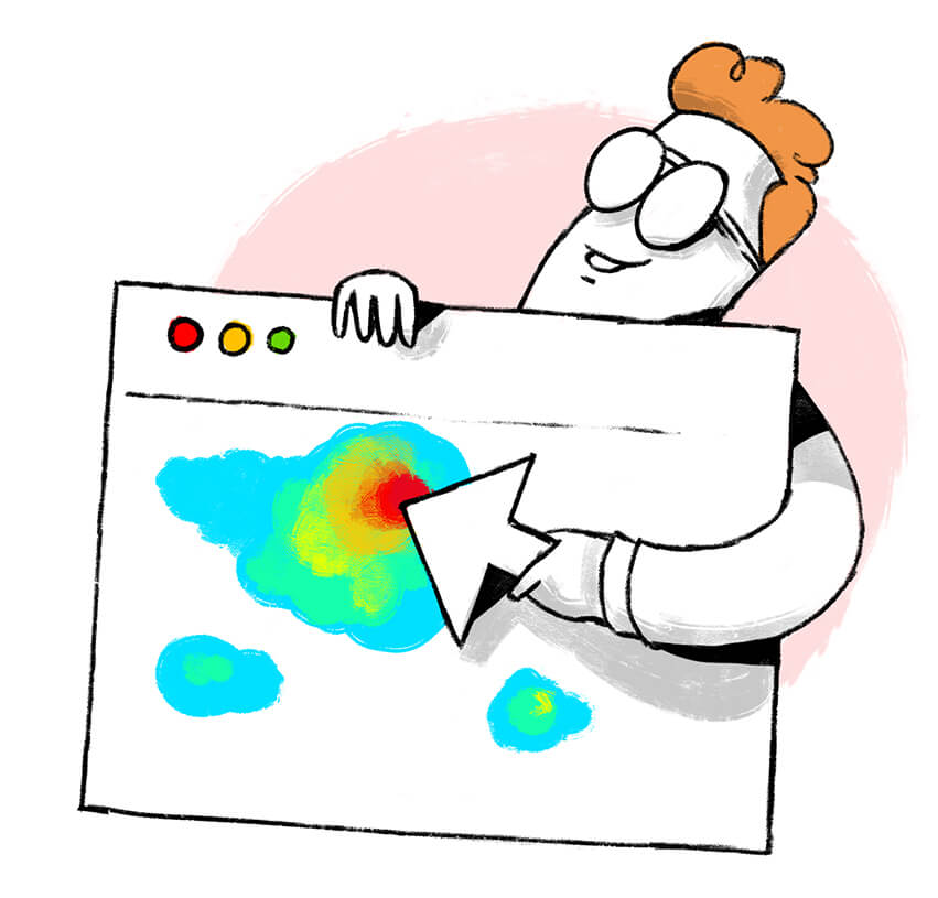
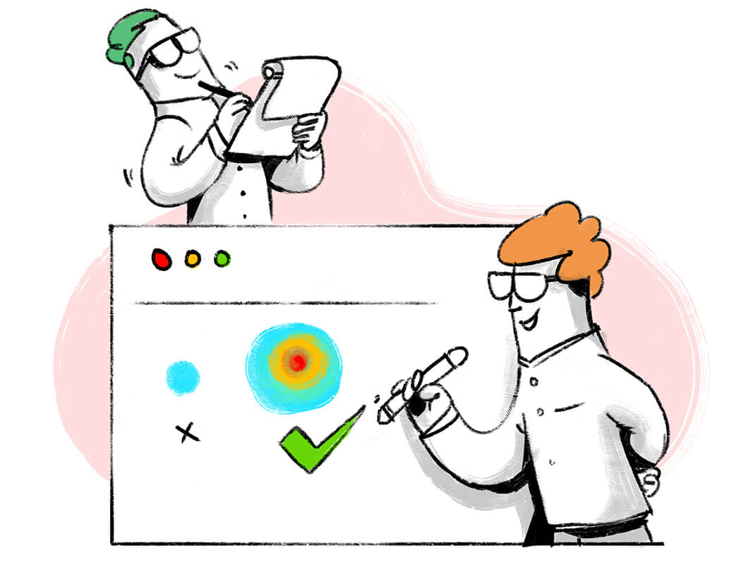
A website heatmap is a visual representation of how visitors interact with each element on your website. It shows which sections get more clicks and hold your visitor's attention.
Are heatmaps new? Absolutely not! You've probably seen weather reports coming in red-green-orange shades indicating the intensity of a storm at different locations. This is a type of heatmap. And in recent times, you might have noticed sports like Cricket and Tennis adopting heatmaps to analyze a player's scoring patterns.
So while the concept is not new, picking the right heatmapping tool for your website and using it correctly can be challenging.
Why use a website heatmap?
Find the right website layout
If you're a designer, you've probably tried a hundred design layouts for your website before zeroing in on one. The worst part is, you will still not be 100% sure the final layout is perfect.
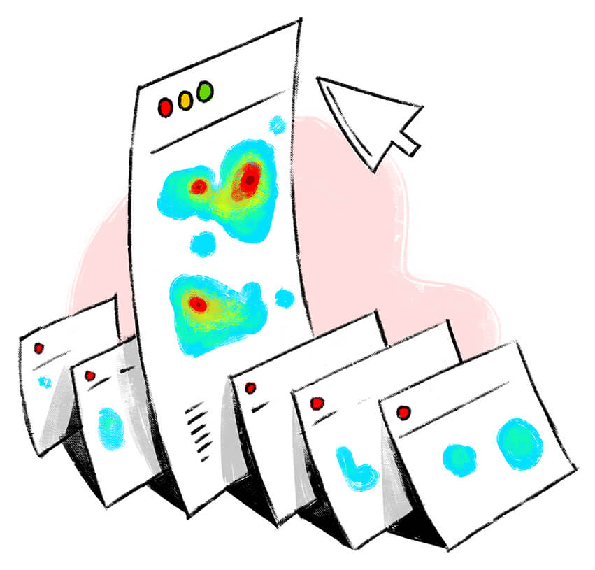
Heatmaps solve this for you—they help you see where visitors click and where they don't. With this piece of information, you can alter your website design and get it the attention it deserves.
Pick a single goal
Sometimes we stuff more than one call to action (CTA) in our copy and confuse our visitors. For example, you might have announced a winter sale followed by "go to collections" button, included a product catalog for visitors to choose from, and added "free image consulting" ad all on the same page. With heatmaps, you can identify which CTA gets the maximum attention and make that your main goal.
Remove distracting elements
Another important reason you should use a heatmap is it tells you if your visitors are clicking on non-clickable elements, images, and white spaces while missing areas they should focus on. This information can be a life-changer as it helps you remove unnecessary elements, add links where needed, rework the white spaces, and direct visitors to the right places.
How do you use a website heatmap?
Once you've found the right heatmapping tool, setting it up is easy. You just have to add a piece of code to the pages from which you want a heatmap recording. Voila—you see what your visitors see! Check out PageSense's step-by-step guide to setting up a heatmap.
In addition to heatmaps, you can also use scroll map and attention map to crack the behavioral pattern of your website visitors, give them a smooth user experience, and, in turn, increase your ROI.
What is a scroll map?
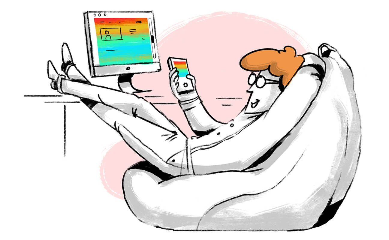
As the name suggests, a scroll map indicates how far your visitors scroll down a page. A scroll map comes in handy when you want to decide where to place key elements of your website like hyperlinks, videos, or any CTAs.
Scenarios where scroll maps can be used :
Identify false bottoms on your page
Visitor scrolling patterns vary from page to page. A visitor might come to your blog and read the complete write-up before taking action. On the other hand, another visitor might come to your homepage and leave without crossing the first fold.
Scroll maps help you spot folds that get maximum traction and false bottoms that negatively impact your conversions—that is, visitors missing out on content by not scrolling till the end of the page. When you know your false bottom, you can move important content to the top and bring more visibility to it.
Offer a seamless website experience across devices
Your website will look different on different devices. It might be a two-fold page on a desktop as opposed to a four-fold page on a mobile device. Scroll maps can be recorded for desktop, mobiles, and tablets so you know how far visitors read on various devices. This will help you optimize your website, give it cross-device compatibility, and facilitate a smooth navigation experience for your visitors.
What is an attention map?
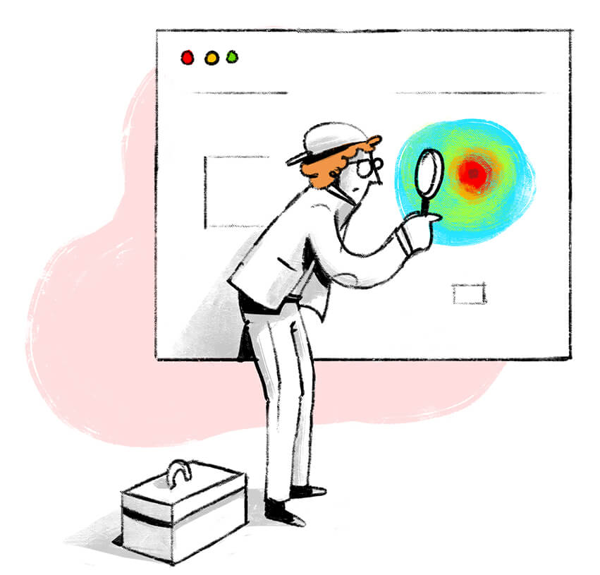
An attention map tells you the average time a visitor spends on each section of your website. You'll discover which part of your website your visitors spend the most time on and which parts they skip.
How can an attention map improve your website experience?
Improving the content on a page
Imagine a visitor has landed on your contact page and spends more than 10 minutes there. This might be because an important contact detail might be missing or the message might not be clear. When you see more visitors doing this, you know you have a problem to fix. Now put yourself in the visitor's shoes and think about what details you'd look for in a contact page. Then go ahead and add what's important.
Help visitors make important decisions
If your attention map tells you that your visitors spend a considerable time on your pricing page and then go to your customers page, it might be worth adding a customer testimonial on your pricing page to aid your visitor's decision-making.
How to create a website heatmap?
Learn how to create and launch a heatmap with Zoho PageSense.


