- HOME
- More
- Best Practices
- How to write a perfect abandoned cart email
How to write a perfect abandoned cart email
- Published : August 30, 2024
- Last Updated : May 26, 2025
- 284 Views
- 8 Min Read
In the e-commerce industry, a customer journey has multiple milestones. A business can measure its success by measuring the users that complete these milestones. One such milestone is the user adding items to their cart, finally ready to make the purchase. Whether it's a new customer or a repeat one, getting them to add the items to the cart in itself would have been the result of multiple sales strategies. But what if they don't take the final step? What if, after getting the customer to your cart, they just left all of the items there? You're then back at square one. But you don't have to be.
One survey says that 70% shoppers abandon their carts, which can amount to $4 trillion in losses every year. But a Moosend survey says this about abandoned cart emails:
More than 40% of cart abandonment emails are opened, and this rate can reach up to 45%.
50% of cart abandonment emails are clicked on, and 21% of the opened emails receive click-throughs.
50% of the users who clicked and engaged with the content of the email completed their purchase.
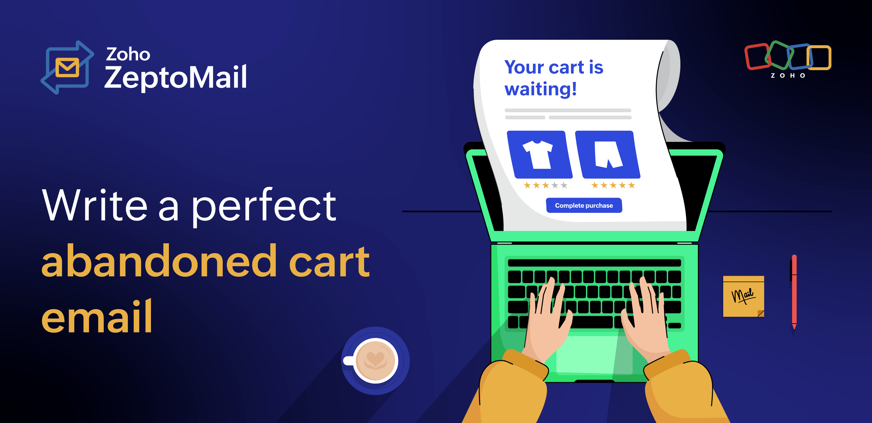
So all isn't lost until that abandoned cart email is sent. An abandoned cart email is simply a follow-up email reminding and gently nudging the customer to pick up where they left off and complete the purchase.

What can abandoned cart emails do?
The primary goal of an abandoned cart email is to get the customer to complete the purchase of the items that they added to their cart, but that's not all it does. Here's how your business can benefit from a well-delivered abandoned cart email.
Complete a purchase
The most important benefit of these emails is the opportunity to get the customer to buy the items they've left in their cart. Not all customers who abandon their cart can be revived. Some of them simply add items to the cart to compare between platforms. Some of them are simply exploring your application. But there are a chunk of these customers who were genuinely interested in the purchase but were either interrupted or discouraged by something. A well-written and well-delivered cart abandonment email can help boost your sales by convincing these customers to complete their purchase.
Re-engagement
If the email is unable to convince them to complete the purchase, with a high open rate an abandoned cart email is still a great way to re-engage with your customers. Even if they cannot be convinced to complete the purchase they started, the other information you give in the email, like alternative products, discount coupons, and reviews, can help re-engage the customers and encourage them to keep interacting with your platform.
Customer insights
You can include elements in the email that allow you to understand why the customers didn't purchase the cart even if you can't get them to complete the order. With insights from the customers, you can improve your platform's process to reduce the cart abandonment rate.
There are multiple reasons why a customer chooses to or is forced to abandon a cart. Read our article to see the reasons for this and how to avoid it.
Is abandoned cart email marketing or transactional?
While the intent of a cart abandonment email is to boost business, it's still considered to be transactional because it's triggered by the action of the user. In this case, the action is to add items to their cart and subsequently exit the cart. But because abandoned cart emails walk the fine line between marketing and transactional emails, the rules and laws that apply could vary based on region or jurisdiction. It's always best to understand the laws in place for your business specifically before planning these emails.
Things to keep in mind while writing abandoned cart emails
Simple but encouraging subject lines
Just like every email we write, the subject line plays a huge role in whether your customers open your email or not. Especially in the case of an abandoned cart email, the subject line has to entice the user enough to click on the email but not come across as being pushy. The subject line can be quirky and personal in order to connect with your customers. No matter what, ensure that the subject doesn't make the customer feel like you're being intrusive or forceful in your attempt to re-engage. You can also mention incentives that aren't discounts right in the subject line.
Some examples of subject lines:
Left your cart hanging? Pick up where you left off.
Remember me, Allen? It's your cart!
Your red dress is waiting. Now, with no shipping charges.
Prices for the items in your cart have dropped
Clean email copy
Your customers already liked your items enough to add them to their cart. With the intent already present, it's best to focus your email copy on the task at hand. Write an introduction that is short, witty, and piques their interest enough to get them to come back to their cart. Even with all the right points, a long paragraph on why they should buy your product is not going to help your cause. Keep the copy simple and to the point. You can even add something that is nostalgic or would connect personally with the customer.
For example:
Dropped these bestsellers?
The item in your cart has been ranked #1 at Beauty Awards and has a 5/5 rating from 2k+ reviews. Don't miss out!
No hard selling
Don't be pushy. This is the most important thing to remember when crafting a cart abandonment email. Being pushy with your email content can put customers off your entire brand. By being too forceful, you can lose more than just the sale in the customer's cart. If the user feels rushed, they might start questioning the entirety of your business ideology. It's best to capture attention, but your email should always come across as being helpful rather than forceful.
Product prominence
Despite the customer having added the items and possibly remembering all of the items, it's always best to give the most prominence to the products in the cart. Right after the short introduction, display the items in the cart one after the other with clear item names accompanied by images of the product. This is both to remind the customer of the products and to entice them to come back to the cart.
Minimal design
Keep the design elements minimal. Images are a great way to capture the customer's attention, but overdoing it can make the email feel like a full-blown promotional email rather than a personal email. Overloading the email with colors and images will make the customer feel less connected with the message that the email carries. It's also possible that the design overpowers the mention of the products in the cart. Use design elements only when necessary and when it elevates the content.
Justified urgency
Creating a sense of urgency can encourage the customer to convert a cart into purchase sooner rather than later. Creating this urgency, however, comes with a caveat. The urgency has to be justified. Simply putting in a "Hurry before your item disappears" won't do the messaging any good. You need to justify why the items would disappear. Is the urgency an indication of a sale that's ending soon? Make sure you justify the reason for the rush and always follow through. If the sale doesn't actually end soon, next time your customer sees a "Hurry up!", they won't.
Fear of missing out
Highlight all that the customer will miss out on if they fail to purchase that product. It can be a price comparison, an award that the product was given, study results on the effectiveness of the product, and more. Because your customer has already added the item to the cart and shown interest, this information might help push them over the line and make the purchase.
Address hesitations
If the customer is someone who was genuinely interested in the product but still failed to complete the purchase, there's a good reason. Maybe getting them to complete the purchase is as simple as answering some questions for them.
Here are some examples of questions your customers might have:
What's included in the package?
Until when can I return the order?
When will the order be delivered?
Social proof
It always matters more when your customers talk about your products than when you do. Include a short quote or a great testimonial about the product in the cart. This is easier to do when there is just one single item in the cart, but you can always try to include quotes about how the product worked well for previous customers. Having said that, you'll have to be careful that this doesn't overpower the main messaging.
Clear CTA
The bulk of the email content will convince them to return to their cart, but the CTA is what convinces them to purchase it. So ensure that there is one prominent CTA in the email that will help them navigate back to the cart easily. It needs to be accessible across multiple devices, especially mobile devices. You can be creative in the text of the CTA to make it more engaging and enticing.
For example:
Grab them now!
Run to your cart
Get these bestsellers
Related products
Sometimes, your customers change their minds about the items they've added to the cart, or they wish to purchase the item but aren't sure about the size, color, model, and more. Provide them with the product details and some alternatives without taking away from the primary message. This might not work for all cases because giving them other options could take them further away from the item in their cart. It's simply an effort to get them to buy a variation of the item they saved, if all else fails. If you're sending multiple cart abandonment emails, it's best to reserve product suggestions for the later emails.
Incentives
Offering incentives like discounts always nudges the customer towards a purchase, but they should be used sparingly. A steep drop in price simply to get them to purchase might devalue your product in the eyes of the customer. Offer other incentives like free shipping, extended return periods, earlier delivery, and coupons before offering a slashed price. If all else fails and a discount is all that works, provide it with an expiry time so if the customer is really interested, they'll make a move immediately.
Segmented templates
Personalize the email by creating different cart abandonment email templates for different groups of people. The grouping can be your choice, but including elements that might connect most with the group of customers might have a better conversion rate than using a single template for all customers abandoning their cart.
For example, the groupings can be:
New and long-time customers
Groups based on the item in the cart
Groups based on the reason for cart abandonment (you could run a quick exit survey to find the reason)
Groups based recent purchases
Device-optimized email
It's of utmost importance for your email to be accessible on any device, and this includes the links and images in your email. Is it more likely that customers access a cart abandonment email through a hand-held device like mobile or tablet? Your email has to be optimized for these devices. Even the links that open from the email have to be optimized for all of the devices and browsers.
How do you send cart abandonment emails?
Most businesses follow a multiple email strategy to reel the customer back in. No matter how many emails are sent, the first attempt should always be to simply remind the customer that they have a cart waiting. Maybe they simply forgot. The next tactic should be to include social proof and other information that elevates the products. Finally, when all else fails, incentives should come into play. Whether it's a single email or multiple messages, this should be the order of priority. Use reliable transactional email services to send these emails to make the most out of them and re-engage well.


