Crack the code: How to make website navigation seamless and intuitive
- Last Updated : February 29, 2024
- 1.0K Views
- 11 Min Read
Navigating a website shouldn't be an obstacle course. The key to effective website design lies in guiding users seamlessly through the digital space with easily recognizable menus, strategic page flows, and prominent call-to-action (CTA) buttons.
From understanding the power of user-friendly interfaces to cohesive layout designs that prioritize ease-of-use without sacrificing style or substance, we'll cover it all in this article. By the end, you'll be equipped with practical tips and insights to revolutionize your website's navigation in order to elevate your online presence and scale your business. Let's dive right in.
What is website navigation?
Website navigation refers to the way visitors move through a website to find the information or services they need. It's like a map that guides users to their destination, ensuring a smooth and intuitive browsing experience.

Beyond providing easy access to information or products on your site, good navigation directly impacts user experience (UX) and conversion rates. According to Hubspot, good website design can improve time on site by 84%. Confusing or poorly structured navigation can frustrate visitors and lead them to abandon your site entirely, resulting in the loss of potential customers.
Essential website navigation components
Website navigation comprises various components that work together to provide a seamless browsing experience.
Copy
The text or words used in the navigation menu and link labels should be clear, concise, and descriptive, guiding users to understand their destination.
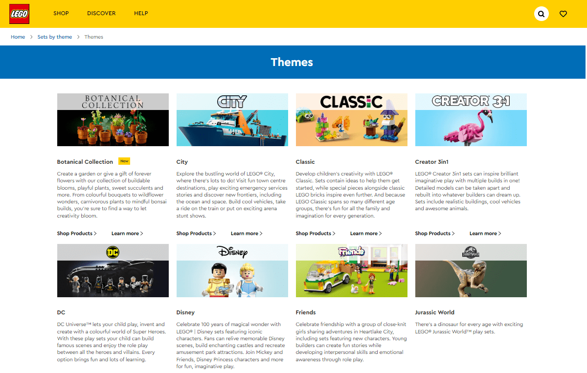
Source: Lego
Link text
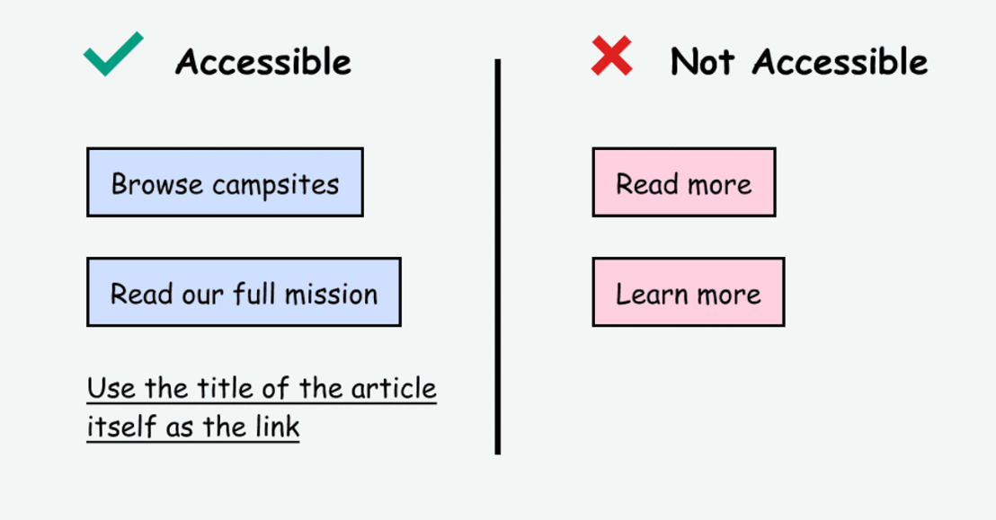
Link text helps visitors understand where they'll be directed when they click on hyperlinked text. Descriptive link text improves the navigation's usability and accessibility.
Source: Access Guide
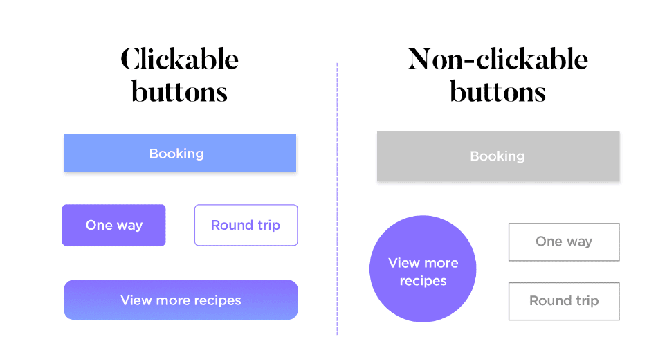
Button
Buttons can be used in website navigation to draw attention to specific actions or features, providing users with a direct and intuitive way to interact with the site.
Source: Justinmind
Menu
A website navigation menu organizes the links to different pages within the site. It can take the form of a horizontal navigation bar, dropdown menu, hamburger menu, vertical sidebar, or footer menu, depending on the website's design and layout.
Here's a brief explanation of some of the important menu types:
Top menu navigation bar: It comprises a horizontal list of links, often organized into dropdown menus for subpages or categories. This type of navigation allows users to access different sections easily or pages on the website without scrolling too much.
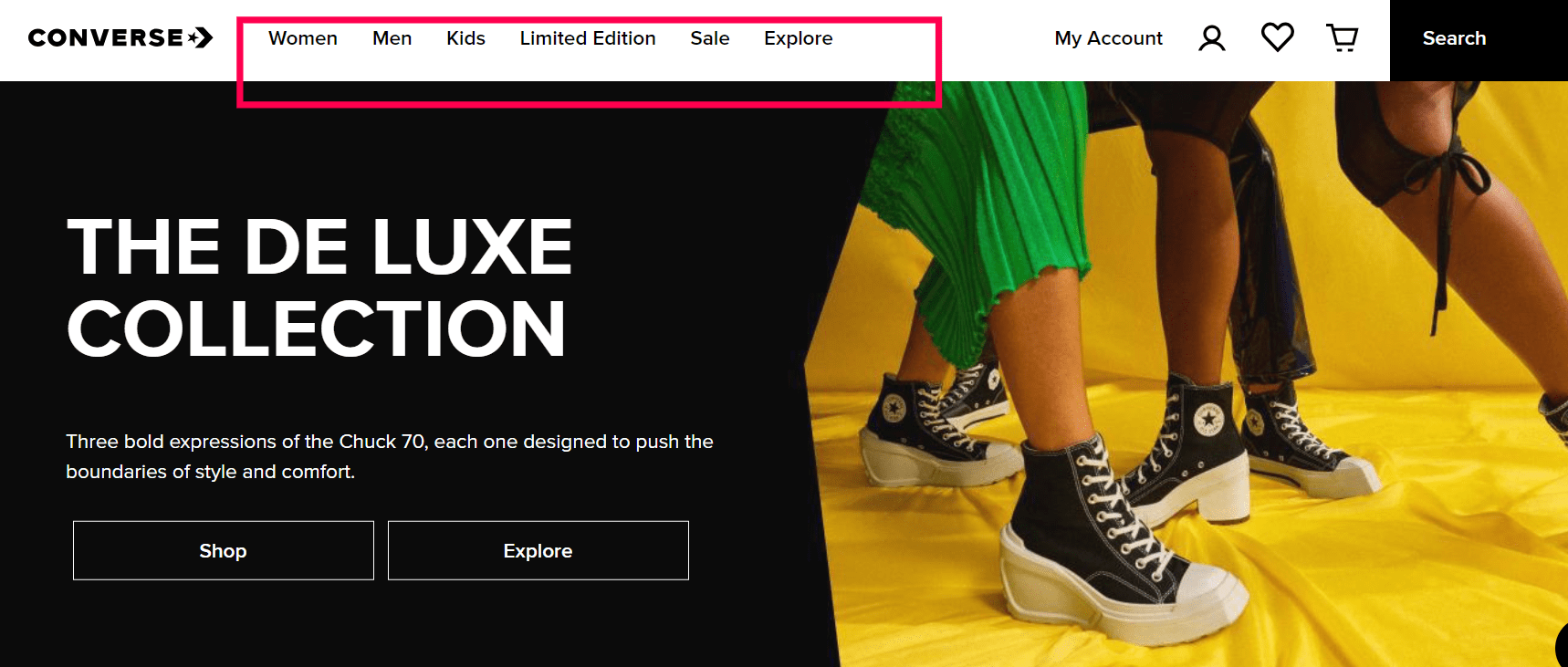
Source: Converse
Side menu bar: Found commonly found on blogs, ecommerce websites, and content-heavy sites, the side menu usually appears as a vertical list on either the left or right-hand side of the webpage. It offers quick access to various sections or features within a website.
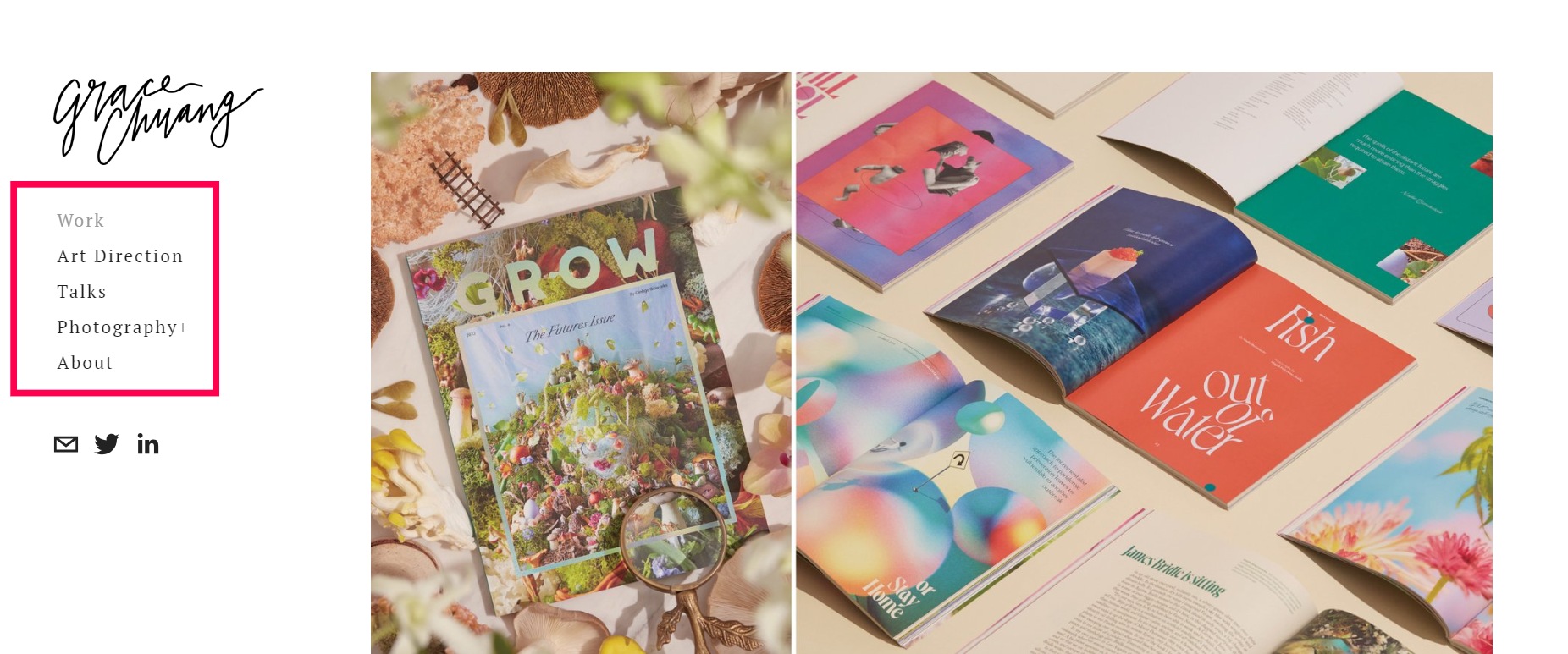
Source: Grace Chuang
Footer navigation: Placed at the bottom (footer) section of a webpage, these links provide additional options for users who have reached the end of a page or want quick access to essential information such as contact details, terms and conditions, privacy policy, etc.
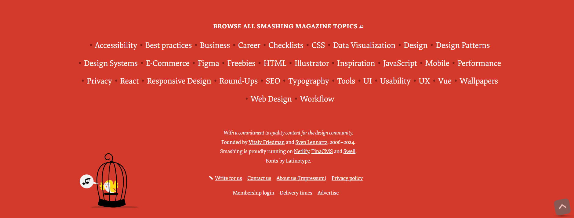
Source: Smashing magazine
Dropdown menus: These allow web designers to create hierarchical structures within their main navigational elements. By organizing pages into categories and subcategories under primary menu items, dropdown menus enable users to find specific content more efficiently without overwhelming them with too many choices upfront.
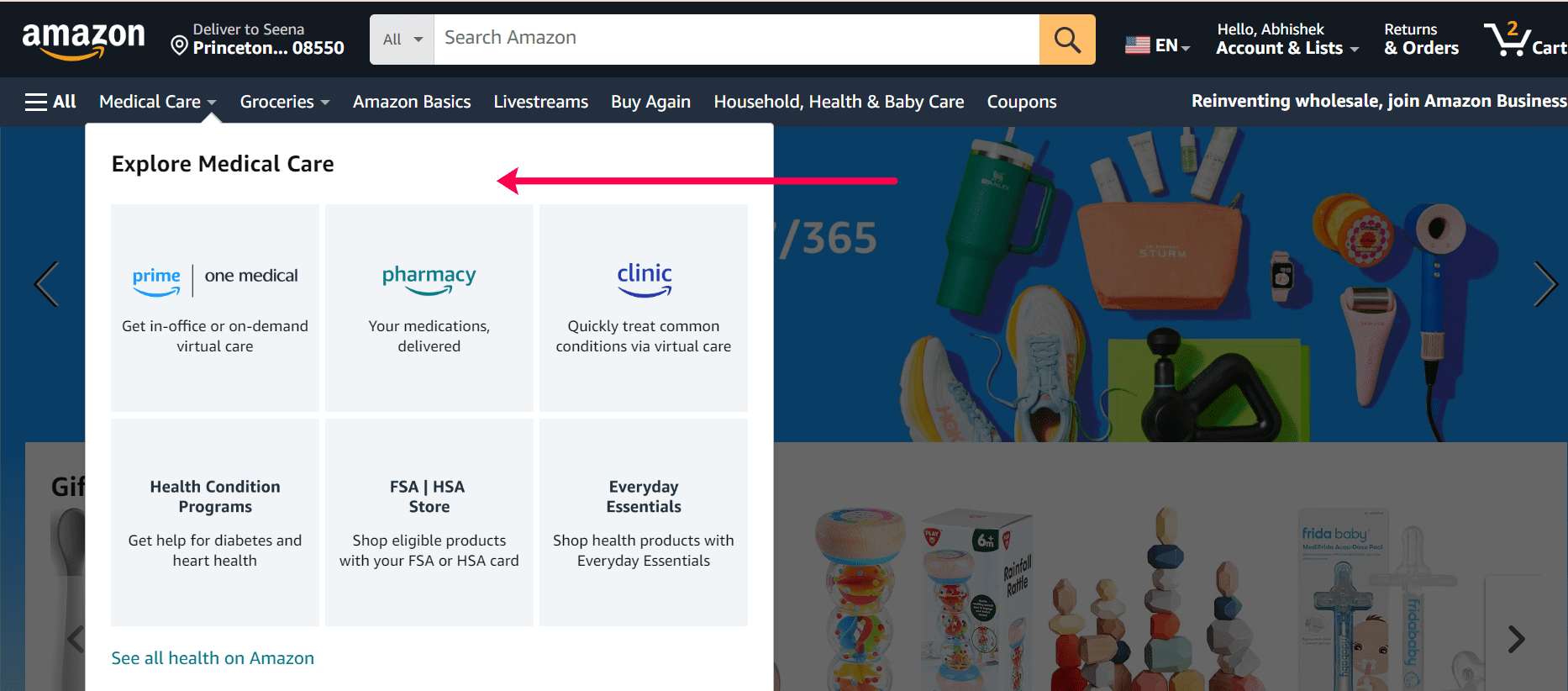
Source: Amazon
Breadcrumbs: Breadcrumbs display the hierarchical structure of pages within a specific category. They allow users to understand their current location within your website and provide a quick way to navigate back to previous levels or categories.
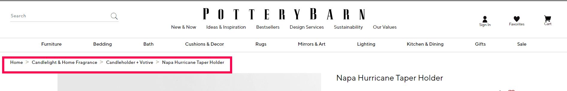
Source: Pottery Barn
Sidebars: Commonly used in blog layouts to categorize and organize content, they can include navigation links, recent posts, popular articles, and other relevant information that complements the main content.
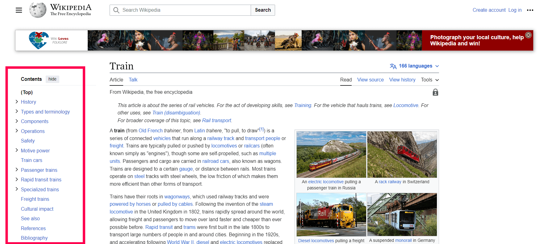
Source: Wikipedia
Accordions: Accordions are interactive elements that expand and collapse sections of content. They are useful for displaying a large amount of information while keeping the page visually clean and easy to scan.
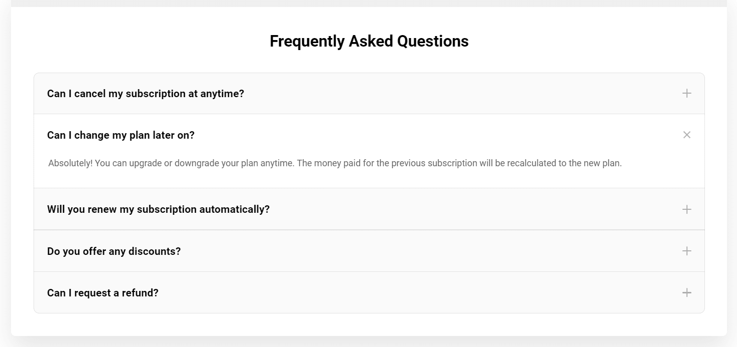
Source: Elfsight
By understanding these common types of navigational structures, web designers can make informed decisions about how best to organize their website's information architecture based on their target audience's needs and preferences.
Types of navigation
When it comes to website navigation, there's more than meets the eye. As websites continue to evolve, it's essential for designers to explore new ways to enhance user engagement and satisfaction.
By leveraging the power of forward, horizontal, and backward navigation, websites can provide a multidimensional experience that captivates and inspires audiences.
Forward navigation
Forward navigation in a website refers to the process of moving from one webpage to another in a sequential order. It's like following a path or story, with each click leading you to the next logical step. This type of navigation is crucial for guiding users through the website and helping them easily find relevant information. By incorporating forward navigation effectively, website designers can create a seamless and intuitive user experience that keeps visitors engaged and encourages them to explore further.
One fascinating aspect of forward navigation is its ability to shape the user journey and steer individuals towards specific goals or actions. When well-executed, this method can direct users through a predetermined flow, leading them from landing pages to product information, FAQs, checkout processes, or any other desired destination. Incorporating clear calls-to-action at every step ensures that users stay on track and are continually guided towards their intended destinations while maintaining an exciting digital journey.

Forward navigation is particularly useful for websites with a hierarchical structure, where content is organized into different levels. It enables users to navigate through these levels and access more specific and relevant information within the same overarching topic. Whether it's diving deeper into a product catalog or exploring various aspects of a particular subject, forward navigation empowers users to explore and discover the content that matters most to them.
Horizontal navigation
Horizontal navigation, also known as horizontal navigation, is a website design technique that involves organizing content to be accessed through left or right scrolling rather than traditional up and down scrolling. This approach can enhance user experience by making it easier for visitors to explore different sections of a website without having to navigate through multiple pages.
From a design perspective, horizontal navigation offers an opportunity for creativity and originality. By breaking away from the conventional vertical layout, web designers have the chance to experiment with new ways of presenting information and guiding users through the site's interface.
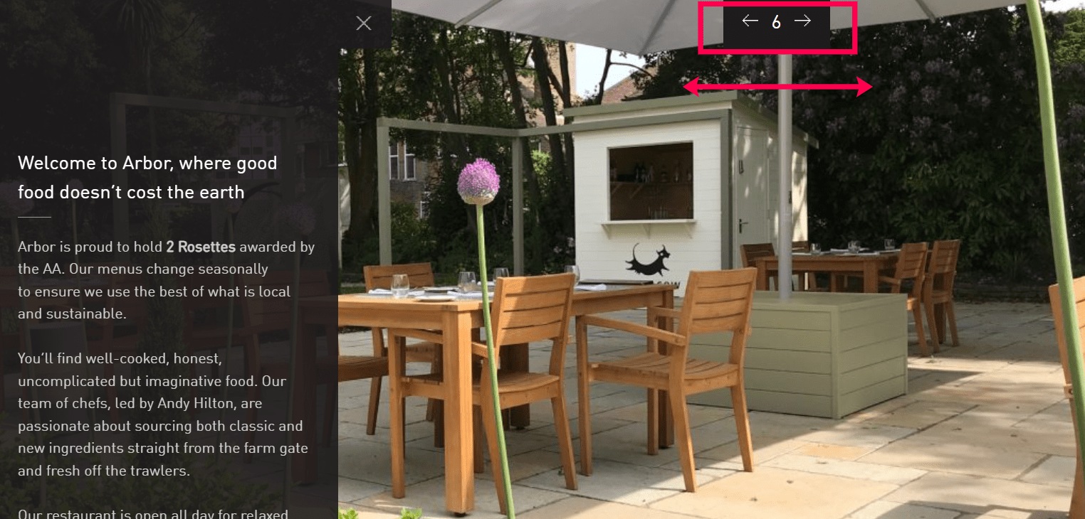
Source: Arbor Restaurant
Implementing horizontal navigation not only enriches the user experience but also increases the chances of users discovering additional valuable information on the website. By presenting related content in a seamless and accessible way, horizontal navigation adds depth and relevance to the user's browsing journey, giving a comprehensive understanding of the topic at hand.
Backward/reverse navigation
Backward or reverse navigation is a crucial feature that allows users to return easily to previous pages or steps within a website. It enhances the user experience by providing a seamless way to backtrack and explore different paths.
One common method of backward navigation is through the use of breadcrumbs, which are navigational aids that display the hierarchical path a user has taken through a website. Breadcrumbs help users understand their location within a website's structure and provide a convenient way to retrace their steps if needed.
Backward navigation is particularly valuable in situations where users are involved in a multi-step process, such as filling out a form or completing a checkout process. It allows users to revisit previous steps easily and make any necessary changes or review information before proceeding forward.
Revolutionize user experience with these genius tips
When it comes to designing website navigation, simplicity is key. Cluttered and complicated navigation can overwhelm users and lead to frustration. By keeping the navigation clean and user-friendly, you can ensure that visitors can easily find what they're looking for. Utilizing clear labels and intuitive placement of navigation elements can significantly enhance the user experience.
Create a sitemap
Start by creating a sitemap, which is a hierarchical list of pages on your website. This will help you determine the organization and hierarchy of your site, making it easier for users to navigate and find what they're looking for.
Creating a sitemap isn't just about organizing content; it's about providing an intuitive and visually appealing tool for users to navigate through your website effortlessly. Incorporating search functionality and breadcrumb navigation can further elevate the user experience, resulting in increased engagement and satisfaction.
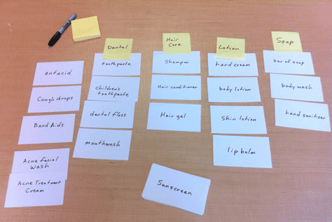
Use card sorting
Conduct card sorting exercises to understand how users think and organize information. Making others list the different items under a broad category they deem fit can provide valuable insights into how different segments of your target audience might prefer to navigate your website.
It empowers designers to step into the shoes of their audience, gaining invaluable insights that ultimately shape an intuitive, seamless, and enjoyable browsing journey. The result? A website that not only looks good but feels tailored specifically for its users.
Here's an example:

Prioritize pages
Based on user needs and preferences, prioritize the most important pages in your navigation. Limit the main navigation menu to seven items or fewer and use descriptive labels to enhance clarity and usability. Another valuable approach is to consider the logical flow of information and prioritize pages based on their position in the user journey.
For example, if your website aims to convert visitors into customers, prioritizing product pages or contact information ahead of secondary pages can enhance the conversion rate. Additionally, incorporating clear calls-to-action and visual hierarchy within the navigation design can further emphasize priority pages and guide users towards their intended destination.
Consider user experience
When it comes to website navigation design, user experience should be the guiding star. Use website heatmap and scroll map analysis, website interaction analysis, user adoption metrics, bounce rates, and others to gain insights into user experience. One often overlooked best practice is to ensure that the navigation elements are consistent across all pages of the website. This not only helps users orient themselves but also enhances usability and reduces frustration.

Additionally, leveraging intuitive labels and clear language in navigation menus can significantly improve user experience. Instead of using generic terms like Products or Services, consider incorporating more descriptive labels that resonate with your target audience.
Incorporate visual cues
Incorporating visual cues into your website's navigation design can also greatly improve user experience. Using icons or directional arrows can help guide users through the site and quickly convey information without relying solely on text. Not only does this enhance the visual appeal of your site, but it also streamlines the browsing process, making it easier for users to find what they're looking for.
Additionally, contrasting colors can be used to create visual hierarchy, making it easier for users to distinguish between different sections of the website.
SEO
SEO optimization and website navigation are closely intertwined components of a successful online presence. By providing a clear and hierarchical link structure, websites enable search engine bots to easily crawl and index the content, improving visibility in search engine results pages (SERPs).

Another crucial aspect is implementing descriptive anchor text for internal links within the website. This not only helps users understand where each link will take them but also communicates valuable information to search engine crawlers about the content of the linked pages.
Mobile responsiveness
When it comes to website navigation design, mobile responsiveness is no longer just a bonus–it’s a must-have. In addition to having a hamburger menu, incorporating touch-friendly buttons throughout your website can greatly enhance mobile usability.

Consider using touch-friendly elements and strategically placing important calls-to-action within easy reach of mobile users’ thumbs to enhance usability. Additionally, leveraging responsive grid layouts can ensure that your website design adapts seamlessly across various screen sizes, providing a consistent and user-friendly navigation experience on both desktop and mobile devices.
Accessibility guidelines
It's not enough to design visually appealing and user-friendly navigation; it also needs to be accessible to all users, regardless of their abilities. Accessibility guidelines ensure that individuals with visual impairments, motor disabilities, or cognitive limitations can navigate websites effectively.
To achieve accessibility in website navigation, there are several best practices to follow.
Alternative text for images must be used in navigational elements. This enables screen readers to describe the image content accurately to visually impaired users.
Using proper heading structures and semantic markup helps screen readers easily navigate through the page by allowing them to understand the hierarchy of content.
Making all navigational elements easily accessible via keyboard ensures equal access for these users.
Incorporating colors with sufficient contrast between text and background allows people with visual impairments or conditions such as color blindness to distinguish different elements easily.
By following these accessibility guidelines for website navigation design, you can create an inclusive experience where everyone can access and interact with your site effectively.
Emerging trends in website navigation techniques
In the ever-evolving world of web design, new trends and techniques are constantly emerging to enhance user experiences and make navigation more intuitive.
One such trend that has gained popularity is single-page designs with scrolling navigation. This approach allows users to seamlessly scroll through different sections of the website without having to reload or navigate to separate pages. By presenting all content on a single page, users can easily find what they're looking for by simply scrolling down.
Source : CSS Script
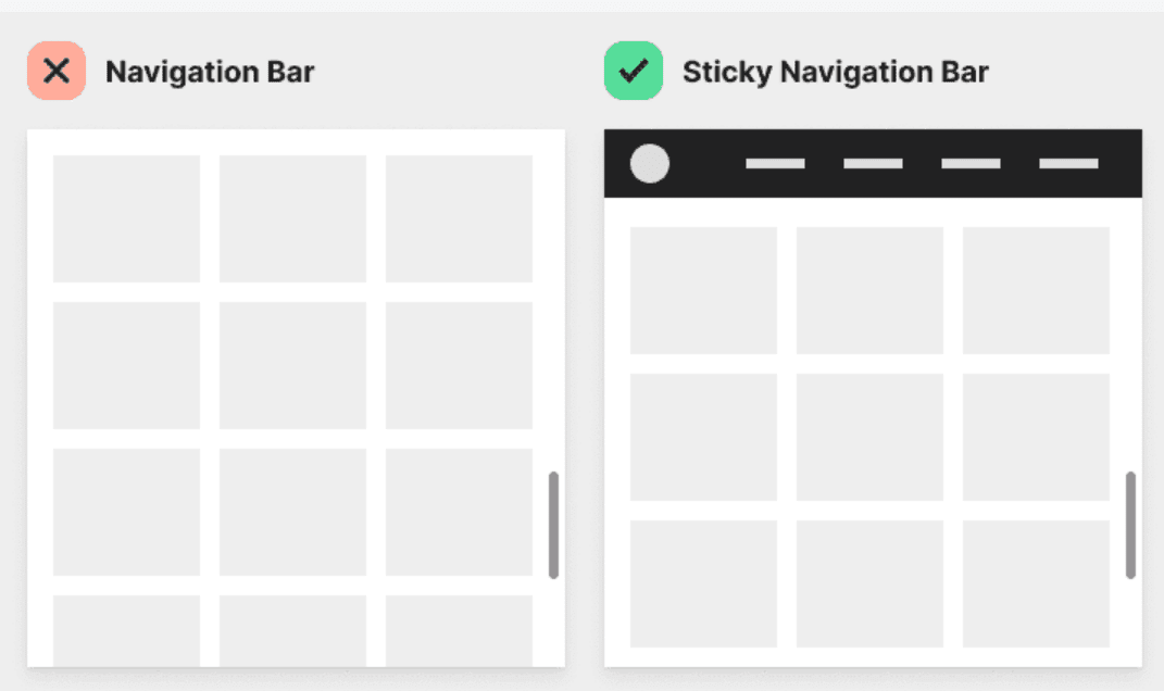
Another trend that has been widely adopted is sticky navigation menus. Sticky navigation refers to a fixed menu bar that remains visible always as the user scrolls through the website. This provides quick access to important links and helps users easily navigate within the site without having to scroll back up or search for the main menu again.
Source: UX Movement
Tabbed navigation is another technique that has seen an increase in usage recently. Tabbed navigation involves grouping related content into tabs, allowing users to switch between different sections of a website without reloading or navigating away from the current page. Tabs provide a clear visual hierarchy and can be particularly useful when organizing large amounts of content, making it easier for users to find what they need.
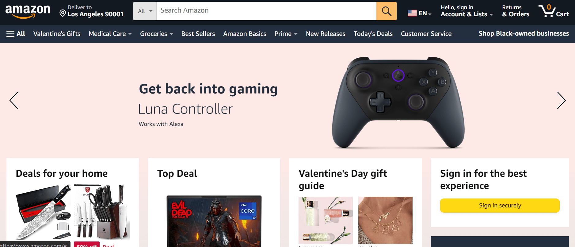
Source: Amazon
These emerging trends in navigation techniques highlight how designers are continuously pushing boundaries and re-imagining conventional ways of navigating websites.
Conclusion
In this comprehensive guide, we've explored the importance of website navigation and provided you with practical tips on how to create intuitive and effective navigational elements for your websites. Here are some key takeaways:
Prioritize simplicity and consistency: Simplicity is the key to a successful navigation design.
Choose the right type of navigational structure: Consider different types of navigational structures. Selecting the appropriate structure will enhance usability.
Optimize for mobile responsiveness: Use mobile-friendly formats like collapsible menus or off-canvas designs.
Don't forget about SEO: Website navigation can impact search engine optimization (SEO). Ensure that search engines can easily crawl and index all pages by using HTML text links instead of JavaScript-based ones in your navigational elements.
Make it accessible: Accessible navigation benefits not only users with disabilities but also improves overall usability for everyone visiting your site.
Seize new opportunities in navigation design: Stay updated with emerging trends in website navigation techniques such as mega-menus or sticky headers.
By understanding these best practices, you can create a well-planned website navigation that contributes significantly towards meeting your business goals and ultimately results in satisfied visitors who keep coming back.