- HOME
- How to use color psychology to drive website conversions
How to use color psychology to drive website conversions
- Last Updated : November 10, 2023
- 1.3K Views
- 6 Min Read
Humans are visual creatures. Our brains process visuals and colors faster than text. This means the first thing your visitors notice on your website are the images and colors you've used.
Over the years, the use of colors has evolved from the realm of artists to the art of persuasion. Today, colors play a vital role in influencing our purchasing decisions. They've become an indispensable part of recognizing brands and creating store environments, be it brick-and-mortar or online stores.
Recently, a couple of terms are often being tossed around in the website optimization and marketing domains – Color Psychology and Emotional Marketing. What's the relationship between these two pieces of jargon, you ask? Well, read on and find out.
Colors and conversions
There is a massive sea of websites out there. So how do you stand out to your visitors and leave a lasting impression? The answer is color persuasion! If you use colors the right way, you can tap into your visitor's emotions and influence their buying decisions. You can make them feel the way you want them to feel and ultimately boost your website conversions.
Now let's take a look at a few persuasive colors and the emotional impact they can create in your website visitors.
White
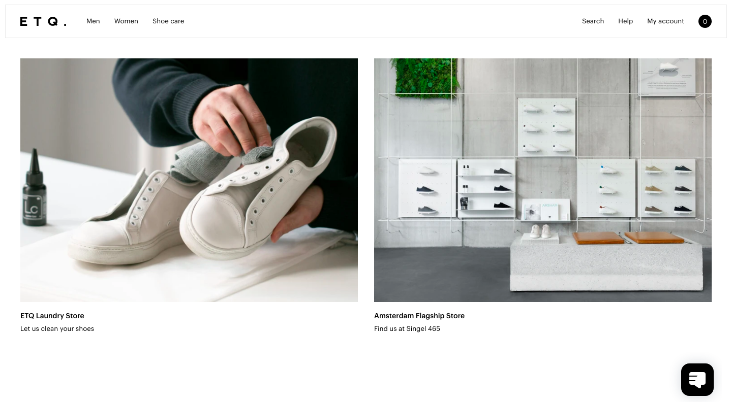
White is often associated with elegance, style, and simplicity. Moreover, being a neutral color, it can be paired with just about any element on your website. It gives your site a minimalistic feeling and draws the visitor's attention to the most important aspects, like your products and services. It makes your content stand out and fosters a feeling of authenticity. However, striking the right balance with the other stimulating colors is vital, because sometimes excessive usage of white can come across a little cold and boring.
Red
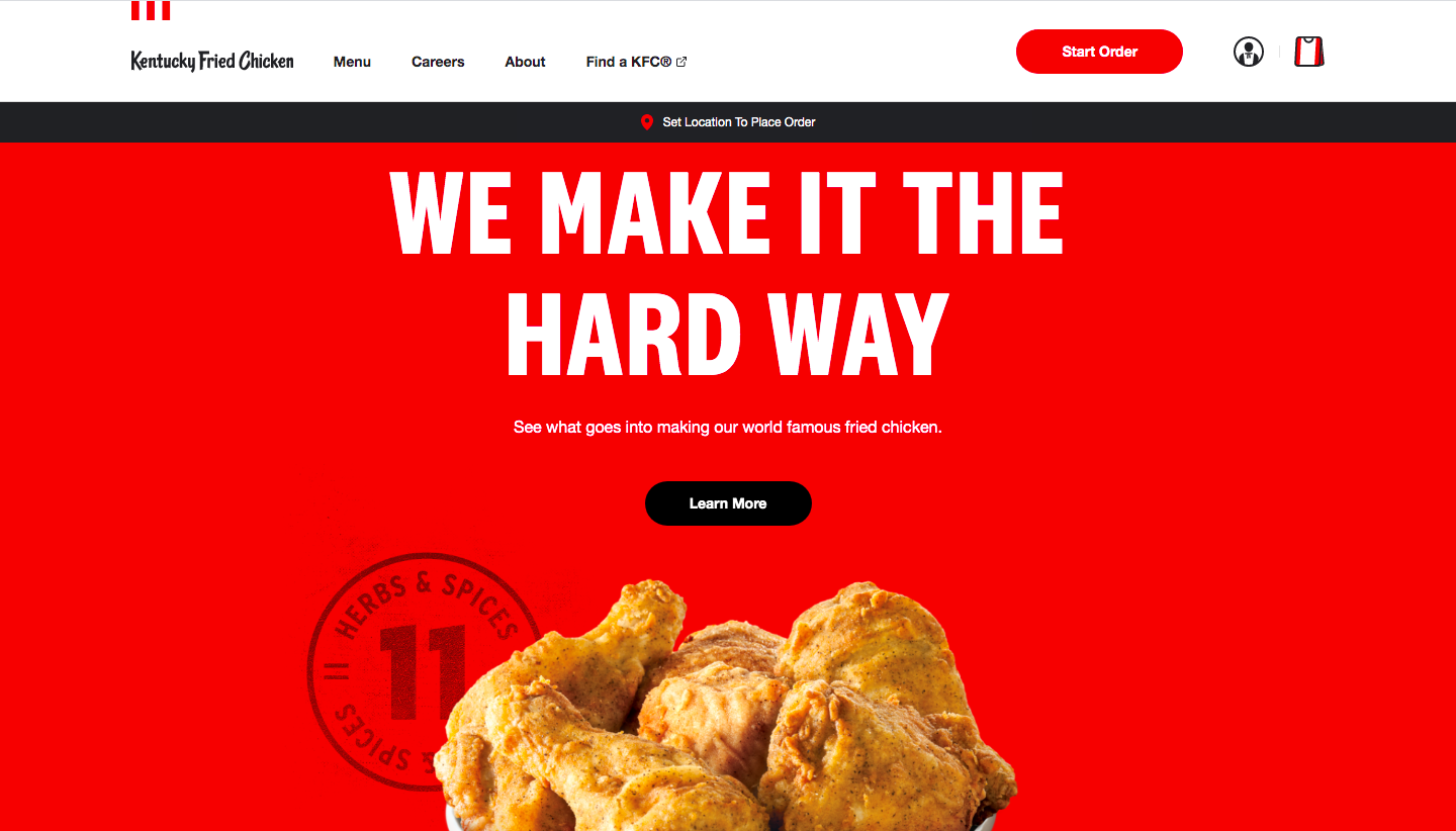
Red is the most passionate color and instills a sense of power and confidence in the buyer. It's proven to evoke stimulation in the human mind, which is why red is used to advertise sales and discounts. This is also why many brands that rely on impulse purchases often use red on their website. Coca-Cola, McDonald's, and Burger King are just a few of the brands that use red in their logo and packaging. As a dominant color, red is the first color that catches the attention of your visitors, and it is fittingly called the "Call-to-action" color.
Blue
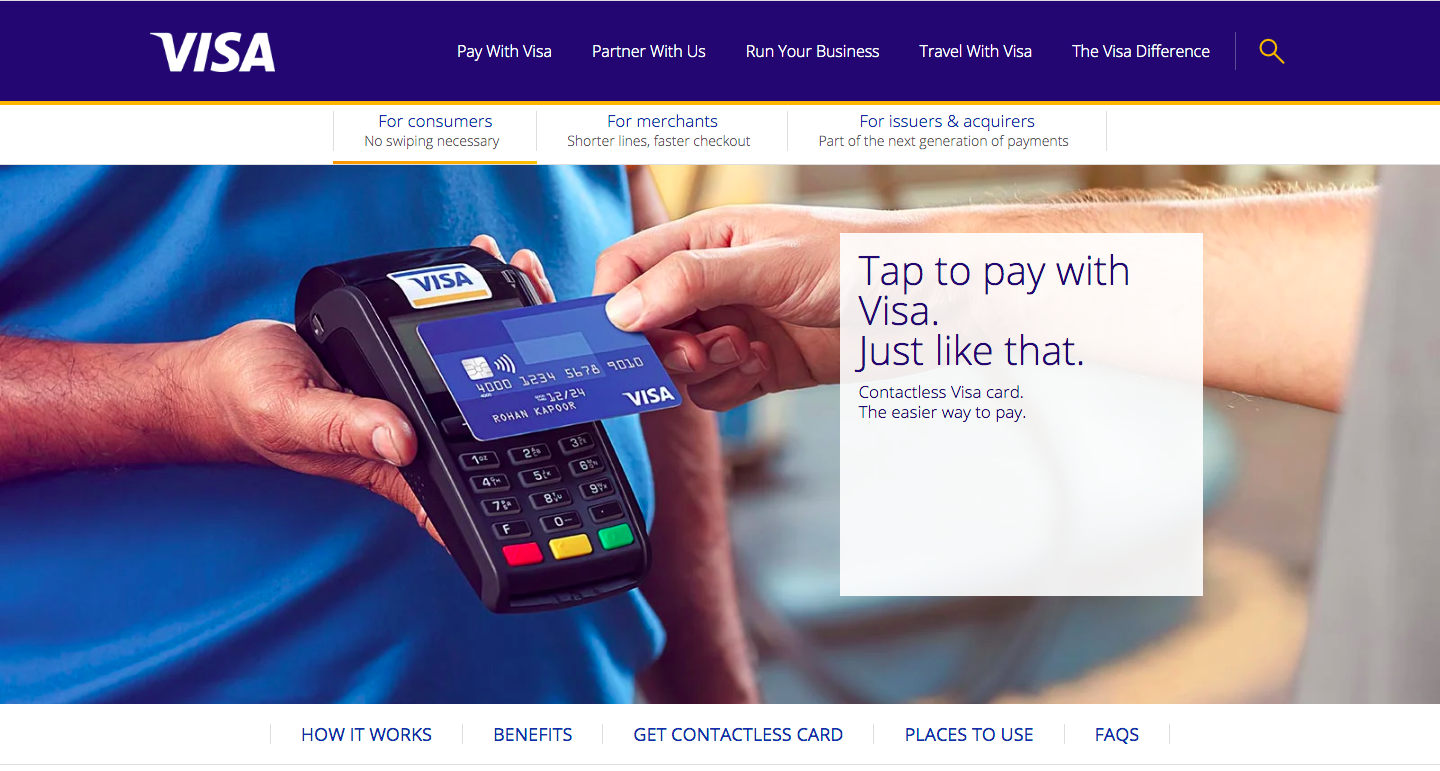
Did you know that blue is the most preferred color for more than half of the world's population? Blue symbolizes honesty, loyalty, and security. It's said to instill a sense of calm and trust. This explains why financial giants like Visa, Barclays, and PayPal use a blue color scheme in their branding and websites. And not just the financial sector—blue seems to be a hot favorite even in the medical, tech, automobile, insurance, and cybersecurity industries. In addition, various social media platforms like Twitter, Facebook, Skype, and LinkedIn prominently feature blue in their logos and interfaces. However, the food industry generally steers clear of blue, as it acts as an appetite suppressant.
Green
Green symbolizes nature and is the color of life, growth, and harmony. So if the product or service you offer has to do anything with the environment, organic produce, or plant-based supply, you can opt to use a plethora of green hues on your website. This is because, when we see a brand in green, our mind is wired to automatically associate it with health and wellness, and we perceive it to be an eco-friendly product. Also, here's a fun fact for you—green has a relaxing effect on the eyes and puts your visitors at ease. In fact, this is the reason people who are about to go on stage for a show are made to wait in the green room. Green also induces decisiveness, and that's why many websites use it for their positive calls-to-action.

Yellow
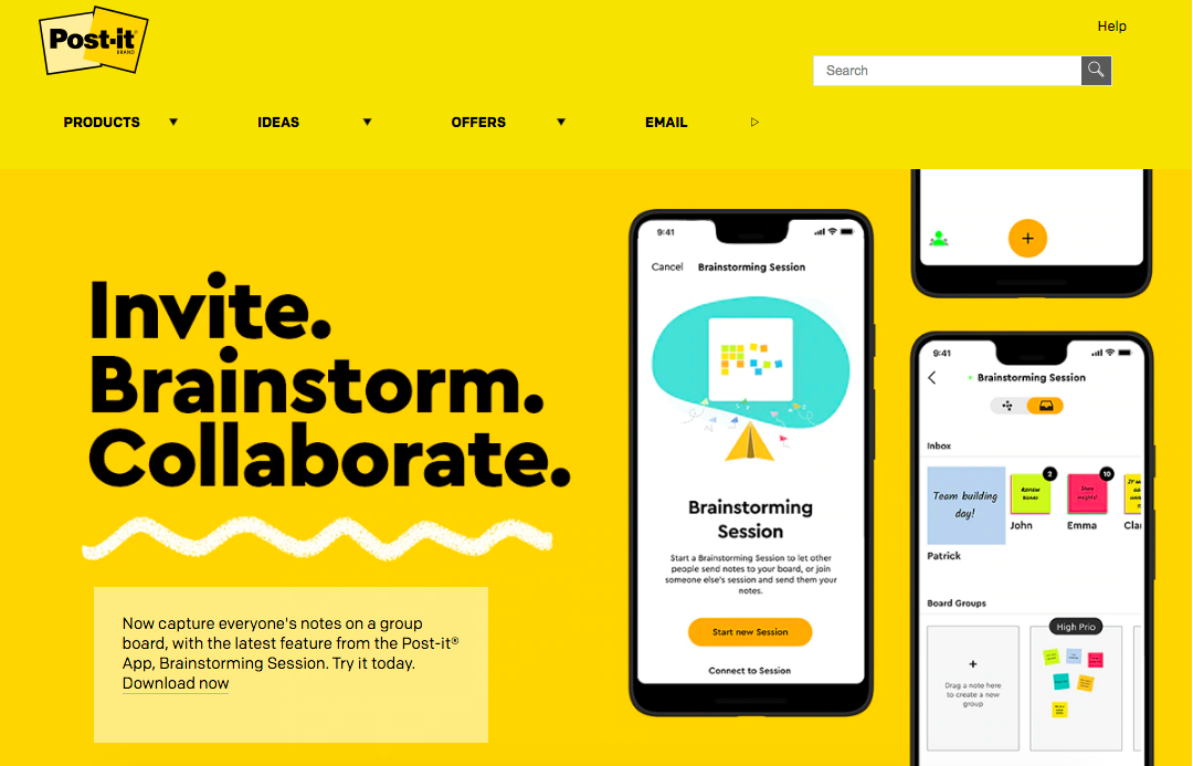
Yellow is a cheerful color. Being the color of the sun, it evokes warmth, optimism, and confidence in your website visitors. Using yellow on your website can make it feel approachable and welcoming. You can also use it to highlight the important elements on your site. However, it's important to use the right shade of yellow as too much of it can come across a little jarring and irritate your visitor's eyes.
Black
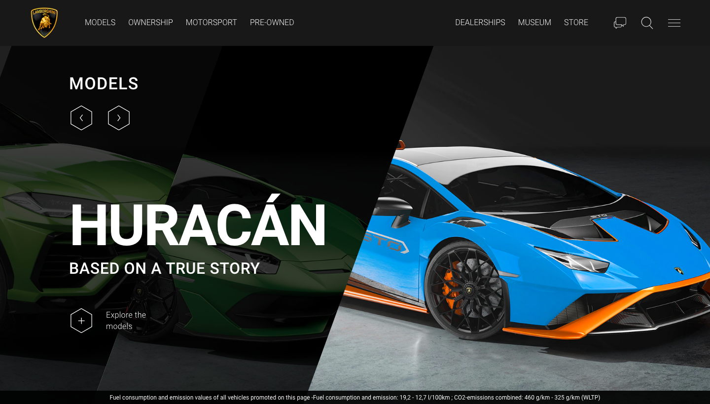
Black adds an air of sophistication and elegance to your website. This explains why many of the world's top luxury brands use black in their websites as well as in their branding. Rolls Royce, Mercedes-Benz, Apple, Prada, Louis Vuitton, and Chanel are just a few examples of powerful brands that endorse black. Moreover, black hues will create a sharp contrast and highlight the other key elements on your site, as well as giving it a sleek look.
Factors to consider while choosing your website colors
Now that you know how colors invoke emotions in your visitors and how they affect your website experience, let's take a look at the few other factors you'll need to consider while choosing colors for your website.
Culture
The same colors could have different meanings and associations in different cultures around the world. For example, the color white is perceived as the color of elegance and purity, and is widely used in weddings and ceremonies in most countries. Whereas in Asian culture, white is the color of mourning. While red symbolizes good fortune in China, it represents bad luck in Germany. So it's very important that you take into account the cultural sensibilities of your audience and evaluate the impact that a color might create for your business.
Usability
One of the most pivotal factors to consider while choosing your website color is the usability of your visitors. You might have done thorough research about the ins and outs of color psychology and chosen a color for your website, but this might be of no use if your visitors are having a tough time reading your content. So ensure that the colors you choose do not hinder visibility and that they work well with all the other elements of your page. Also, using too many colors can create a sense of confusion, so don't go overboard. Remember to stick to your color palette scheme.
Moreover, you shouldn't miss the fact that a majority of your visitors might access your website from their smart phones. So make sure your website is optimized for mobile phones and the colors you've chosen look good on phone screens as well.
Target audience
Doing profound research on your target audience and understanding the masses you're catering to is a fundamental step in designing your website. Studies show that color preferences may depend on entities like age group, gender, region, cultural backgrounds and more. So you could use a conversion optimization platform like Zoho PageSense or any other similar tool to dissect your target audience and segment them based on metrics like geographical location, device, browser, gender, age. Based on the insights you gather from these reports, you can choose the colors you think will resonate with your audience and use them on your website.
Test various colors and combinations
Just because a particular color worked for your competitor or a brand similar to yours doesn't mean that the same color will resonate with your website visitors as well. You need to test different colors and accents to see which ones your visitors respond to the most. So test your web page variations with various layouts and zero in on the one that brings you maximum conversions.
PageSense has a foolproof Split URL Test feature that requires zero coding skills. If you've been looking for an all-encompassing website optimization tool that can carry out powerful tests for you, then you know where to head.
Wrapping up!
Colors undeniably have the power to communicate different emotions and values. You can use them to implicitly convey what your content is explicitly stating. That said, one cannot overlook the power of good design, as it evokes trust and confidence in a brand. But color psychology, if played right, can have a significant impact on your website's user experience and conversion rates. So a sensible, and well-considered color choice for your website is sure to make your visitors stay, engage, and boost your revenue.
How did you choose the colors for your website? Did you take color psychology into consideration? Let us know in the comments below.