- HOME
- Ecommerce CRO guide for beginners
Ecommerce CRO guide for beginners
- Last Updated : December 3, 2024
- 632 Views
- 8 Min Read
A good website is beyond just visually appealing layouts, attractive banners, and product discounts, collectively accounting for only 10% of the overall website architecture. If you've experienced a sudden surge in sales followed by a decline, it's time to explore why. Rather than investing in ads, introducing new product lines, or hiring additional staff to help boost conversions, consider the power of optimization.
This guide delves into the significance of conversion rate optimization (CRO) for eCommerce websites, providing insights on site optimization, CRO strategies, real-world use cases, and much more.
The eCommerce CRO puzzle: Exploring the whats, hows, and whys
What is eCommerce CRO?
eCommerce CRO is when you make changes to your website to drive visitors to do what you want them to do on your website. It can be to increase product purchases, website sign-ups, or visits to your newly launched product catalog. In short, you make website changes to enhance the user experience, increase trust and credibility, and boost the conversions.
Why do you need it?
Picture this. You have around 10,000 site visitors every month, and your conversion rate is cruising at 1%. Each purchase is around $10, and life's good. However, you're also dropping a hefty $5,000 monthly on Google and social media ads to squeeze out that extra 1–2 % conversion.
What if you pause the ad spend and put that energy into your existing traffic? Imagine doubling that conversion rate to 2%. Not only do you score more sales, but your revenue increases too. Sometimes, you have everything you need in those 10,000 potential customers already stopping by your site.
Ask yourself:
Is there a gap between the number of visitors and the number of purchases?
Are people coming but not sticking around to buy?
If your answer to each is "yes," then you need eCommerce CRO.
There are other benefits to implementing CRO:
Trends and seasons change; with CRO, you adapt, evolve, and stay fresh.
Testing, tweaking, and optimizing your website keeps you ahead of the competition.
Understanding visitor behavior allows you to tailor your offerings to them.
Instead of scattering your budget everywhere, CRO helps cut costs and guides you to invest in the right marketing channel.
How to get started
If most of your traffic comes from places like Amazon and eBay, it's a good idea to first focus on increasing your website presence before diving into CRO implementation. You need decent traffic for those metrics to show up on your analytics radar. Without having visitors check out your product and category pages, CRO won't do much for you because when it comes to CRO, data does the talking for you.
Breaking down your website data
Every move you make should be backed by data. If you're venturing into CRO and thinking about trying out a strategy without delving into your website data, it's like walking on thin ice. Every CRO strategy starts with data analyzing your website performance. If you're not aware of what users are up to or your existing conversion rate, then tweaking anything becomes guesswork. Make sure you've got a web analytics tool like Google Analytics set up. There are also plenty of CRO tools on the market that come with analytics, like Zoho PageSense, as part of their package.
Examine the funnels that need improvement
Begin by charting the webpages customers navigate to, from the homepage to the checkout page. This approach will provide a more transparent understanding of which pages experience higher exit rates and drop-offs. This is exactly what a CRO tool like funnel analysis can help you with. You can identify where visitors fail to convert and get a visual graph of where they drop off.
Choose the particular KPI that is not performing well
Focus on specific areas of the website associated with user interaction, making user engagement the key performance indicator (KPI) here. Try other CRO tools, such as heatmaps and session recordings, to gain deeper insights into user behavior and derive qualitative observations.
Heatmaps allow you to analyze user interactions on your website or application. Session recordings capture real-time user sessions, giving you a detailed view of individual user navigation, including mouse movements, clicks, and interactions.
By using these CRO tools, you can identify common issues such as confusing navigation, unclear calls-to-action, or unexpected hurdles during the user journey. The insights you gather can help you formulate hypotheses for optimization.
Defining a winning hypothesis for an A/B test
A hypothesis is an idea or theory that undergoes testing, aiming to either validate or invalidate it. Crucially, a hypothesis should be created from a well-defined problem and, more importantly, be firmly grounded in data and have a quantifiable result.
For example, let's say you observe a significant decline in website analytics on your new homepage. Further investigation reveals visitors abandon your site when prompted to create an account even before browsing. Another variation will be introduced to the registration process to test this hypothesis, allowing users to browse and place orders without mandatory account creation. Subsequently, the impact on user retention and engagement metrics will be measured. This hypothesis follows the three essential elements: an identified problem (drop-off during account creation), a proposed change (removing the mandatory step), and a measurable outcome (impact on user retention and engagement metrics).
A/B testing
You're spaghetti testing if you blindly copy what your competitors tested or the best practices you found online. What worked for them might not work for you. Strategies need not be complex.
Here are additional A/B testing ideas that you can consider.
1) Call-to-action (CTA) variations: Test different wording, colors, or placements for your call-to-action buttons to see which combination yields the highest conversion rates.
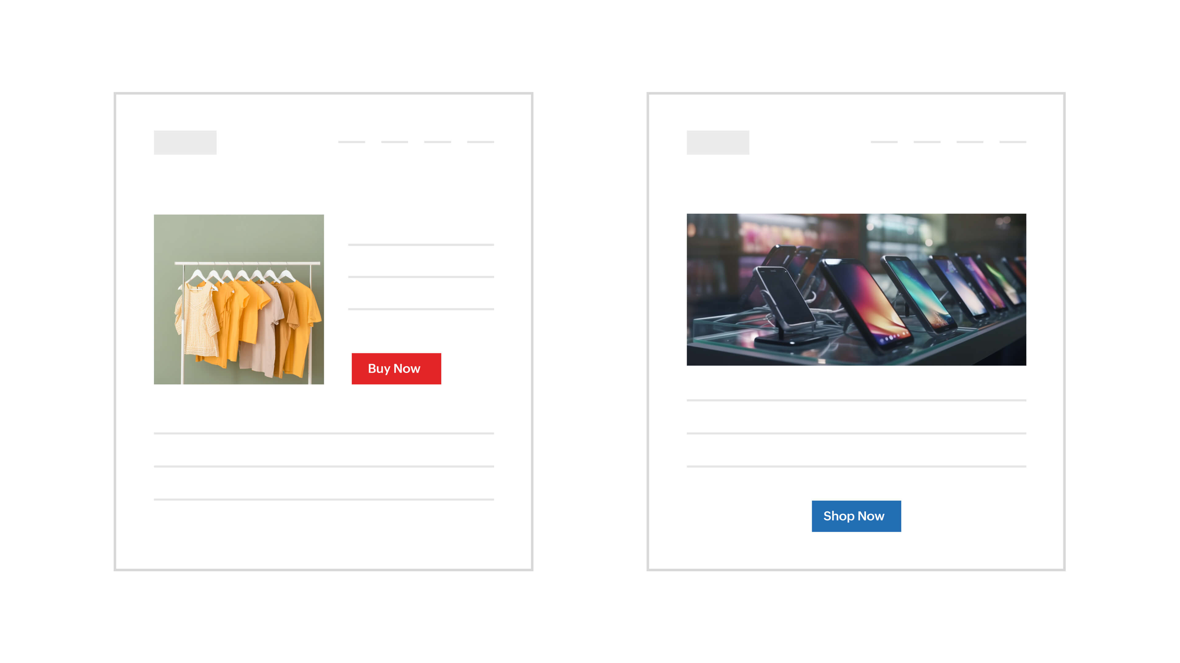
2)Navigation and site layouts: Experiment with changes to your website's navigation or overall structure to determine if a different layout improves user engagement and reduces bounce rates.
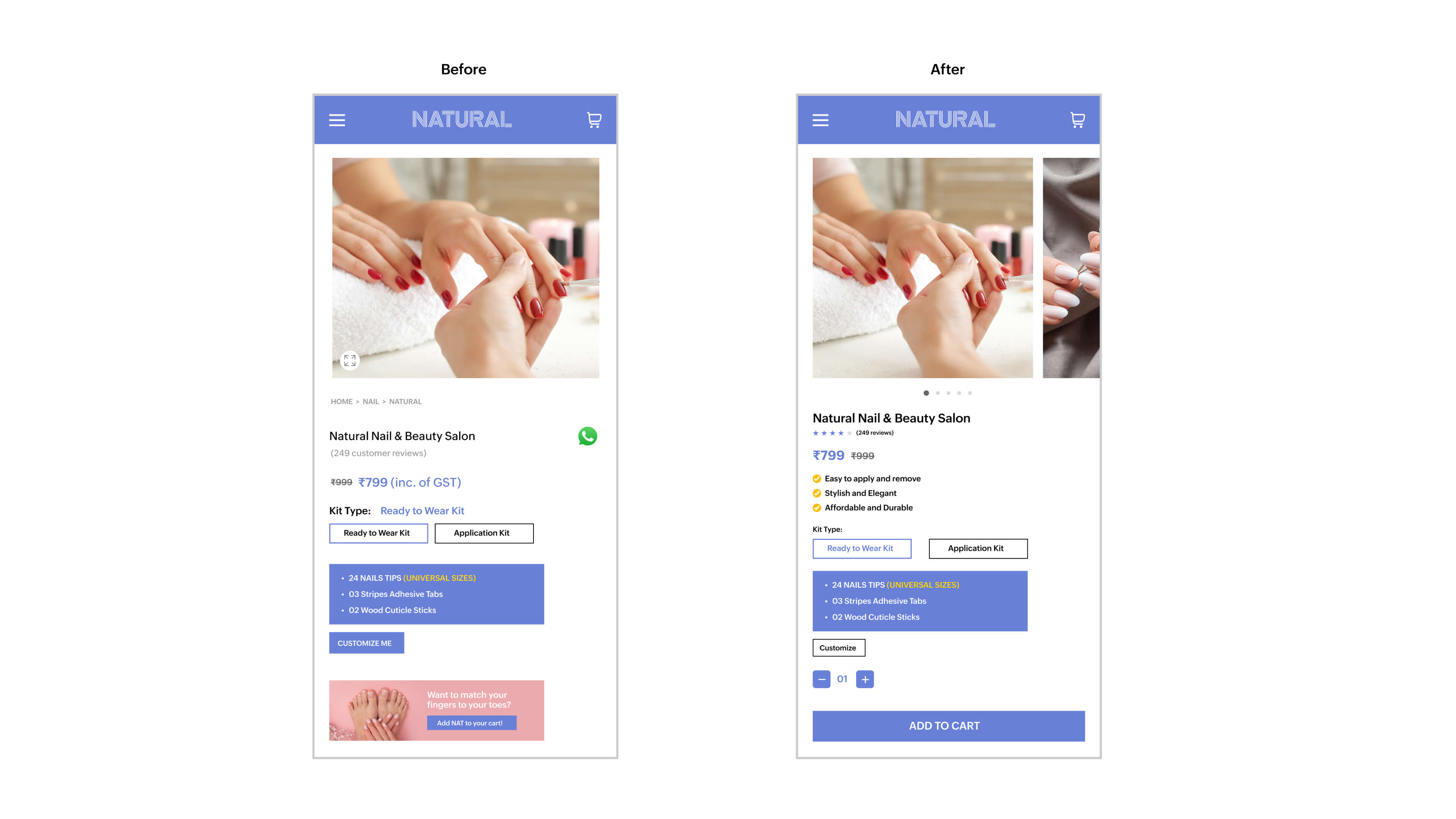
3) Product page elements: Test variations in product page elements such as images, product descriptions, and the placement of customer reviews to optimize for higher conversion rates.
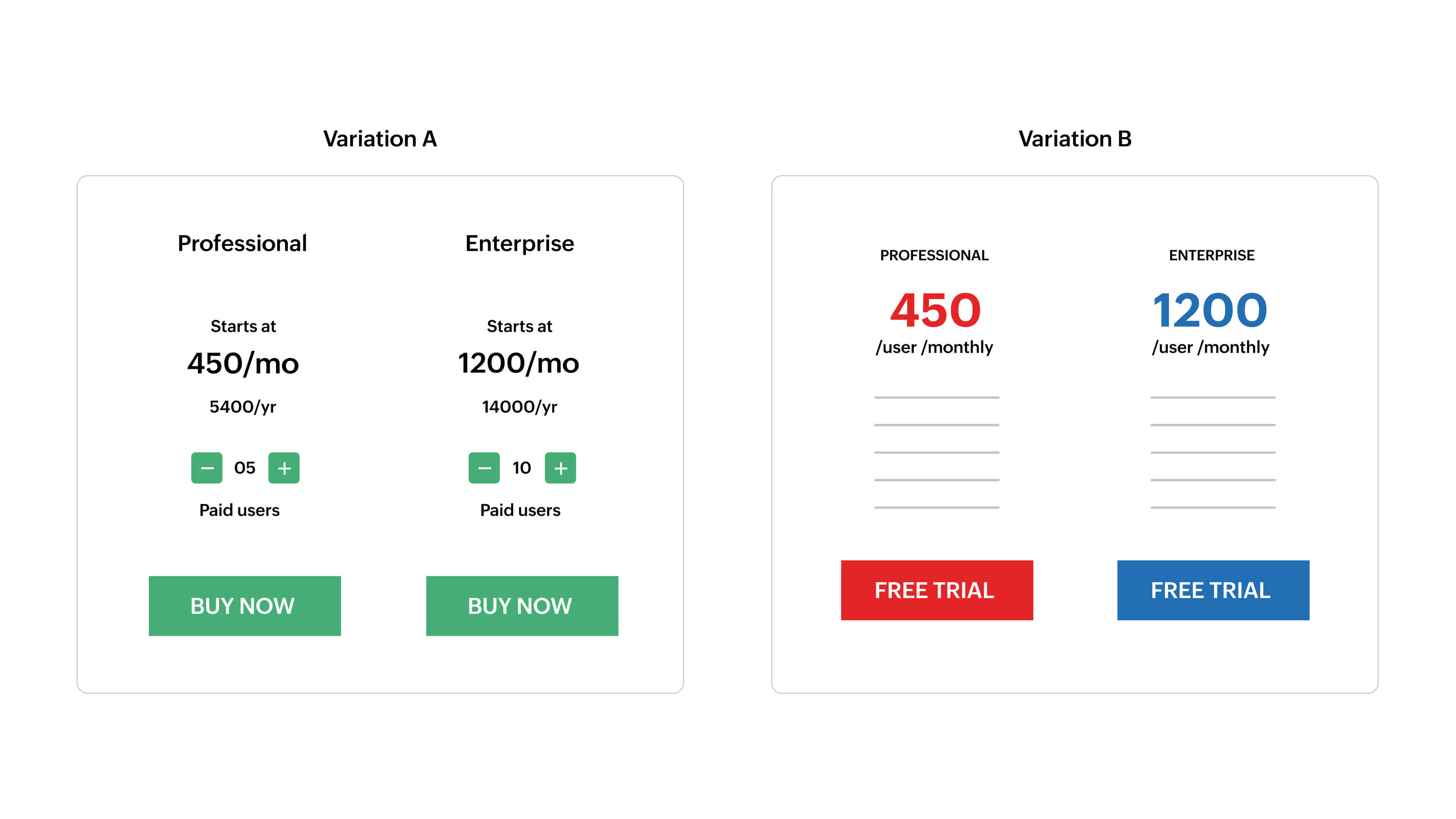
4) Pricing strategies: Explore different pricing models, discount structures, or promotional strategies to identify the most effective approach for maximizing revenue and customer satisfaction.
5) Form and checkout process: Optimize forms and the checkout process by testing different form fields, lengths, and the number of steps to reduce friction and increase completion rates.
6) Mobile responsiveness: Ensure your website or app performs well on various devices by testing different mobile layouts, navigation patterns, and responsive design elements.
Remember, the key is to form hypotheses based on your understanding of your audience and business goals. Test these hypotheses to gather data-driven insights. A/B testing is an ongoing process, and continuously iterating based on results will lead to better optimization over time.
If you're still completely unsure where to start A/B testing, here are two sources of inspiration.
Product reviews: Sometimes, customer reviews provide insights, pain points, and areas where your product needs improvement. Look for common themes or recurring issues that users mention.
Customer polls and surveys: Directly engage with your audience through polls and surveys to gather specific feedback on their needs and preferences. Use this information to formulate hypotheses and design A/B tests that address your customers' concerns.
18 ways to improve your eCommerce site
Optimize your product and category pages
1) Studies state 50% of shoppers say images help them decide what to buy. Grab attention with captivating product images along with a short video showcasing the product and its features. Here's how a jewelry business did this:

Image source: Rubans
2) Display user-generated photos and videos alongside influencer content. Myntra does a great job of doing this by adding a separate tab to share influencer product content.
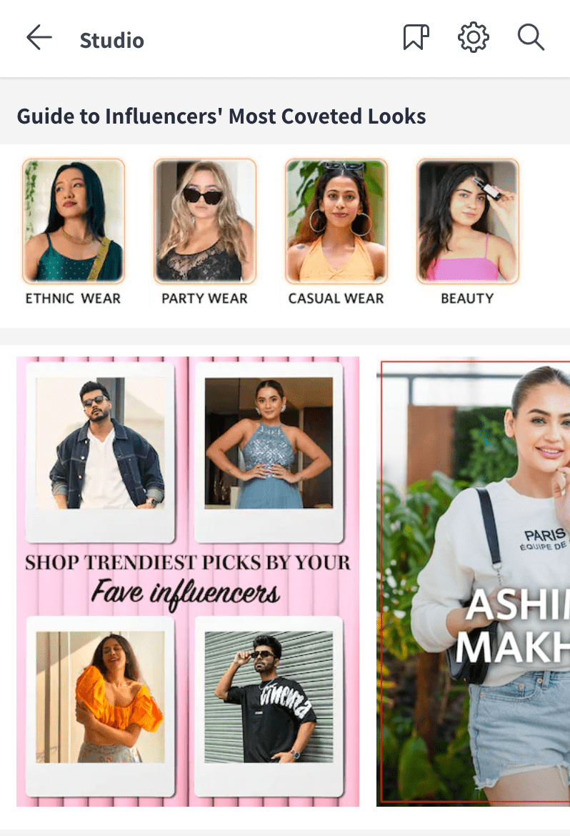
Image source: Myntra
3) Ensure you have clear navigation menus within every category page so that the visitors don't have to leave the page to browse other products.
4) Add filters to category pages to help users narrow down their search and find specific products instantly.
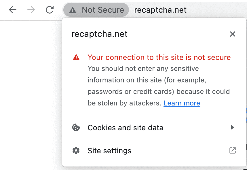
5) Ensure that your website is HTTPS encrypted to improve SEO and conversions. In 2014, Google’s algorithms began using HTTPS as a minor ranking signal. In 2018, Google’s Chrome browser began flagging HTTP sites as "not secure," thus scaring away customers who visited those sites.
5) Bring authenticity to the forefront by showcasing product reviews for each item.
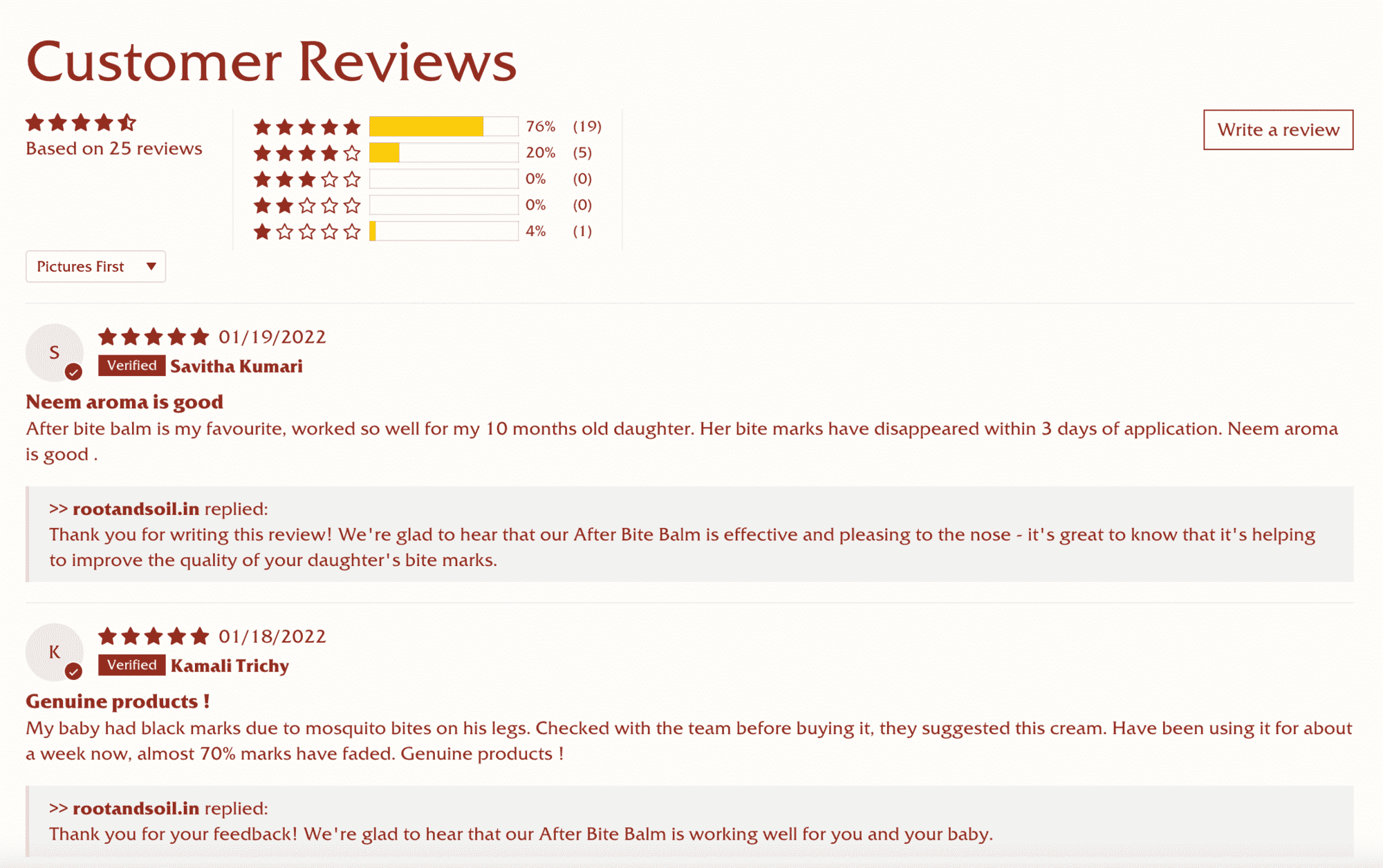
Image source: Root and soil
6) Dive deep into product details. Pack your product description with useful and relevant information.
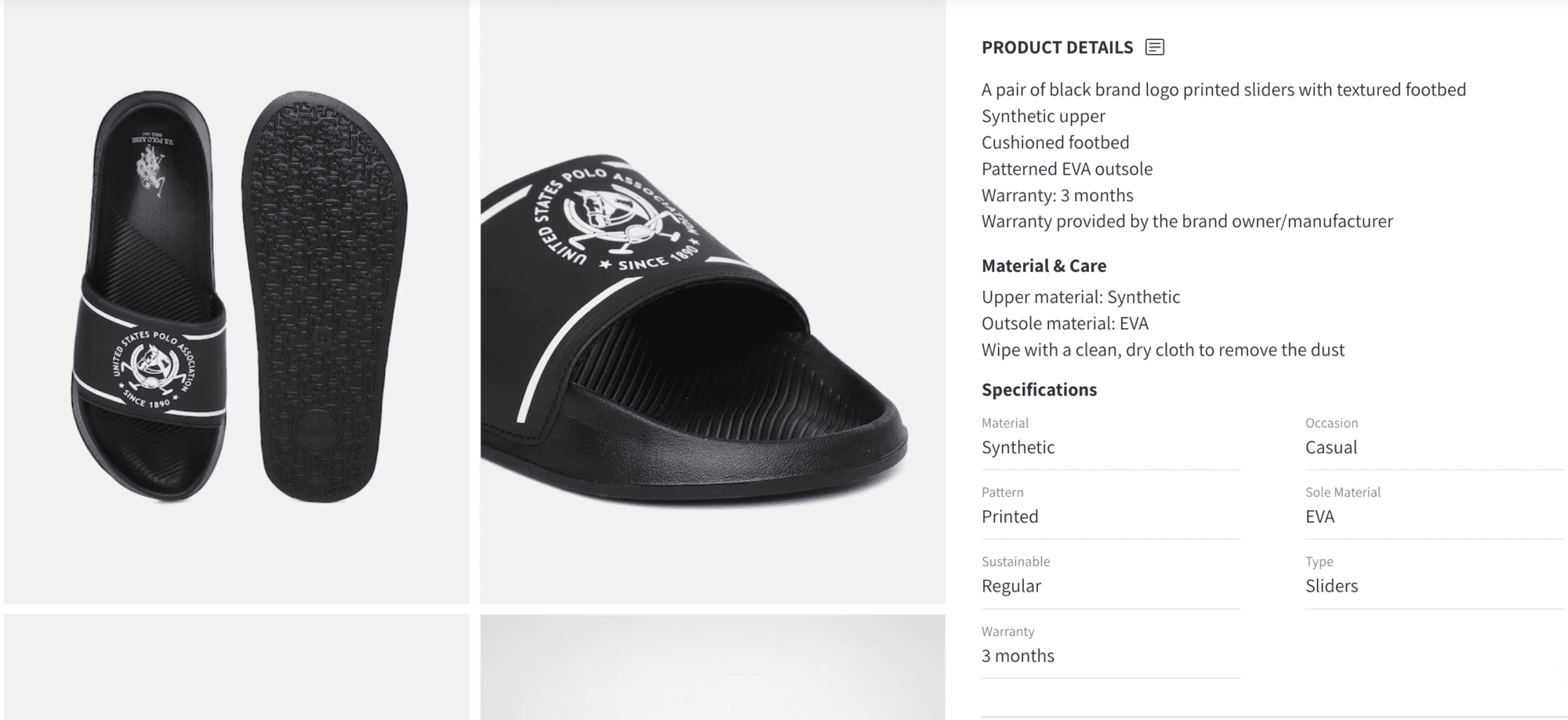
Image source: Myntra
Boost add to cart rate
7) Use smart recommendations to suggest related or complementary products to encourage users to add more items to their cart.
8) Encourage impulsive purchases by including complementary products or recommendations on the Add to Cart page.
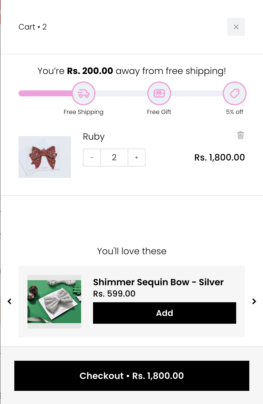
Image source: Cats and Bows
Improve check out experience
9) Showcase trust badges and social proof during the checkout process. This will also reassure customers about the security and reliability of their purchase. This is what the checkout page of Vilvah looks like:
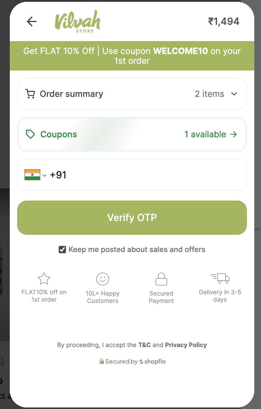
Image Source: Vilvah
10) Trigger an exit-intent pop-up as customers are about to leave the checkout page, capturing their attention with exclusive offers to encourage them to reconsider and complete their purchase.
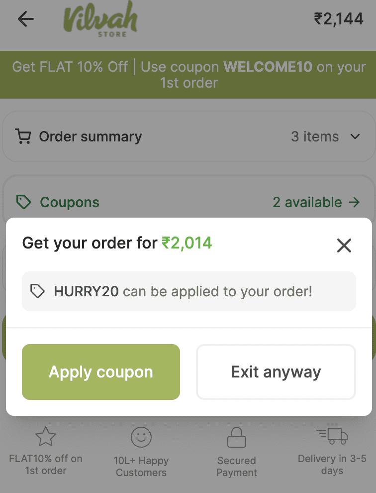
Image Source: Vilvah
11) Offer various payment channels to cater to different preferences.
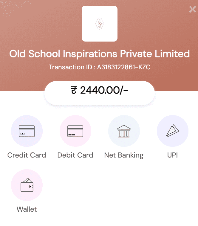
Image source: Old School Rituals
12) Create a separate page highlighting your returns and refund policies to provide assurance to your customers.
13) Provide free shipping or clearly display shipping costs upfront to minimize drop-offs. Studies show 64% of users looked for shipping costs on the product page before deciding to add a product to the cart. Here is how a jewelry shop prominently displays the information on their homepage:

Image source: Hamilton jewelers
Focus on user experience
14) Ensure your website is seamlessly accessible and user-friendly on mobile devices.
15) Curious about user interactions on your website? Utilize heatmaps to visualize engagement levels, identifying hotspots and cold spots. Leverage this data to optimize the positioning of crucial links, buttons, and CTAs for enhanced user interaction.
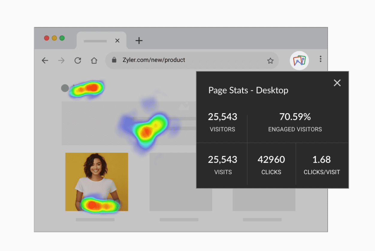
Source: Zoho PageSense
16) Ensure that your product visuals are aligned with your product, audience's preferences, and the overall brand strategy. Sometimes, featuring pictures of people enjoying your products can create a relatable and enticing visual experience, but for highly technical or professionally oriented products, customers may lean towards illustrations with features and specifications.
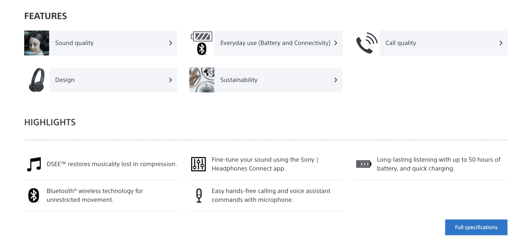
Image source: Sony
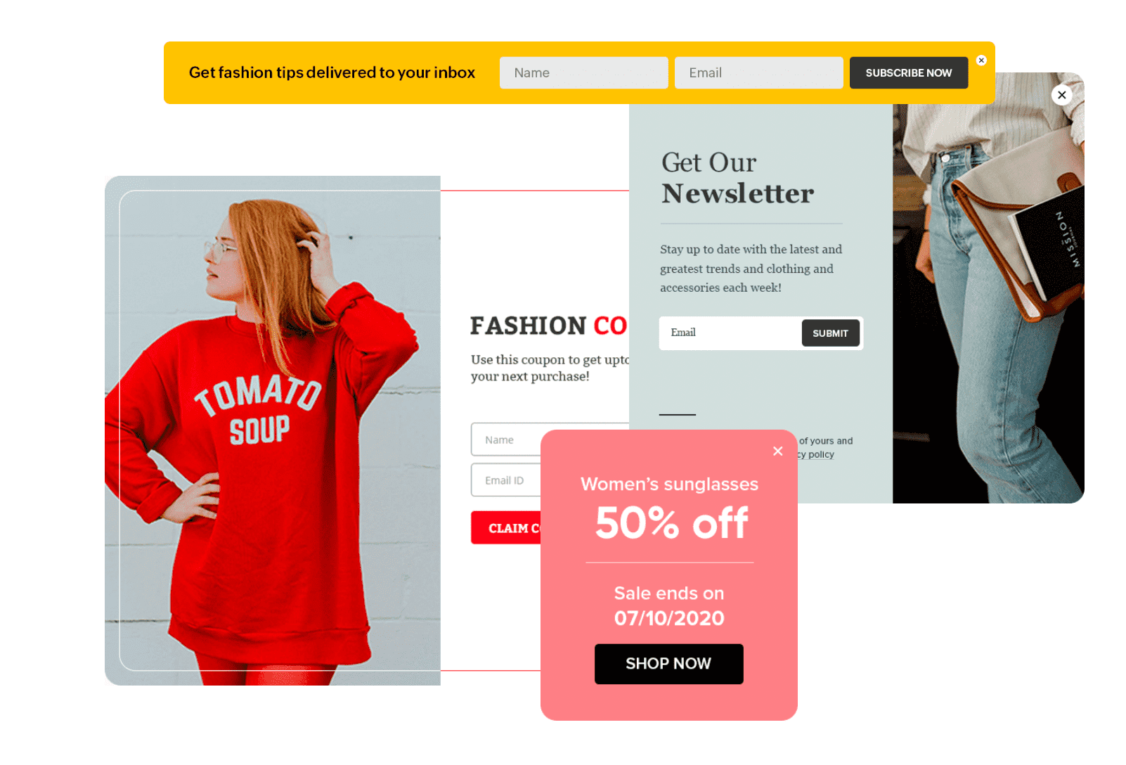
17) Use engaging pop-ups to announce new products or promotions. Check out these pop-ups that were created using Zoho PageSense!
Personalized user journey
18) Tailor the user experience based on preferences, browsing history, or demographics to make each visit feel unique and relevant. This 2017 survey states customers will spend more money when their shopping experience is personalized. There are a few tools on the market, like Zoho PageSense, that offer advanced filter and segmentation options for behavioral targeting, making it easier to deliver unique experiences.
Source: Zoho PageSense
Wrapping up
To conclude, eCommerce conversion rate optimization (CRO) is crucial for the performance and profitability of your online store.
Remember, optimization is ongoing as you embark on your eCommerce CRO journey. Regularly assess your website's performance, leverage the insights from a tool like PageSense, and implement the suggested optimizations to stay ahead in the competitive online landscape.
PS: If you're interested in implementing CRO on your website, get in touch with support@zohopagesense.com. We would love to help!