- HOME
- Design & deliver
- Deconstructing a presentation template: Layouts, colors, fonts, and more
Deconstructing a presentation template: Layouts, colors, fonts, and more
- Last Updated : July 16, 2024
- 406 Views
- 6 Min Read

A few of my colleagues and I were working on a presentation recently. While deciding between a presentation theme and template, we unanimously chose to use a template (thanks to this blog). However, we still had to finalize a specific template. We discussed our individual requirements for the perfect presentation template. Through the process, we deconstructed a presentation template. Here is the summary of our discussion-
But first-
What is a presentation template?
A presentation template is a collection of predesigned slides that streamlines the process of creating a slide deck. These slides consist of multiple layouts, text placeholders (often prefilled with placeholder content), background designs that align with the theme, and fonts that feel relevant to the presentation. Templates also contain placeholders for graphics like icons, images, videos, graphs, and charts. All of these elements must be uniform to maintain consistency across your presentation.
To top it all off, the presentation template must help you tell a story. The narrative approach will captivate the audience, enhance clarity, improve retention, and make the presentation memorable for the audience. Incorporating a story can transform your presentation into a compelling experience and leave a lasting impact.
Deconstructing a presentation template
Multiple layouts within a uniform structure
The purpose of a layout is to arrange the elements precisely to ensure the content is communicated effectively to the audience. A layout contains formatting, positioning, and placeholders for all the content on a specific type of slide. Predesigned slide layouts save time and help you focus more on content creation. A presentation template contains multiple slide layouts, so it is easier to customize one rather than having to create each slide from scratch.
Title slide
This slide is the introduction of your presentation. Add a suitable title, subtitle, presenter's name, and date to give context to your audience.
Title and content slide
This slide is used to introduce new topics or sections. Add a title and introductory content, which may include visuals, text, or a chart.
Title-only slide
This slide is used for keeping things simple and focused when introducing your topics that need prominent attention.
Section header slide
This slide denotes the end of one section and the beginning of a new section. In addition to the title, it may contain a subtitle and relevant visual elements.
Two content slide
This slide is used to present two separate but related pieces of information.
Comparison slide
This slide is set up for evaluating two or more concepts or objects.
Blank slide
This is an empty slide that can be customized for any purpose.
Image with caption slide
This slide is ideal when you want to give more attention to a specific image.
Title, text, and image slide
This slide is ideal to introduce a new concept or idea with a brief description and supporting image to help the audience visualize the content.
Content with caption slide
This slide contains placeholders for content and a caption to provide additional information about the content.

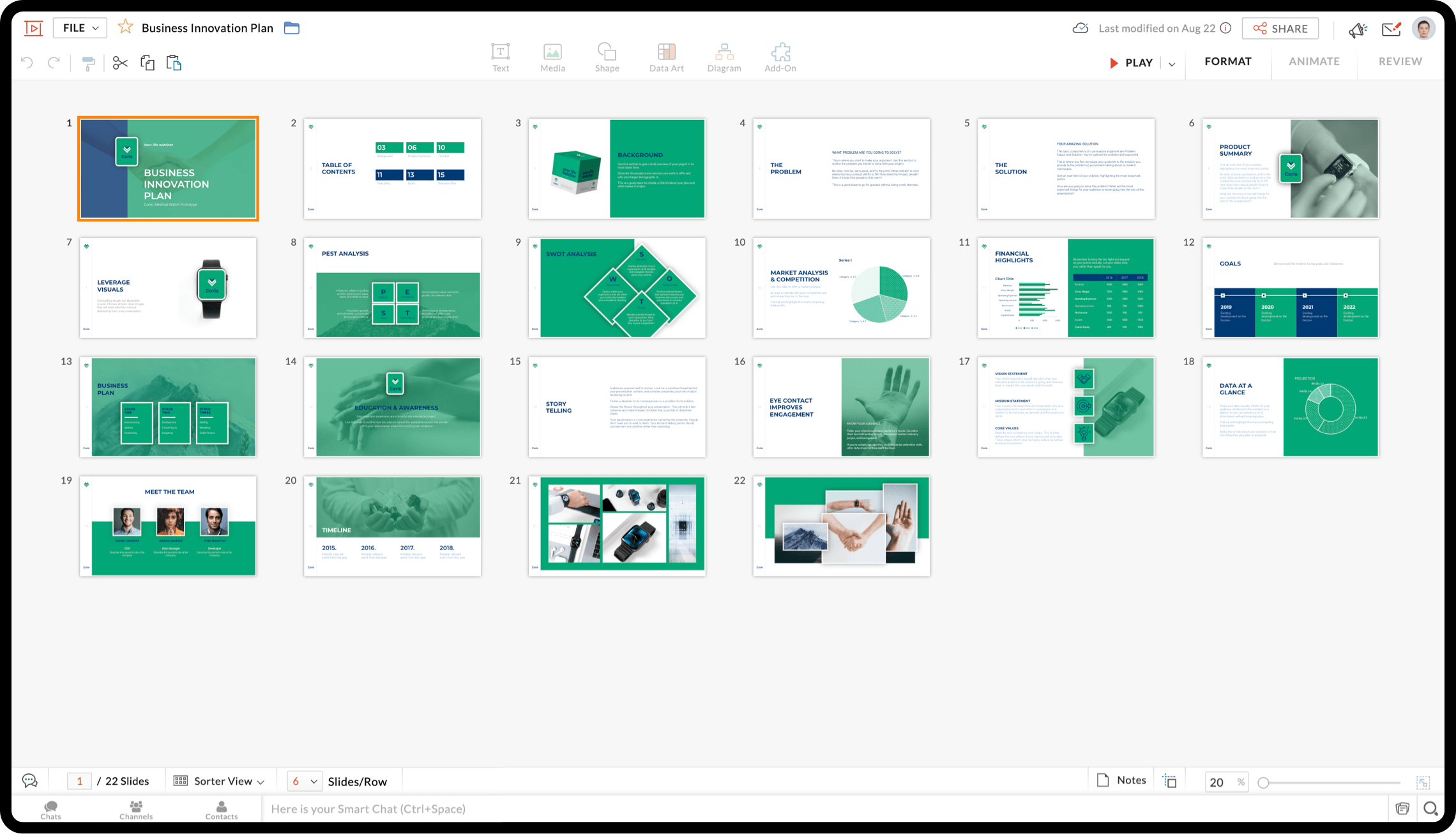
For instance, here is a presentation template that covers different layouts to help you create an organized and structured presentation. You can check out this presentation here.
Background colors that align with the presentation
Design-wise, colors in a slide should typically follow the 60-30-10 rule, where the primary color constitutes 60% of the slide, the secondary color 30%, and only 10% of the slide consists of accent color. Maintaining this ratio helps ensure the slide is aesthetically appealing.
Colors evoke emotions, and each color is known to evoke different emotions among the audience. If you are presenting a sales presentation and want to persuade the audience to buy your product or service, blue may be the best color for you to choose. The color blue is used to create credibility and trust among your audience. Colors are divided into warm, cool, and neutral—and each one has a different purpose. While warm colors are used for creative presentations, cool and neutral colors are more commonly used for technical and training material, respectively.
Also, colors used in a presentation template must compliment each other, and there has to be sufficient contrast between text and background to make the content easily readable.
Fonts to make your presentation stand out
Remember this famous meme about how fonts can change the context if used wrongly? Fonts play a crucial role in your presentation template. A font with the right components- style, weight, size, and case- to ensure readability. Proper use of a font will enhance aesthetic appeal while setting the tone for your presentation.
The most commonly used fonts for presentations are classified into serif, sans-serif, script, display, monospaced, handwriting, block letter, transitional, and modern fonts. Each of these have different characteristics and uses. A presentation template will provide a font that aligns with the topic and the theme of the presentation.
Creating a visual hierarchy in a slide is important to ensure the audience reads the slide in the order of their importance. A presentation template will have headings, subheadings, and body text in different sizes and styles (bold, italics, and underline) to make it easier for the audience to follow the flow of the information.
Background designs and effects to add that extra flair
We all tend to focus on creating visual appeal when we design slide decks; opting for a presentation template that aligns with your presentation's theme will check the first box of requirements for a visually appealing presentation. The more minimalist your presentation is, the better it will resonate with your audience. An overly cluttered background will steal your thunder and distract the audience. Go for a simple background with limited design elements like a high resolution image or an illustration to add more value to the presentation.
Here is an example of a presentation template, that with its minimal designs and pastel shades showcases aesthetics and style.
Another important aspect that we miss to notice is the whitespace in the presentation template. Whitespace in the slide design is what pauses are to a speech. Having blank space in your slides will help people focus on the content, improve readability, avoid information overload, and maintain a professional look.
When used sparingly, simple animations and slide transitions can add a dynamic energy to the presentation. This will help you show a narrative and keep your presentation engaging. These effects can help you emphasize key points, build suspense and curiosity, or reveal information gradually.
Placeholders for visuals to reinforce key points
Visuals are easier to interpret than text. Visual assets, such as images, videos, illustrations, charts, and graphs, can help reinforce your points to add credibility and help your audience retain the information. Having placeholders for visuals in appropriate slides can help you organize and plan how they appear instead of guessing and then adjusting the layout every time.
It is important to have slides that have placeholders that make it easy to incorporate different types of visuals as the dimension of the image and video can be different according to each layout. This way, you can worry less about formatting and use the same visual (if we get lucky with the visual used in the presentation) or can replace it easily with ones o align with the topic of the presentation or your company's branding.
Wrapping up
A successful presentation relies on a perfect mix of a well-designed slide deck and how well the deck is presented to the audience. When you choose the right presentation template, it not only makes your deck visually appealing but also helps in effectively conveying your message. This gives you time to focus on practicing and rehearsing for the presentation.
PS: And yes, we did find a suitable presentation template in Show that met all our requirements🙌!
Hunting for the perfect template for your next presentation? Check out Show's free presentation templates for your personal and business needs.
Happy presenting!


