Sales Landing Pages: Essential elements, Templates, How to create?
- Last Updated : August 12, 2025
- 3.2K Views
- 7 Min Read
Key takeaways
- Sales landing pages are designed specifically to drive conversions and make sales, catering to various stages of the buyer's journey.
The effectiveness of a landing page depends on its structure (long vs. short) and key content elements, such as a compelling value proposition, clear headlines, customer-centric language, and engaging visuals.
Successful landing pages result from ongoing testing and optimization, allowing businesses to refine their approach and improve conversion rates over time.
Landing pages are highly versatile. They can be used at different stages of the buyer's journey to serve various purposes from lead generation to event registrations. However, as the name suggests, sales landing pages are built with a singular goal: to make a sale. Through a carefully constructed narrative, the sales page explains how the product or service will make the customer's life easier.
What is a sales landing page?
A sales landing page is a type of landing page that is designed to promote and sell a specific product or service, with the primary goal of converting visitors into customers. It features a clear value proposition, persuasive copy, and a strong call-to-action button to encourage immediate purchase.
By implementing the following strategies in your landing page builder, you can turn them into high-converting sales landing pages.
Long sales pages vs. short sales pages - which is best for you?
This is one of the more basic decisions you have to make for your landing page. If your product or service is complicated or belongs to a significantly high-end price range, you will have to explain things better and work harder to convince your visitors to make a sale. In such cases, the long-form sales page is the way to go.
If your product is relatively inexpensive and self-explanatory, short sales pages where most of the content lies above the fold is more practical.
Long-form pages are easier to address customer objections and pain points in detail, while short-form sales pages help businesses cater to visitors who won't necessarily have the patience to read a long sales page or for those who don't need a lot of convincing.
Sales landing pages vs. regular landing pages: the major differences
Sales landing pages and regular landing pages serve distinct purposes in landing page marketing. Here are the major differences between the two:
Purpose
Regular landing pages can serve a variety of purposes, such as lead generation, brand awareness, or providing information. They might not always be focused on direct sales.Sales landing pages are designed to drive conversions, usually focused on selling a product or service. They often include persuasive elements to encourage immediate purchase.
Content
Regular landing pages typically contain general information, signup forms, or promotional content without a strong emphasis on closing a sale. But sales landing pages feature detailed product descriptions, benefits, testimonials, pricing, and a clear call to action (CTA) urging visitors to buy.
Design
Regular landing pages tend to be more informational and less focused on urgency or the CTA button.Sales landing pages often contain more visually aggressive and attention-grabbing elements like countdown timers, bold images, and testimonials to create urgency and establish trust.
How to create high converting sales pages: 9 key factors to consider
Focus on the unique value proposition
Sales pages are a great way for businesses to convey their value proposition to customers. The unique value proposition (UVP) or unique selling point (USP) speaks directly to the customers and it answers how your product or service solves their pain points and why customers should choose your business over other competitors.
Craft effective headings
Even if you have put in a lot of lead nurturing hours educating customers about your business and product, a landing page that doesn't immediately capture their attention isn't going to convert very well.
Create headlines and subheadings that make it easier for visitors to understand the contents of your landing page faster. If the product or service is complicated, including a long headline and layering the landing page with subheadings that reinforce the value proposition catches the attention of your target audience and acts as a positive influence to make a buying decision.
Speak in your customers' language
Toning down the technical jargon, explaining the product or service from the customer's point of view, and focusing on benefits instead of features can help make the content palatable to visitors. Emphasizing how the product or service will make them feel can also persuade visitors to make a purchase.
Switch up the layout
In long-form sales pages, it is important to break the page up into segments and break away from patterns that can be repetitive. Chunks of content and bulleted lists interspersed with relevant images and videos can make landing pages more engaging. If you can retain the attention of customers throughout, the chances of making a sale are higher.
Let your customers speak for you
Offering social proof and testimonials from existing customers can help seal the deal with potential customers. Typically, businesses use various types of social proof to persuade visitors to take action. Counters that show the number of existing customers influence visitors to take notice of your product. When you add ratings from popular websites and a few lines of text from customers that describe your product, you have concrete social proof that visitors simply can't ignore. B2B brands can use customer logos and testimonials from their clientele to make their business more credible.
Show don't tell
Including videos and images is no longer a suggested strategy, it's a mandatory strategy. Use visual cues and images to direct your visitor's eyes through the page. Videos help hold the attention of visitors and also gently nudges them towards taking action. Videos can either be testimonials, explainer videos, or a mix of both.
Minimize navigation and distractions
Sales pages rarely have navigation links in the header or footer. Since your visitors are coming to a post-click landing page, they have a singular purpose in mind. Hence, showcasing the entire array of products or services can distract visitors from buying. External links that lead visitors to other resources could be fruitful in the early stages of the buyer's journey. However, on a sales page, they aren't just unnecessary, they are simply counterproductive, leading customers away from the sale.
The call to action
Ultimately, it all boils down to whether your sales page can make a sale. So, let's talk about the call to action. Learn everything you need to know about CTAs here.
Some marketers believe in using a single call to action on the sales page—a prominent, distraction-free call to action that catches the eye of the visitor. Landing page software usually have multiple CTA buttons that users can simply drag and drop. This makes sense for short sales pages, but when it comes to long sales pages, businesses must offer visitors the option to purchase at any point on the page where they might feel convinced to buy your product or service. The last thing you need is an interested buyer scrolling up and down, searching for the call to action.
Keep experimenting
There is no secret formula to creating high-converting landing pages, but they don't happen by accident either. All types of landing pages can bring in high conversions. By experimenting with these strategies to find relevant ones for a campaign and implementing them on every landing page, businesses can consistently create landing pages that convert.
Sales landing page templates to boost your business sales
Transform your sales landing page into a powerful asset for driving conversions. With Zoho LandingPage, you’ll have access to a diverse selection of professionally designed templates, each crafted to resonate with your target audience. Start creating sales landing pages that capture attention and convert prospects into loyal customers!
Online store sales landing page
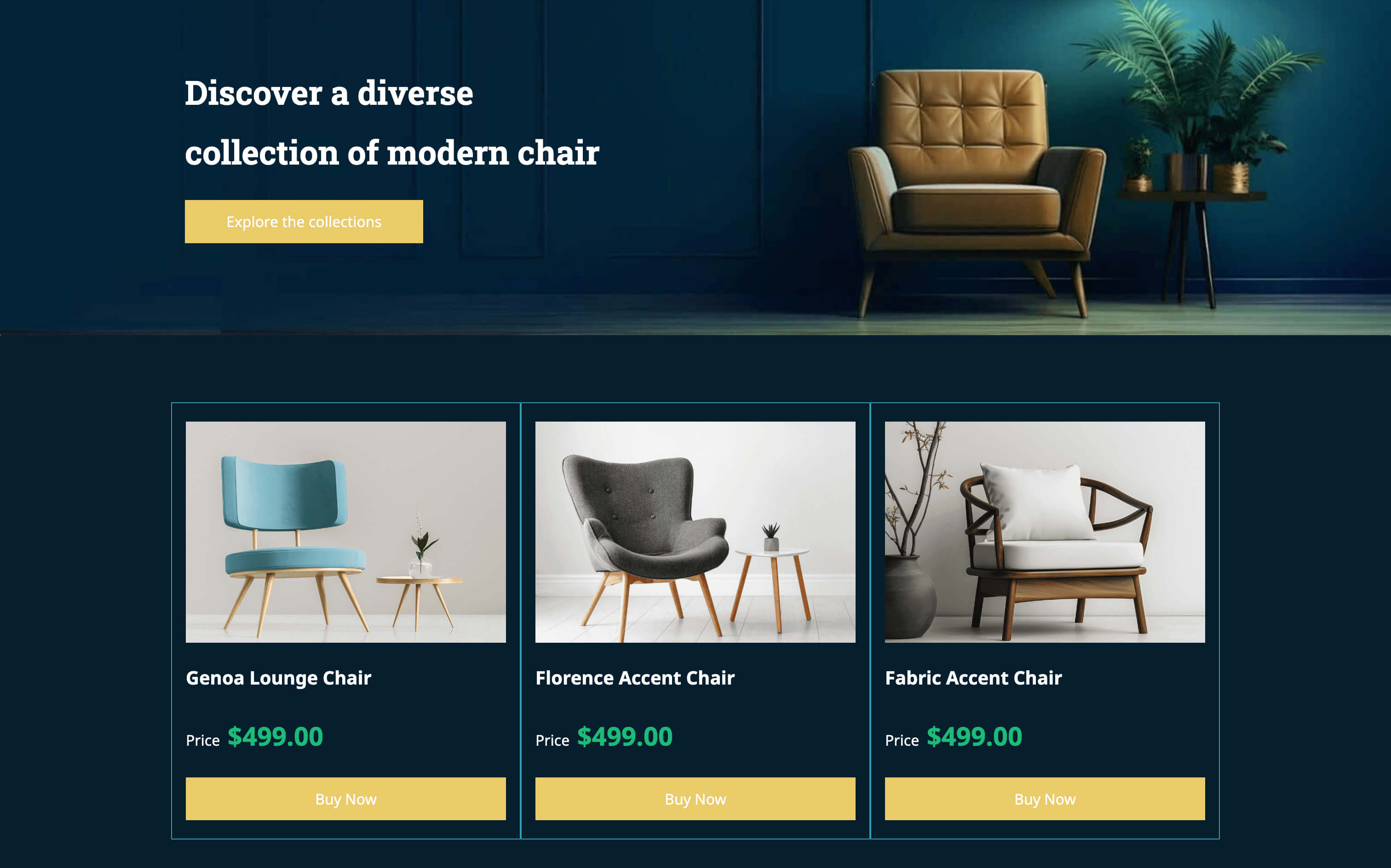
This sales landing page for a furniture store is effective primarily due to its strong visual appeal and prominent call to action (CTA). High-quality images of the furniture not only showcase the products but also create an emotional connection with potential buyers. A clear and eye-catching CTA, placed prominently on the page, encourages immediate action, helping to convert visitors into customers.
Start building your sales landing page with this template : https://zurl.co/BQjL
Product sales landing page template

This sales landing page template showcasing all the features of a phone works well because it combines engaging visuals and a clear call to action (CTA). Moreover, the page effectively communicates key feature such as camera quality and battery through concise, impactful copy. By focusing on user experience and providing all necessary information at a glance, the template drives engagement and boosts conversion rates.
Start building your sales landing page with this template : https://zurl.co/Z9ds
Seasonal sales landing page template
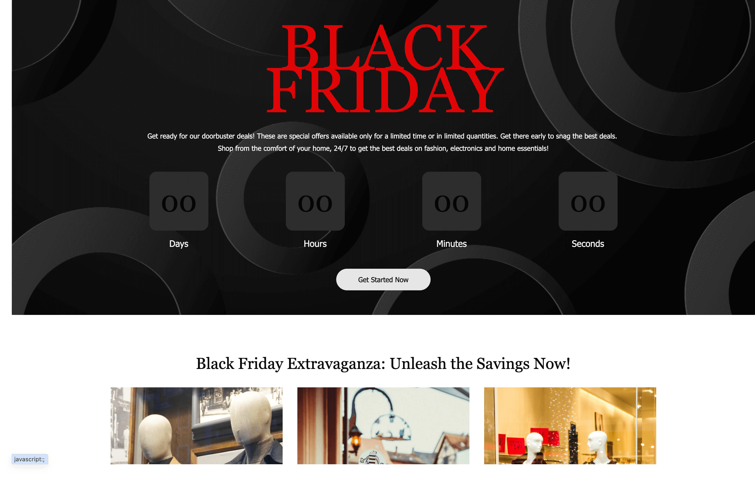
This Black Friday sales landing page template is highly effective due to its combination of urgency, clear offers, and strategic design elements. The countdown timer creates a sense of urgency, encouraging visitors to act quickly before the sale ends. A prominent call to action (CTA) such as "Shop Now" or "Grab the Deal" can help guide users to take immediate action, making it easy for them to engage with the sale.
Start building your sales landing page with this template : https://zurl.co/iKoX
Why is Zoho LandingPage the best sales landing page builder ?
High converting sales landing page templates
Zoho LandingPage offers a variety of professionally designed landing page templates optimized for conversions. These templates are structured to grab attention and guide visitors toward taking action, making them ideal for boosting sales.
Essential landing page elements
The platform includes key features like countdown timers and sections that clearly outline the value proposition. These elements create urgency and help potential customers understand the benefits of the product, which can significantly enhance conversion rates.
Drag and drop payment buttons
Zoho LandingPage allows users to easily add payment buttons through a drag-and-drop interface, integrated with Zoho Checkout. This simplifies the checkout process, making it user-friendly and efficient, which can lead to higher sales.
CRM integration
The builder seamlessly integrates with popular CRM applications such as Zoho CRM, Salesforce, and HubSpot. This integration enables users to track sales and manage customer relationships effectively, providing valuable insights and helping to streamline marketing efforts.
 Krithika
Content Marketer @ Zoho LandingPage
