- HOME
- Product Tips
- Five ways to visualise your business data with a BI platform
Five ways to visualise your business data with a BI platform
- Last Updated : July 19, 2024
- 417 Views
- 4 Min Read

Businesses deal with so much data—from sales figures and customer interactions to market trends and operational metrics, the sheer volume of data can be overwhelming. Visualising your business data with clarity can make a huge difference in understanding and using the information you have. This is where a business intelligence (BI) platform comes into play; it turns raw numbers into meaningful insights and visual stories. In this blog post, we'll discuss five ways you can visualise your business data using a BI platform.
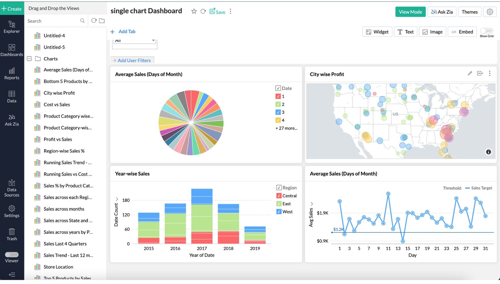
1. Dashboards
Dashboards are highly customisable central hubs where you can see a real-time overview of all your key performance indicators (KPIs) simultaneously.
Imagine you're a sales manager overseeing a large team. A dashboard can show you metrics like total sales, regional performance, and individual sales rep achievements all at a glance. This consolidated view helps you spot trends and outliers, making it easier to decide where to put your focus. Your general manager's dashboard might display different statistics, such as a pie chart of product sales distribution, a bar graph comparing monthly revenues, and a line chart tracking customer acquisition over time.
With all this information at your fingertips and customised for the viewer, dashboards make monitoring business health straightforward and intuitive.
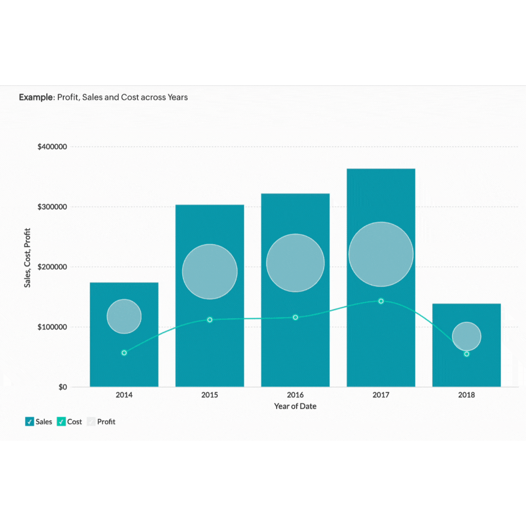
2. Graphs and charts
Graphs and charts turn complex data sets into simple visuals. They help you see patterns and trends quickly. Whether you're dealing with sales trends, customer demographics, or financial projections, there's a graph or chart that can help.
Take a sales trend analysis. A line graph can show you how your sales have increased or decreased over the past year. If you're presenting this data in a meeting, a bar chart comparing quarterly sales can highlight periods of growth or decline. Pie charts are perfect for showing the proportion of different product categories in your total sales. The simplicity and clarity of graphs and charts make them easier for your audience to understand and remember.
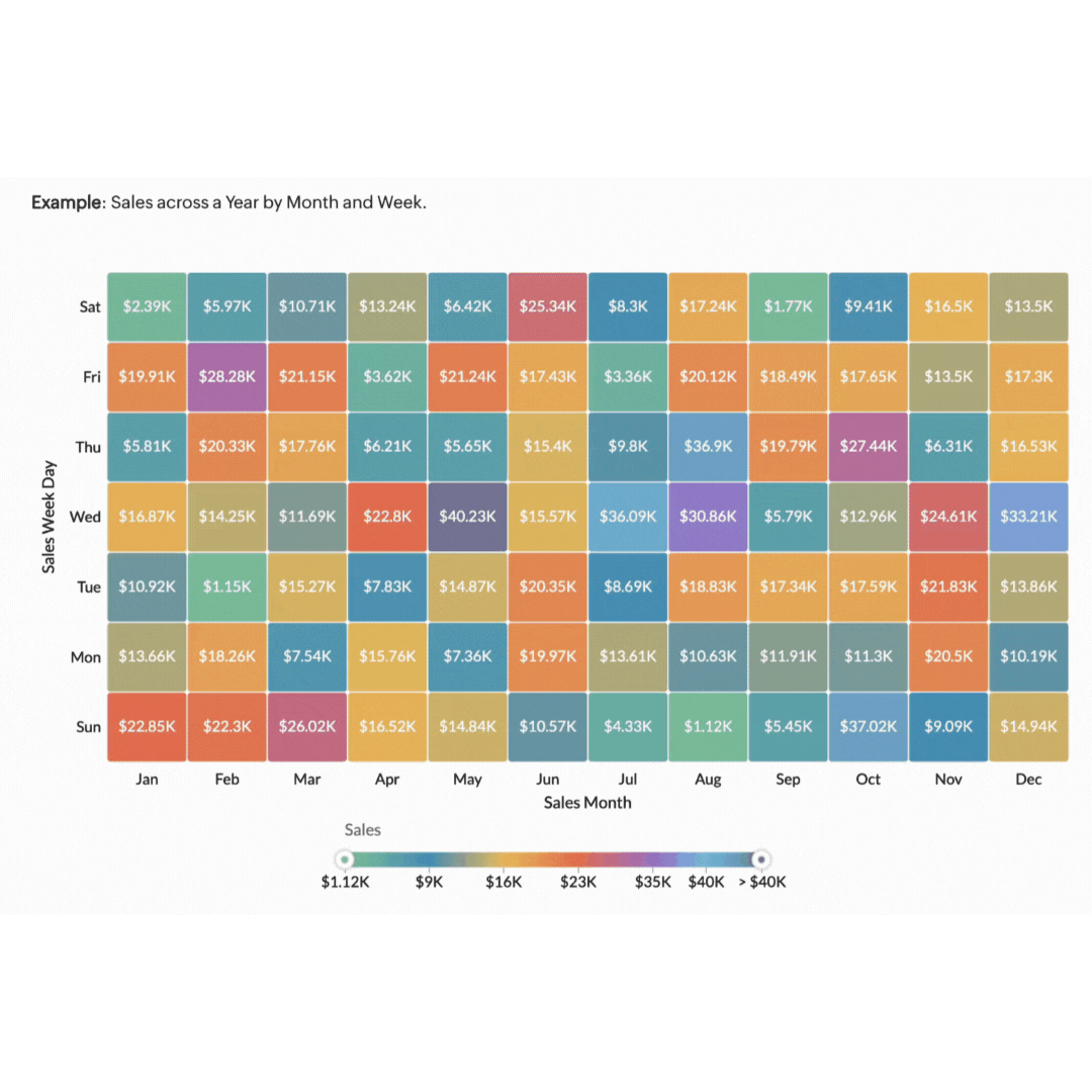
3. Heat maps
Heat maps are powerful tools for visualising data density and distribution using colour gradients to show data values. They make it easy to see where the most activity or highest values are concentrated. For example, heat maps can show you how far users scroll down a page before losing interest or where they spend the most time reading content.
Imagine you're managing a marketing campaign for an ecommerce website. You need to understand how users are interacting with your website so you can optimise user experience and increase conversions. A heat map of your product pages can provide valuable insights into user behaviour. By analysing the heat map, you can see which areas of your website receive the most clicks. Using this information, you can optimise your website's layout and design to improve user engagement and conversion rates.
4. Interactive reports
Interactive reports take data visualisation to the next level by allowing users to engage with the data. Instead of static charts, interactive reports enable users to drill down into details, filter information, and even customise their views. Interactive reports are particularly useful for teams where different team members can explore the same report from various angles, bringing diverse perspectives to the table. This shared, dynamic approach to data sharing ensures that all stakeholders have access to the insights they need.
Consider a financial analyst who uses an interactive report to explore quarterly earnings in depth. By clicking on a particular quarter, they can break down the data by department or region. Filters might allow them to view only the top-performing products or focus on a specific period. This turns reports into interactive tools for finding and exploring information and not just summaries.
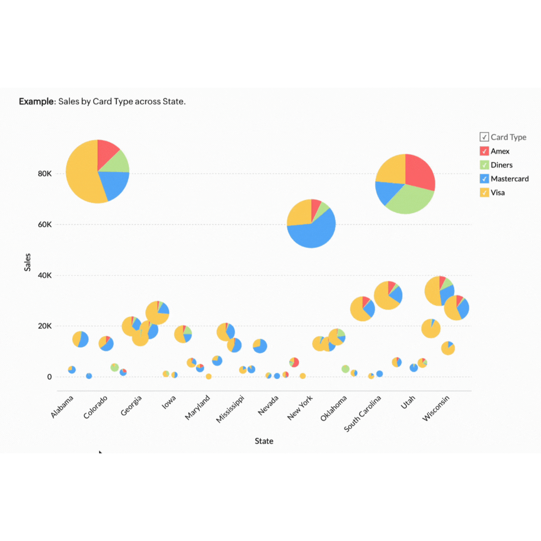
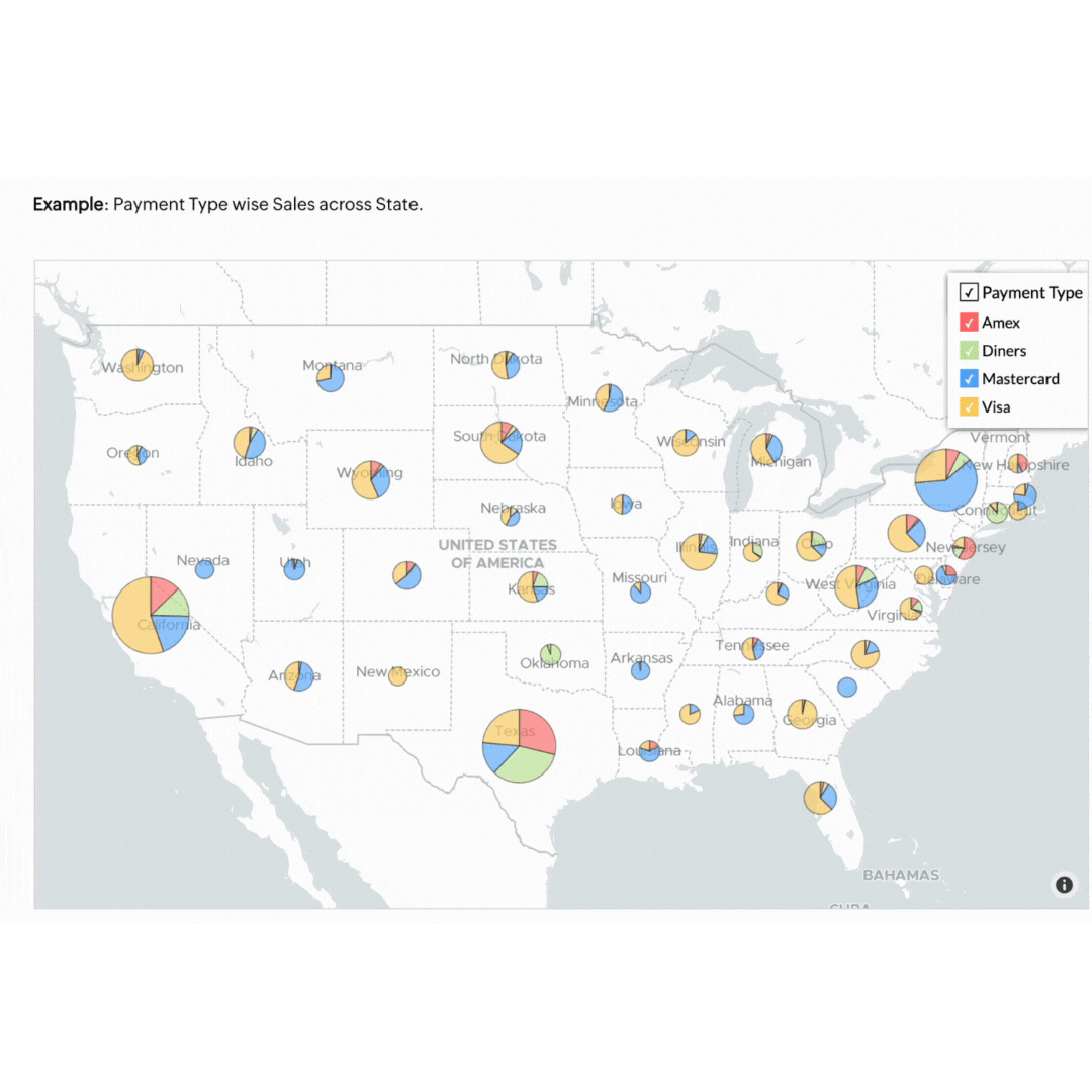
5. Geo data visualisation
Geo data visualisation combines data with geographical information, providing a spatial dimension to your analysis. This is particularly useful for businesses with a regional or global footprint.
Think of a retail business that can benefit by mapping customer data to see where their products are selling best. This approach helps in planning effective marketing campaigns and managing stock levels efficiently. If the map highlights that a specific product sells better in Sydney and Melbourne but not in Brisbane, the store can tailor its ads to target its audience better. This ensures the store's resources are invested in the right areas to forecast demand accurately and meet customers' needs.
Visualising your business data doesn't have to be complicated. Our own BI tool, Zoho Analytics, makes it easy to visualise, derive insights, and act on your data. Start using these methods today to see your business progress more clearly and make smarter decisions.
To learn more about how BI can benefit your business, check out our post: Business intelligence software: What it is and what it can do for your business.