- HOME
- Design & deliver
- Five ways presentation templates can enhance productivity
Five ways presentation templates can enhance productivity
- Last Updated : June 21, 2024
- 619 Views
- 6 Min Read
Will this design align with the theme of the presentation?
Do these colors complement each other?
Should I include an image in this slide?
Is this the right layout for this content?
Will the text size be readable?
These are the common questions that arise while designing a presentation.
What is a presentation design?
It is the era of visual storytelling, and presentations have to be crafted in an appealing way to communicate your ideas effectively. Presentation design is not just putting together a group of slides, but also ensuring that the slides narrate your ideas as a story. The slides must also meet design standards in terms of color, typography, background styles, layouts, icons, images, and visual flow to create a visually aesthetic presentation.
Here are a few of the key principles for presentation design:
- Including whitespace in the presentation to make the audience focus on the important elements in the slide.
- Follow a visual hierarchy while positioning text or elements in the slide based on the order of their importance.
- Align and position the slide elements symmetrically or asymmetrically based on their visual weight.
- Follow the same type of design element throughout the presentation to maintain consistency.
- Include colors that complement each other and maintain contrast to ensure it is easy on the eyes.
- Choose the design elements that align with the purpose and theme of the presentation.
- Keep animation and transition effects to a minimum so it does not overshadow the content.
Whether you are a novice or an expert, and if you are presenting to your clients, team, or friends, designing a presentation can definitely be an overwhelming task.
Q- How can you simplify the design process and focus more on the content for the presentation?
A- A presentation template.
What is a presentation template?
Presentation templates are a set of slides that contain layouts, colors, fonts, background effects, and designs. Some also include placeholder content. It gives a structure to your presentation. These predesigned templates can be edited and customized according to your requirements. Templates help you create professional and consistent slide decks without you having to arrange, align, or format the elements manually.
Remember, you can always create a presentation template for your business and repurpose it for various occasions or use the predesigned, built-in, ready-to-use, and completely customizable presentation templates that various apps like Zoho Show offer.
Five reasons why presentation templates can boost your productivity

While you just learned how presentation templates can help you design slide decks easily, they can also help you boost your productivity.
Saves time
Creating a slide deck can be time consuming. The time it takes to create a slide deck can vary, ranging from a few hours to several weeks, depending on the type and purpose of the presentation. A predesigned template carries different slide layouts; all you have to do is to replace the content, visuals, or the charts, and you are all set. This will take just a few minutes of your time and will save you time planning how to design the deck. Your presentation creation is simplified, and you can focus more on other tasks.
Maintains consistency
Be it creating a slide show for school projects, pitching projects to clients, or talking revenue numbers to stakeholders, a consistent slide deck is key to capture the audience's interest. Adhering to the design standards as mentioned above will ensure that your presentation is uniform and maintains consistency across your slides.
Ensures branding
Presentations are an important communication tool. Having branded slide decks for your business is important for more than one reason. While it helps you differentiate you from your competitors, it also boosts your marketing and advertising, thereby influencing customer's buying decisions. Create a presentation that aligns with your brand in terms of colors, typography, design elements, and the company logo, which you can repurpose when you present internally or externally. This builds trust and helps your audience recognize your brand.
Reduces error
Having a presentation template is standardizing the process. That's why when you follow a presentation template, the chances of making errors are minimal. As the layouts, designs, colors, and fonts are already in place, you are only going to copy and paste or type in the content you intend to show the audience. The chances of you making formatting or aligning errors are minimal as the elements are already positioned to make the presentation visually appealing.
Focus on content
The goal of a presentation is for the audience to perform the desired action. Content and design are the two strong pillars for a successful presentation. While the presentation template takes responsibility for the design part of it, It gives you enough time to focus more on crafting the content. You can analyze the audience and create content that is tailor-made for them.
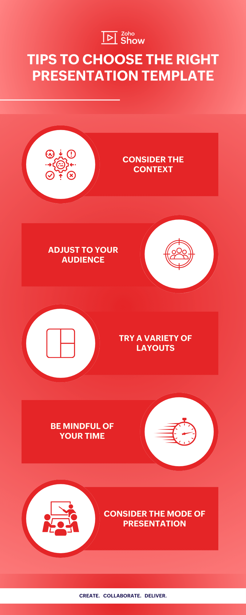
Tips to choose the right presentation template
While this blog is mainly about presentation templates and how they help boost productivity, here are some insights that will help you find the ideal presentation template. When sourcing for presentation templates online, ensure you keep a few things in mind.

Consider the context:
Find a presentation template that aligns with the nature of your topic and content. A data-heavy presentation might need a template with graphs and charts, while a creative presentation can use more images.
Adjust to your audience:
Select a presentation template that aligns with your audience's interests and stylistic preferences to keep them engaged throughout the session. A formal presentation can use minimal design for utility, while a more informal presentation can feature colorful designs.
Try a variety of layouts:
A presentation might include a mix of text, charts, graphs, audios, images, and even videos. You can start with a presentation template that has multiple slides with different layouts. This makes it easy for you to find the right fit for your content.
Be mindful of your time:
Keep things simple if your presentation needs to be short. If you are hosting a lengthy presentation, like a webinar or workshop, you may want to choose a presentation with transition slides so the audience can follow the narrative and remain engaged throughout.
Consider the mode of presentation:
Where and how you are going to present should inform your design decisions. For example, it is often most effective to choose a dark background with light text for small locations and vice versa for larger locations.
Wrapping up
Humans are visual beings, that is why we focus on designing a visually appealing presentation to capture your audience's attention and retain the information presented. Whether you are a student, project manager, or a presenter who wants to showcase your portfolios to your audience, there are templates for all your needs to make work easier for you.
While the design is important, you should be able to convey the information to your audience successfully. Opting for a template makes designing content easier for you and gives you sufficient time to prepare and practice for the presentation delivery.
In summary, presentation templates provide a framework for your content and help streamline your design process. Additionally, they help speed up turnaround times, helping individuals and organizations maximize efficiency and improve the quality of your presentation. The ideal presentation templates can definitely make your presentation a pleasant experience and help your content shine.
Hunting for the perfect template for your next presentation? Check out Show's free presentation templates for your personal and business needs.
Happy presenting!


