- HOME
- Technology
- Get the best out of your event website: content, design, and other proven practices
Get the best out of your event website: content, design, and other proven practices
- Last Updated : August 18, 2023
- 1.2K Views
- 7 Min Read

It’s been crazy few weeks for the event industry. We’re witnessing a massive shift in our expectations with events, but what remains constant is the need for a killer website. Conferences, trade shows, meetups, or festivals—every event needs a website.
Yes, it’s undeniable that you need an aesthetically pleasing website, but is that all you should think of when you invest time in building one? Essentially, an event website has to answer visitors’ questions about your event, make it easy for them to register, and give them an idea of what to expect at your event. There are tons of ways to jumpstart building a website. We’ve compiled a list of best practices that can help you get a fantastic-looking and effective site up quickly.
Subscribe to The Green Room
Sign up here and get all the most relevant MICE industry content delivered right to your inbox once a month.
By submitting this form, you agree to the processing of personal data according to our Privacy policy.
The goal of your event website
Before we get into what makes an event website successful, let’s answer a more fundamental question: How do you define the success of your event website? Is it how engaging your site is to visitors? How much traffic you’re getting? Or is it the ticket sales count?
There’s no one answer to this—each event will have different things for its website to accomplish. For example, a private event’s site might serve the purpose of informing while a paid event’s site might exist to sell tickets. The important thing here is to define the goal for your specific event’s website.
After you’ve defined the goal, it’s time to identify who this site is for—your target audience. Define the demographics, mindsets, needs, wants, and the interests of your audience. This information will help you craft the content they actually need.
Above-the-fold content
The first fold of any event website is the area visible on screen (without scrolling) when a visitor first loads the website. Basically, it’s the first impression, and it can work as a deal-maker or deal-breaker.
This is the place you’ll probably want to lay out all the essential details like the event’s name, date, and venue, as well as how to buy the tickets. Apart from these details, content above the fold should reflect the ideologies of your event and your brand. For that reason, it needs to be carefully designed.
Registration buttons
CTAs—calls to action—are the cornerstone of your event website. Examples of these can include “Register now” or “Buy tickets” buttons. A strong and effective CTA can work wonders in convincing people to act. Try to keep the text clear and concise and make sure you use three or fewer CTAs on one page.
A properly placed CTA can keep visitors from bouncing off your page before signing up. And a CTA that is poorly placed and unfriendly to users, or a site with several CTAs, can do more harm to sales.
Keep in mind that your CTAs should stand out and shouldn’t be hard to find. One way to do this is by using contrasting backgrounds and bright colors for CTA buttons.
Simple registration process and agenda
We cannot emphasize enough the importance of creating a simple registration flow. Building out an intuitive and robust registration flow can ensure a smooth ticket purchasing experience for the attendee and will also help you set up an insightful post-event reporting process for event marketing.
Keep the registration steps as few as possible and thoroughly optimize the registration form to ask only the basic questions. Ensure clear navigation throughout the purchase process.
The second most important detail is your agenda. Deliver well-explained and complete information about the sessions and their speakers to ensure effortless user experience.
This prepares your attendees for what to expect at the event.
SEO content essentials
Studies suggest that #1 organic Google results are 10x more likely to get a click than a page in #10 spot.
I know what you’re thinking—how can I get my event website to list that high? While there’s no foolproof method to rank a page #1 in the search result, there are a few must-do exercises that your event needs to fulfill to tell the search engine about your event and help it compete.
First, you need to pick the right set of keywords for your event. After you’ve successfully narrowed down your core keywords, it’s time to populate your meta title, which should include the event name, location, date, and a meta description that contains a short description of the event and why people should attend. Also, ensure a keyword-rich content throughout the website.
Next, we’re going to make the best use of the headings (h tags). It’s essential to set your event title to the “<h1>” header format in HTML. Although you can have multiple h tags on a page, you should have only one h1 tag per page, and every page should have an h1 tag.
Regarding your URL, choose a user-friendly one and try to include keywords in it if possible. For images, search engines use alt tag information to help with identification. Adding alt tags to your images will help show your image as an image search result. It’s also advisable to include keywords that are relevant in the context of the picture.
One-click support option
Now let’s say you build an excellent event website and your visitor is convinced by your value proposition. They are considering buying a ticket. However, your potential attendee has some questions. How do they reach out to you?
This is where support chatbots come to the picture. A simple response with a pinch of human touch can go a long way. Alternatively, you can also include your social media handles, which’ll help your visitors find their way to you.
Apart from this, if you’ve hosted the event before, chances are you know the frequent bottlenecks. It’s best to create an FAQ page answering these questions. This way, you can avoid answering the same questions over and over again.
What should you highlight?
Your speakers, unique attendees, sponsors, and sessions are the reasons for attendees to be at your event. Put out photos of them with short bios and highlight featured speakers on your web page.
You can also exchange links with their website to up your off-page SEO game. Another good practice is to embed driving directions with a Google Map.
Choose meaningful and relevant images
Now, coming to the most enticing part of an event website—choosing the right images. Let your creative energy flow and breathe life into the website with some videos and pictures that are consistent with your brand’s ideology. It’s always preferred to embed the videos on the site directly.
While you can check out Unsplash, Canva, and Unbounce for some stock images, videos, and templates to quickly build and publish a page, it’s always best to include actual images and video from the event itself if you have them available.
Rebranding
Crafting a branded experience tailored to your attendees is crucial for creating an impactful website. Your event is a brand with its own logo, positioning, and messaging. There’s a long list of things that you can do to rebrand your website start off with building your identity with event logo/favicon, custom URLs, and website are consistent event experience.
Start by picking your brand’s colors and images. Some organizers also tend to follow the same theme across all their events. The goal is to keep increased brand awareness with a consistent experience.
Mobile-first design
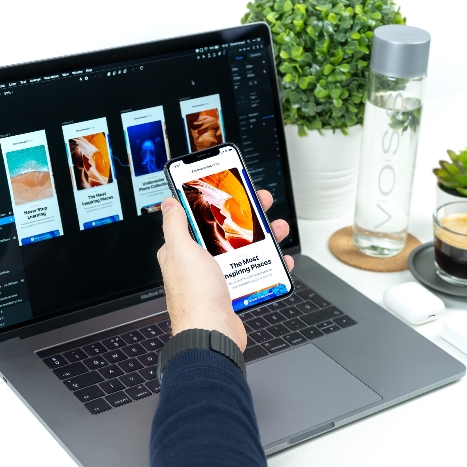
With an increasing number of smartphone users, there’s a strong chance that your visitors are looking at your website on their phones. It’s no surprise that providing an omnichannel experience will help in more ways than one. Not only will it make your event website accessible on-the-go, but it will make it easy for attendees to share your website on various platforms.
Stick to a site design that is responsive. Test it across devices and make sure those experiences are as smooth as the desktop experience.
All of this may sound like a little too much work, but I promise it’s worth every bit. And if you find this article helpful, let us know in the comments below. Also, if you come across a cool event website, share it with us!
If, like us, you're more of a social person, let's connect on Twitter (@ZohoBackstage) and we'll keep you up-to-date with all the latest event news.
 Prachi
Marketer at Zoho.


