- HOME
- Website Building
- About Us Pages
- Positioning Your About Page
Positioning Your About Page
- 9 Mins Read
- Posted on April 19, 2018
- Last Updated on October 8, 2024
- By Lauren
Not sure how to position your About page? Not sure how to structure the content? Not sure what to include, which details to highlight and which to hold back? Don’t worry. All of that falls into place as soon as you realize one thing: Your About Us page isn’t really about you; it’s about them—your visitors, your prospects, and your customers.

The most common mistake businesses make on their About Us page—and frankly, in their marketing in general—is describing in great detail what they see (or worse, what they want to see) in the company mirror. We’ve all been on About Us pages in which the company does little more than sing its own praises: how terrific they are, how exceptional their products or services are, and what a long and hard—but oh so glorious!—road they’ve traveled to become who they are today.
All of this has its place to some degree—and that “place” may very well be on other pages. But the truth is that even though your prospects have clicked on a page called “About Us,” they’re really wondering what’s in it for them.
And that is what you have to give them.
Focusing on the target audience for your About page
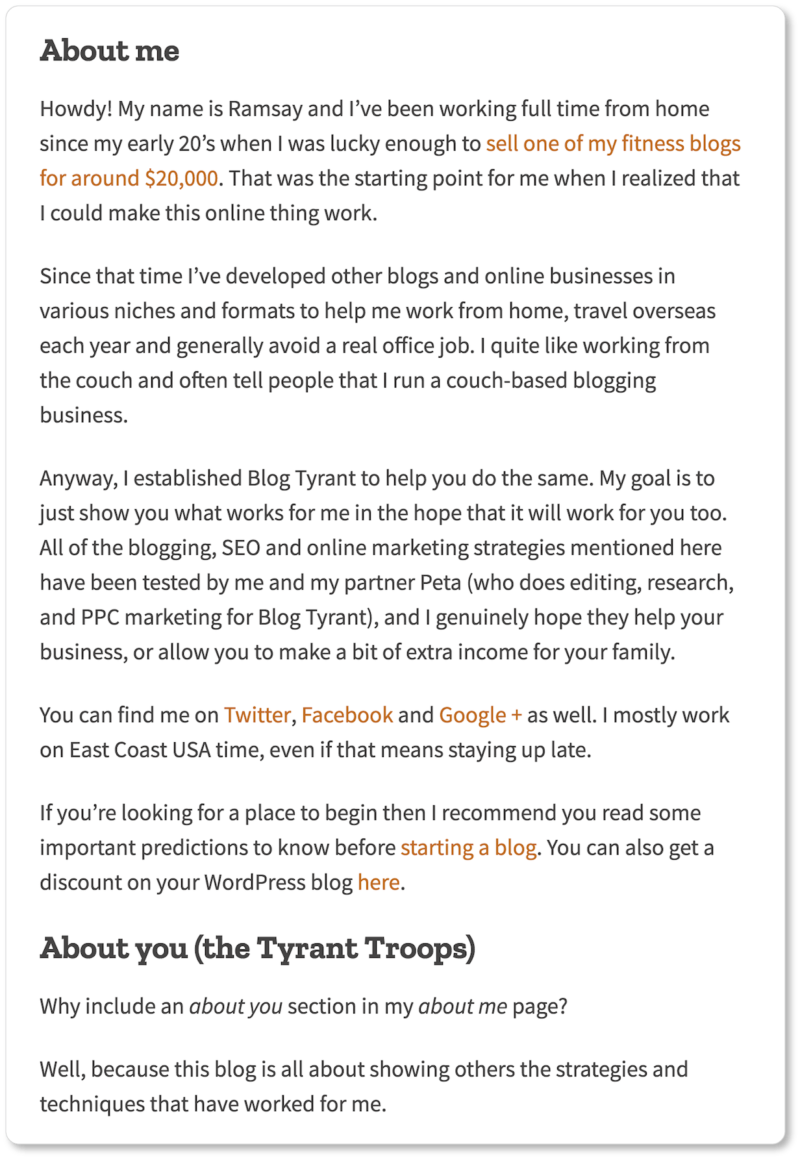
Ramsay Taplin at Blog Tyrant offers an About page that understands this marketing truth and explicitly reflects it. The page’s headline reads “About Me and You,” and the copy beneath is split into two sections: “About me” and “About you (the Tyrant Troops).”
Ramsay understands that his visitors aren’t there solely for the enjoyment of reading his blog. They’re there because they want advice on how to approach their own blogs. So after a brief “About me” that’s there to establish his authority, Ramsay turns to his readers:
The hard truth is that your prospects only care about what you do insofar as it means there’s something they’ll get from what you do. They want to know how your business will improve their lives. So if you open with what you do, or with what your product or service is (and you should!), make sure it’s from the perspective of how that product or service will benefit them:
- Why have your visitors come to your site to begin with?
- What problems do they want you to solve?
- What are their objectives, pain points, and challenges?
- What is the best possible outcome they are probably imagining?
- How can you support them in realizing this best possible outcome?
Dedicate your opening sentences to these questions. Describe your business in such a way that it paints a clear picture of the benefits you can offer each of your visitors.
Speaking to your full visitor range
We say “each of your visitors” because people will come to your About Us page with different objectives. It’s important to do what you can to speak to all of them.
MailChimp’s About page is an excellent example of a page that understands its visitors arrive with a variety of objectives; and it manages to speak to all of them:
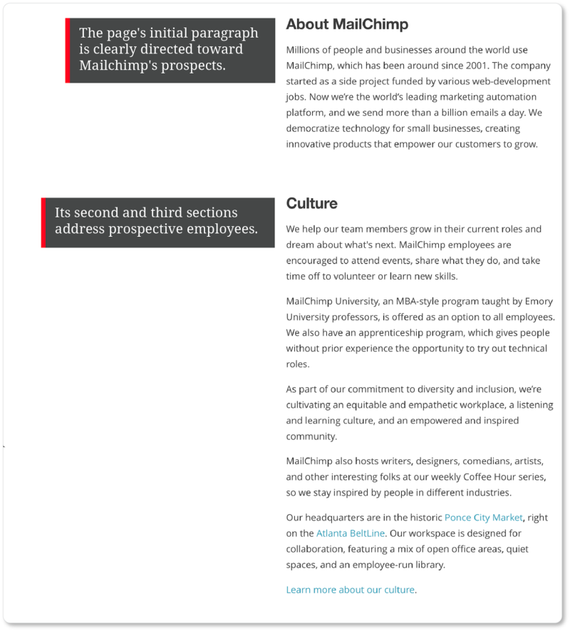
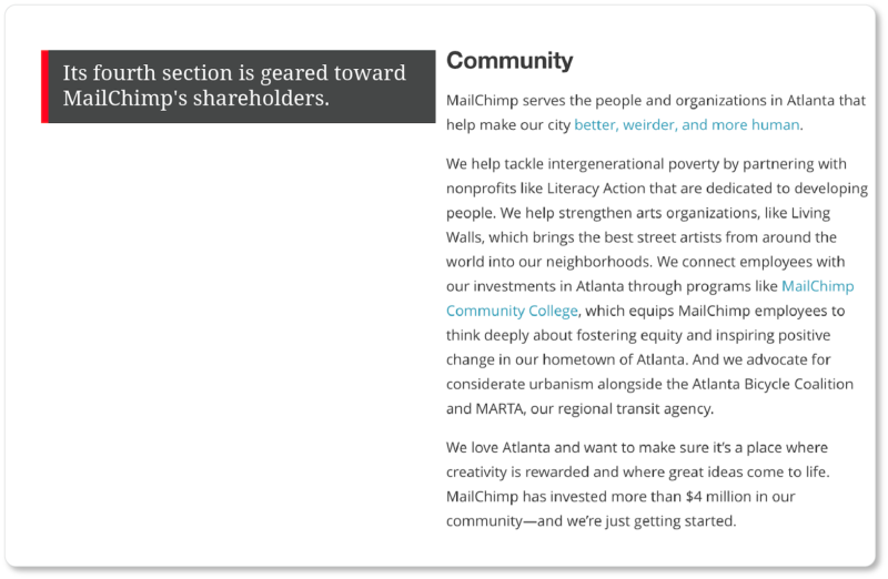
Take a tip from MailChimp and spend some time considering who your site visitors are. (Hint: It’s probably a broader range than your prospect base.) Google Analytics can help you determine where on the web your site traffic comes from (this is called “referral traffic”), and Zoho Campaigns can help you monitor which of your email campaigns is driving the most visitors to your digital doorstep.
Knowing what brought your visitors to your About page to begin with will give you some indication of what they were looking for when they arrived. Use this data to offer your visitors some answers—and some next steps to take—in your About page copy.
Drawing visitors in through their pain points
Speaking to your audience means knowing the pain points of the visitors your About page addresses. Invoking—and then speaking to—these pain points early on is a fundamental psychological strategy for hooking your visitors.
Pain Point, n. the problem your prospects face that you are trying to solve
Derek Halpern at Social Triggers uses his About page to pose a series of questions that his ideal prospects are asking… and keeps them on the page by telling them they’ve come to the right place for the answers. Echoing his prospects’ own internal monologues is certainly an attention-capturing strategy:
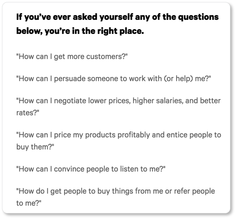
Derek’s site visitors immediately know whether or not they’re in the right place: Either the questions he’s posed are the very same questions that keep them awake at night… or they aren’t.
Those visitors for whom Derek’s questions don’t resonate can quickly disqualify themselves—and that’s okay; it saves him from having those flip-flopping conversations later on. Because for others, it will be absolutely clear that his business is a good fit. Those prospects will be thinking, “ohmygosh, he’s talking to me! He gets me!”
That’s powerful. And those are the prospects you want.
Thinking about the “About Us” page as an “About You” page is a valuable practice because it forces you to sit down and think about who your ideal customer (or partner, or future employee) really is. In this process, you get to clarify for yourself who you want to attract.
Here’s another example, from Copyblogger’s About page:


From the fourth word of Copyblogger’s headline (“Teach”), the visitor knows what’s in this site for them. Copyblogger manages to conjure their authority (“It’s how we built our company”) at the same time that they articulate their service (teaching content marketing). This is a headline that does it all.
Notice, too, that the first paragraph on the page is made up of two simple sentences: 1) What Copyblogger does, and 2) How what they do can help “you” build “your” business. (Don’t underestimate the effectiveness of “you copy.” It helps visitors feel personally spoken to, and allows them to imagine themselves already reaping the benefits of your product or service.)
So take a tip from the above examples. Write your About Us page about them.
Choosing a benefit-driven headline
If you know your prospects’ pain points, you also know what benefits you can offer them in the way of alleviating those pain points. Since we’ve just discussed Copyblogger’s headline, let’s linger on this element of your About page a moment longer.
A headline is no less important for an About page than it is for any other page on a website. Your visitors may have chosen to click in to your About page, but they’re by no means contracted to stay. So hook them—even before the first paragraph—by hitting them up front with your value proposition.
Value Proposition, n. the feature or quality of your product or service that attracts customers to your company rather than to your competitors’
For instance, here’s what’s above the fold on Help Scout’s About page:

Help Scout’s “mission” is simultaneously a benefit for its prospects—a terrific way to draw them in.
Here are some of our current favorite About Us page headlines:
- “Time Shouldn’t be a Luxury” (Hello Alfred)
- “We’re Building the Destination for Getting Things Done” (Thumbtack)
- “Making the Web a Better Place… And Loving Every Second of It” (Moz)
- “Everyone Should be Able to Participate and Thrive in the Economy” (Square)
- “We Didn’t Just Build a Better Student Loan. We Built a Community” (CommonBond)
Note that each of these headlines takes a slightly different tack. Hello Alfred, for example, states a company conviction (“Time shouldn’t be a luxury”) that contains an implicit benefit for its prospects: Since the personal home management company believes this to be true, they’re bound to take their clients’ time seriously. Square, too, offers a conviction with implicit prospect benefits.
Thumbtack, on the other hand, points to the continuously evolving nature of their product (their headline is in the present tense, as opposed to CommonBond’s), articulates their goal (to be the ultimate destination), and suggests to their visitors what they do (they connect customers with local professionals for a wide range of services).
Finally, keep in mind that benefit-driven and pushy are not the same thing; and you absolutely want to abstain from doing the latter. Inscribd has shown that “pushy, salesy” headlines actually have a negative effect on click-through rates (20% less engagement). So announce your value proposition in clear, precise language… and then let it be.
Leading with the important stuff
An oft-cited 2010 study by the Nielsen Norman Group showed that users spend 80% of their time above the fold on any given web page. Whether or not this has changed at all as we’ve become more accustomed to scrolling on our mobile phones, it’s still the case that you want your most important information at the top of your page.
Of course, in the end it’ll be up to you to determine what “the important stuff” is (you know what draws your customers better than we do), but here’s our take on it:
How should I structure my About page?
Start with a benefit-driven headline. Then, follow that with a precise summary of what you do. (We’re talking 1-2 short paragraphs here). Your summary should include enough information to let your visitors decide whether they’re in the right place. Which is to say, your summary should speak to your value proposition, and be no less benefit-driven than your headline is.
We web users are impatient. So don’t spend time “building up” to what your business does or provides. If your summary is compelling enough—and if it fits your visitors’ needs—they will indeed scroll down, and you can offer more detailed, specific information there.
Shape Design Studio’s About page offers a skillful summary of their service:

It’s worth pointing out a few things here:
- Shape’s reference to their years of experience (“over a decade”) and their training (“all of our team members have degrees in both Graphic Design and Web Design”), which helps cement them as design authorities and increases visitor trust.
- Their allusions to client benefits in language such as “outstanding reputation for quality” and “extremely high standards.” Note that this language suggests to the prospect what Shape’s services might cost relative to other design firms. (It also borders a bit on fluff, which we’d caution against.)
- Their transition from “we” copy to “you” copy in the final sentence of their summary.
Shape’s summary is followed by a section called “Meet The Team,” and then by social proof in the forms of both client testimonials and the logos of the major brands Shape has worked for.
social proof, n.The psychological phenomenon in which people rely on the actions and evaluations of others to determine the “right” choice for them in a given situation
Compare this to Basecamp’s About page (sorry, Basecamp!):
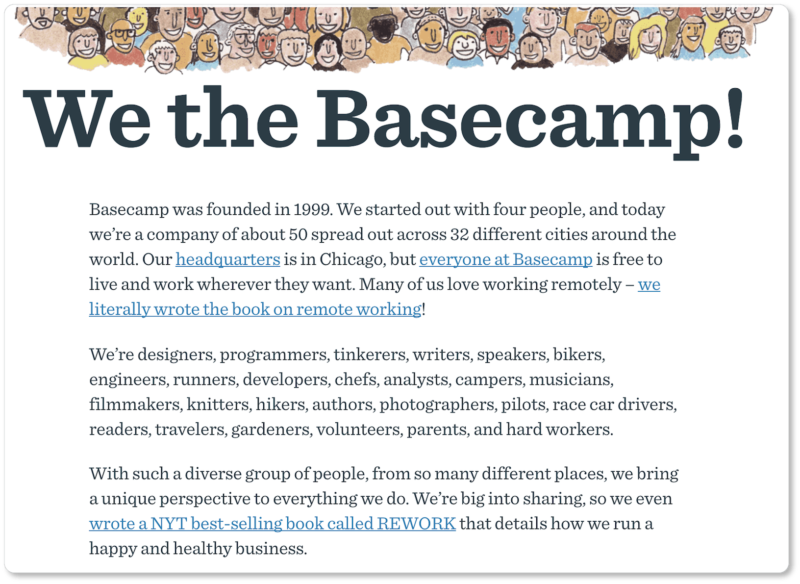
What you see here is everything that’s above the fold on Basecamp’s About page. You know a lot about the company before you scroll down (if you decide to scroll down): how many people work for them, where in the world they are, how happy they all are to be working remotely, what they all do in their spare time, how diverse they are, how they collaborated on a book together. Indeed, the words “we” or “we’re” occur ten times in this short space… and there’s not a single “you” or “your” in sight.
Can anyone tell us what Basecamp does based on what’s here above the fold? Who their customers are? What they can offer their prospects?
(That’s okay; neither can we.)
Don’t follow Basecamp’s lead here. Keep this formula in mind as you write the headline and opening paragraphs of your About page:
- What your pain point is (and how we can fix it)
- What, exactly, we do (and how what we do can help you)
- What our qualifications are (and thus how we can help you better than our competitor can)
A clear audience makes a good page
As you can see, figuring out the target audience for your About page means quite a few things. It means knowing the range of people who’ll be visiting your website, and understanding what relationships they might want to have with your business.
It also means narrowing down, in particular, on your prospective customers’ pain points, and knowing how to phrase your value proposition in such a way that prospects trust you can pacify those pain points. This trust is elicited by stressing customer benefits in both your headline and your leading copy, and summarizing what you do in a way that evokes your authority in your field.
In the next section, we explain how to use language and tone to your advantage by speaking as your most authentic self. If you can do that while reflecting your company personality, you’ll be well on your way to a highly compelling About page.