- HOME
- Website Building
- About Us Pages
- Improving Engagement and Conversions on Your About Us Page
Improving Engagement and Conversions on Your About Us Page
- 11 Mins Read
- Posted on April 16, 2018
- Last Updated on October 8, 2024
- By Lauren
The copy you incorporate into your About Us page is critical to drawing visitors, prospects, and customers further down your sales funnel, or otherwise into relationships with you.
But copy isn’t the only tool in the marketer’s toolbox. Multimedia content can enhance your copy by offering your visitors a deeper impression of the personalities and values behind your company. Testimonials and other forms of social proof can provide unbiased confirmation that your company is as good as it claims to be. Displaying your contact information prominently can help build visitor trust. And a well-calibrated CTA can turn your About Us into a veritable master tool for converting prospects. If you present the right combination of these elements, the results will speak for themselves. But figuring out which elements you need and how to deploy them can be a tricky task. Let’s explore our best practices for increasing the effectiveness of your About page.
Images and videos
This should really go without saying after everything we’ve shown you so far, but we’re saying it anyway: Use images and videos on your About page.
The modern media consumer skims text but is captivated by moving media. This is simply a fact of our moment. There’s precious little you can write that will grab your visitors’ attention faster than a good image or the first few seconds of a good video. In fact, Eyeview Digital says that using video on your landing pages can increase conversion rates by 80%. So treat your prospects’ eyes to some visual candy.
The images and other multimedia you use don’t have to be fancy. In fact, they’re often more interesting and meaningful if they’re not the perfectly polished stock photos we’ve all grown to mistrust. Show photos of your team in action, doing what they love in their work environment. You’ll literally be letting your visitor in behind the scenes of your company. And they’ll love that access.
The small, family-run wool company Cestari Sheep and Wool has an About page that uses the multimedia approach to great effect. Their choice of images, ranging from black-and-white to more contemporary-looking, gives weight to Cestari’s claim to longevity above the fold.
They also include two videos at the bottom of the page: one in which the CEO discusses the company’s history and its founding values, and a clip from the television program Real Virginia that Cestari was featured in. (The latter video serves as social proof, which we’ll have more to say about shortly):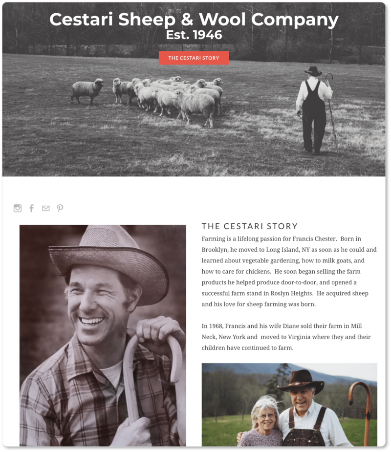
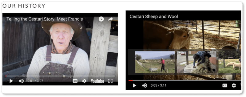
Cestari Sheep and Wool exemplifies skillful use of About page visuals that are neither high-tech nor elaborate. Their page gives visitors the impression of a home-grown product produced with a lot of hard work and care by a business that has deep roots in their industry—as well as deep family values.
Bodybuilding.com includes a video of their core values on their About page. The video is 25 minutes long, but worth the watch:
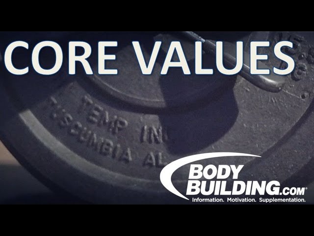
Bodybuilding.com’s video has been executed extremely well; but again, your media doesn’t have to be high-tech (or this lengthy!) for your values to be clear and for your prospects to be moved.
Customer testimonials
Your story, photos, and videos will go a long way toward helping your prospects understand the kind of company you are, the culture you promote, and the values you hold. Nonetheless, prospects will be reading your About page with the instinctive human need to get reassurance from someone who is not you. Of course you think you’re awesome… but who else does?
At some point your prospects will go looking for that unbiased proof from an outside source. So why not give them that assurance without making them leave your About page to get it? Otherwise you run the risk that they’ll seek reviews elsewhere—and those are reviews you won’t be able to control.
So take a break from talking for a moment, hand your most loyal customers the mic, and let them do the talking for you. It’s a way of preempting objections and increasing trust. Of course you’ll want testimonials on your home page and your landing pages as well—you may even want a page wholly dedicated to testimonials—but an About page is an important place to fold in a few standout examples.
Include your customer’s or client’s full name (not just their first name) and whatever relevant details might add to the credibility of the testimonial. Even better, include photos of the customers who’ve written the testimonials. People trust faces more than words. And even better than photos? See if your customers would be willing to film a video testimonial for you. Your prospects’ trust in your company will soar when they get to watch a person endorse you.
According to Zendesk, 90% of people claim that positive reviews and testimonials have influenced their decisions to buy. Conversion Rate Experts made $1 million per year in new subscribers for Moz when they added a long section of testimonials from SEO specialists to their sites. And while your business might not be Moz, all studies point to the role solid testimonials play in conversions.
FortyOneTwenty displays a single visible testimonial just below the fold on their About Us page—but it’s a remarkably well-written one from a big name. And if visitors want more proof, they click on the arrow to the right of Jason Ehrlich’s photo for more testimonials: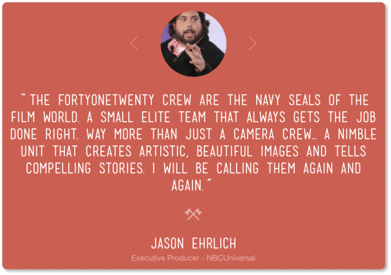 Carol Tice of Make a Living Writing includes a section of “Reader Raves” on her About page, which she prefaces with “Enough from me about me—here’s what my readers say about this blog”:
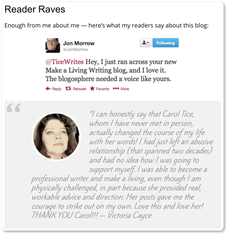 Notice that Carol doesn’t just use photographs; she also takes screen shots of Tweets so that her site visitors are all the more ready to believe that these testimonials are real.
Rather than taking them from single individuals, Econsultancy gets testimonials from the major businesses they work with… which means they get to showcase those businesses’ logos on their About page: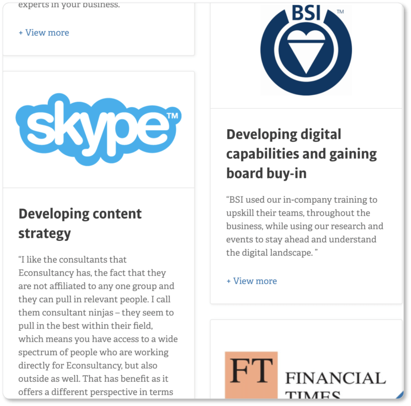 It doesn’t matter whether your clients are big corporations, famous celebrities, or otherwise unknown people. A testimonial always makes a difference.
Social proof
Social proof is the psychological phenomenon whereby people rely on the actions and evaluations of others to determine the “right” choice for them in a given situation. Social proof leads to social influence; it’s an indispensable marketing concept for this reason.
Social proof can go a long way toward enhancing your professional image, your legitimacy, and your prospects’ trust in your business. Customer testimonials are one form of social proof. But social proof also includes:
- Awards your business has won and recognitions it has received (particularly the customer-focused ones)
- Press and media mentions (i.e. interviews and publicity in newspapers or online publications)
- Community service
- Endorsements
- Designations from oversight associations (i.e. the BBB, Consumer Reports, or review sites such as Angie’s List)
- Logos of professional organizations you belong to (i.e. the local Chamber of Commerce)
- Clients’ logos (particularly if those clients are big names—see the Skype example above, or what’s below the fold of FortyOneTwenty’s About Us page):
 Including social proof is a way to toot your own horn while letting others do the horn-tooting for you. Links to interviews, screenshots of social media shout-outs, and photos of you accepting that big award help leverage social proof to your best advantage. You may not be able to include photos of yourself with Oprah like Marie Forleo does on her About page…
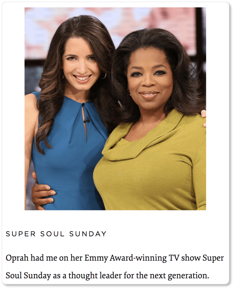 But you can absolutely feature a quote about your business from a credible local news source or mention an award in a prominent place on the page. Social proof simply serves as evidence that you are precisely who you say you are. You don’t have to be big, or grand, or famous. You only have to be honest… oh, and good at the work you do.
Contact information
Your visitors may still have some questions at the end of your About page. So make it easy for them to contact you—the real people behind the site—if they need to. In fact, encourage them to if they have additional questions or concerns. Every phone call your team fields, after all, can mean another conversion.
Even if your prospects never decide to use that contact information, having it there cements trust. A website without contact information tends to set off “scheme” alarms: If you’re not willing to be forthcoming about how to get ahold of you, what else might you be holding back?
If you’re not comfortable disclosing your full address on your site, at least include your city and state, your phone number and email address, and your social media handles (Facebook, Twitter, LinkedIn, Instagram, etc.) so it’s easy for your visitors to find and follow you elsewhere.
List as many modes of contact as you can, as each of your prospects will have a preferred method of getting in touch. More options means it will be easier to get ahold of you if something goes wrong, which is another form of reassurance.
It should go without saying, but always make sure this information is up to date. An out-of-date email address or phone number might not just lose you a sale; it could also set those alarm bells ringing.
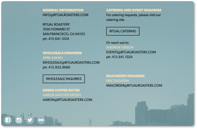
Jay Baer of Convince & Convert lists both his phone number and his email address, along with a photo, so visitors have an idea of whom they’re talking to when they call. So does everyone else on his team. Even better, they include the city and time zone they’re in, so prospects have a sense of what their “office hours” are, and when they’re most likely to be available: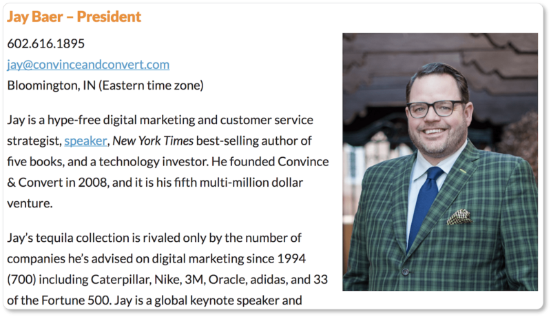 Ritual Coffee Roasters includes several methods of contact for different inquiry types on its About page. You’ll also notice the social media buttons in the bottom left-hand corner—which, if it were up to us, would be a little more conspicuous:
 To cement prospects’ sense of your approachability, add a conversational line prior to your contact information to let them know you welcome their calls and emails. Even something as simple as “We’d love to hear from you!” could be that final prompt for a prospect to get in touch.
Close with a CTA
It’s important to have a CTA on every page of your website. After all, your site isn’t there just to announce that you exist and nothing more. You’ve built your website with an eye toward conversions. And a CTA is precisely what will lead to these.
Marmoset Music includes a persistent (and rather brilliant) CTA on its About page that invites visitors to “Turn On Marmoset Radio”: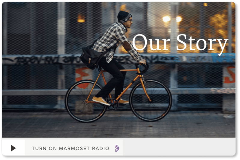 When a visitor clicks the “play” button and begins listening, they’re then given the option of adding any song to their “favorites,” adding it to a mixtape, or downloading it. (Of course, they have to register before they can follow through on any of these options; and Marmoset has wisely obtained a new lead by giving them a taste of the company’s offerings):
 Remember that prospects are on your About page because they’re already interested in you and they want to know more about your business. And they’ve just been informed and—ideally—inspired by your About page copy. Offering them a subscription to your mailing list or your newsletter is like offering them more of what they were already looking for. QualityStocks saw a 158% increase in subscriber growth when they added an opt-in form to their About Us page.
NexxCom Wireless does something a little different by offering a free whitepaper on their About page. Of course, it isn’t exactly “free”; prospects have to give NexxCom their email addresses in return: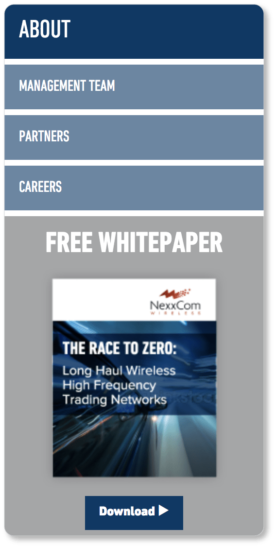
Your About page CTA will depend on the product or service your business offers, as well as where most of your About page visitors are in the sales funnel. (This is something you’ll determine over time—and then again and again—through analytics):
- If your funnel is entirely self-contained within your website, a direct link to your most conversion-inspiring page will help you point prospects in the right direction.
- If you tend to nurture your leads with outbound marketing, attach your CTA to an embedded signup form for your email list.
- If you do direct sales, include a Contact Us form that ties into your CRM and automatically assigns those new leads to someone on your sales team.
- If you want to provide instantaneous contact, funnel your most promising visitors to your most effective conversion tool: live-chat specialists. Automatically initiate chat sessions with visitors when they complete predefined actions, such as spending a certain amount of time on your About Us page. (A live-chat window is, after all, just another type of CTA.)
Whatever you decide to ask for or offer in your CTA, the point is to keep your prospects moving in the direction you want them moving. That said, there’s a difference between an About page with a hard sell and a conversion–friendly About page. The call to action on your About page shouldn’t cost your prospects a dime.
Once they begin receiving your email marketing or start chatting with a sales associate, then you can think about converting those prospects into buyers. For now, we suggest you simply convert them into prospects-willing-to-get-even-more-information-from-you.
Iterate, A/B test, improve
Yes, the point of your About page is to tell your company story. But underlying that, the About page has a much more basic purpose: to drive prospects further down the sales pipeline.
With so many components working in tandem—copy, images, videos, social proof, contact information, and CTAs—striking the perfect balance on the first try is highly unlikely. That’s where revision and A/B testing come into play.
Even before your page goes live for the first time, have someone who doesn’t know your business take a look at it. Ask them what they think your business does and what it can offer its prospects. If they can’t answer those two questions, go back to the drawing board and look at that copy again.
Once the page is up, use heatmapping tools (Optimizely, Crazy Egg, Zoho PageSense, and VWO are all great options) to determine where the most user interaction is happening and which page elements aren’t pulling their weight. Heat maps track your mouse movements and will tell you where your visitors hover, where they click, and how far they scroll down a page. Here’s what PageSense’s interface looks like: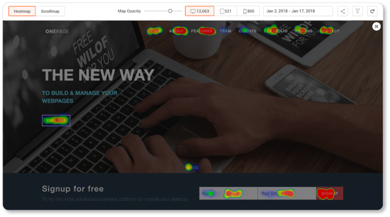 You can then use that information as a starting point for your A/B testing. You might run a Split URL test (an A/B test in which different URLs are tested against each other) and experiment with the copy and placement of your CTA, the placement of your images and videos, the font, the tone you take in your copy, and its length.
Keep in mind that A/B testing is a slow, iterative, and patient process: You’ll be testing one small change at a time with the goal of incremental improvement. That’s because each discrete page element is testable for any number of variables. It will take months—maybe years—of experimentation and creative thought.
And once your About page is great from an A/B testing perspective? Keep returning to it anyhow. Because if all goes well, your business will be growing and transforming, and your About page should grow and transform with it. Remember, your About Us page is a living document. And ultimately, the more alive the page is, the more alive your business will appear to your site visitors.
We’ve loaded you up with best practices and other recommendations for your About page; but it may be helpful for you to see them all in one place. In the next section, we’ve got an About page checklistfor you. Print it out and check off the elements your company’s About page contains… and if there are things it doesn’t, test them! We want to ensure you’re offering the most compelling About page you possibly can.