- HOME
- Ecommerce branding
- What do customers expect from your ecommerce website
What do customers expect from your ecommerce website
The million-dollar question: how are customers really making buying decisions on your ecommerce website? Whether website visitors already know your brand or are exploring product categories, the answer to this question is the holy grail of ecommerce marketing. While some brands always appear to be on top of this problem and seemingly have all the answers, we can assure you that almost everyone in ecommerce struggles with this question every day.
Buyers tend to purchase products when they have confidence in your business. This confidence comes from the care you take to solve any potential problems the buyer might have. Once your "story" aligns with the buyer's desire, the buyer feels confident about your business. When your product (or service) instills the same confidence in the buyer with the right balance of value (price, speed, and quality), you will have won the customer.
As a seller, you need to resolve the problems faced by a customer. Your brand story needs to align with the customer's needs and when your product proves its efficiency, that is when a customer feels confident about your business and makes a purchase from you.
But, it's usually not as logical as all that. Buyers usually don't have a checklist of things they're looking for. Most customers purchase products because of how your brand, your story, or the product makes them "feel." This makes answering "What do customers want from your ecommerce website?" a little difficult to answer. This blog will provide you with tips to make your customers feel confident about your brand and show how Zoho Commerce will be able to help achieve it.
A fast, stable experience
Research shows if a web page takes longer than two seconds to attain "first paint"—the length of time it takes for the first pixel to appear when a page is loading—most people will hit the back button or just close the tab. Whether the customer is browsing your site on their computer or their smartphone, they must have a fast experience. Most of the website traffic is moving to mobile, so optimizing your website for a smartphone is a must. It's just better for your business to set up your ecommerce website to work seamlessly across all devices.
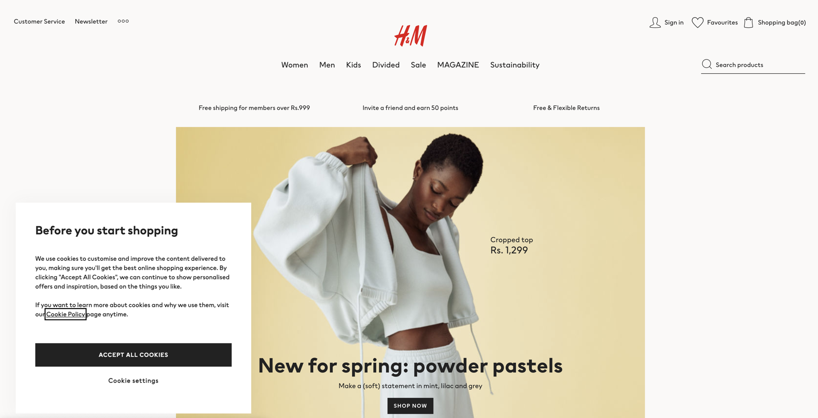
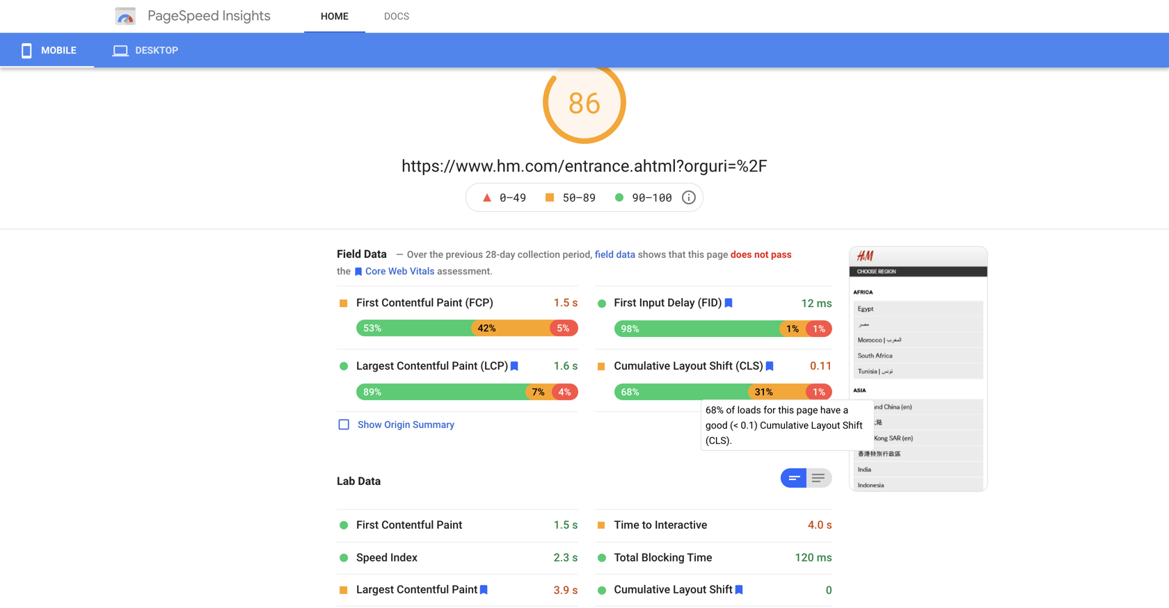
Example: With the website load time being reduced to milliseconds, it's essential that your website loads faster than ever. . The load time has now become a key factor of the user experience. H&M is one of the fastest websites to achieve first paint. The page needs to ideally load in the least amount of time. Google page speed insights have been added to see how fast the page works in real-time.
Pro tip: Zoho Commerce comes with a responsive design. All you have to do is design one website and it will automatically be featured both on desktop and on mobile devices beautifully.
Futuristic Designs
The look and feel of your ecommerce website will go a long way in impressing your customers. While the colors and fonts have a role to play, most of the work should go toward building a logical flow to your website so your customers can reach the point of purchase quickly. Your aim should be to improve the customer's journey. Think of where the customer will enter your website (just like the front door of your retail store) and what you want to place in front of their eyes first. As they browse deeper through the website, organize things clearly and make the navigation as intuitive as you can. Simplicity and a clean design work in your favor. Having the relevant design elements in the right places—categories, collection, and search—is going to the customer's site experience by making navigation simple and intuitive.. Take advantage of this!
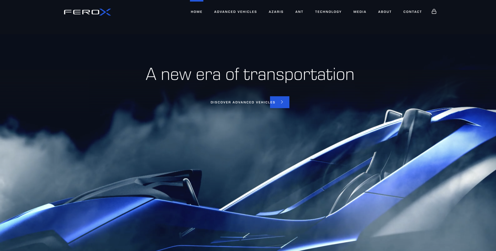
Example: FerroCorp has come up with a simple yet futuristic design. They have a well planned website structure and categorization has been perfected.
Pro tip: Make use of the About Us page to provide an emotional touch to your customers. Design a lucrative return policy that gives your customers the confidence to experiment. Learn more about the different pages on our blog.
Detailed, accurate information on products
Customers often go online specifically because they want to avoid having to deal with a sales representatives.Try to place as much detail about the product, some reviews, technical details, and the USPs on the product page itself. If the content is not detailed enough, potential buyers might abandon their quest to purchase the product on your website.
Always keep the product page updated (especially if the latest batch of the product is different) because the product has to match the description—any inaccuracies will result in customers being unhappy with their purchase and asking for a return.
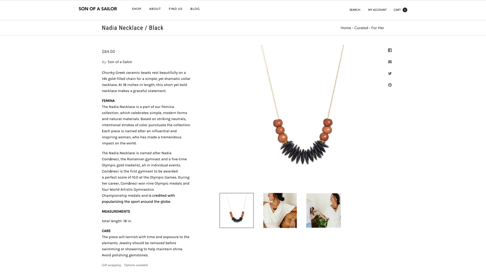
Example: Son of a Sailor is all about handmade designs that are crafted with precision by the hands of expert craftspeople. In addition to the basic details, they include storytelling in their product description. They also provide small tips to improve the life span of these products, which helps add value in the form of improved SEO.
Product images and testimonials
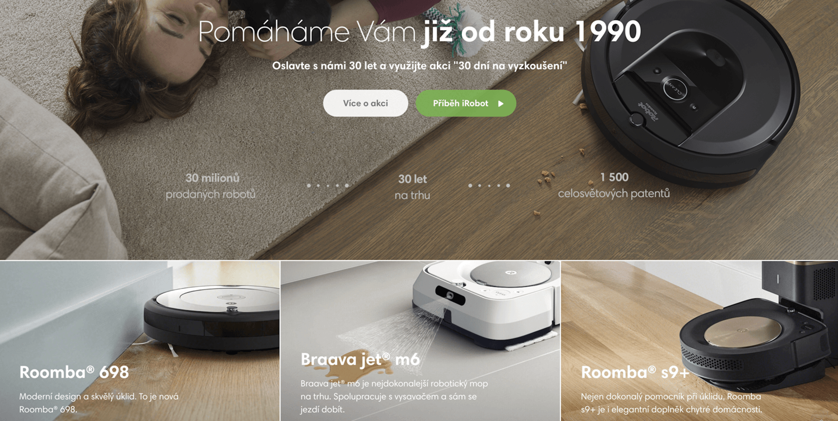
Images are one of the most important factors for potential customers when deciding to purchase. High-quality images, preferably from multiple angles, give customers confidence in your product. Ensure that the product images load quickly, and add features such as zoom to the images in order to make shopping more experiential for your customers.
Example: iRobot has a beautiful website that provides great pictures of the product and adds a touch of realism by placing the product in an environment that might be similar to the customer's. This helps increase the customer's emotional connection to the product.
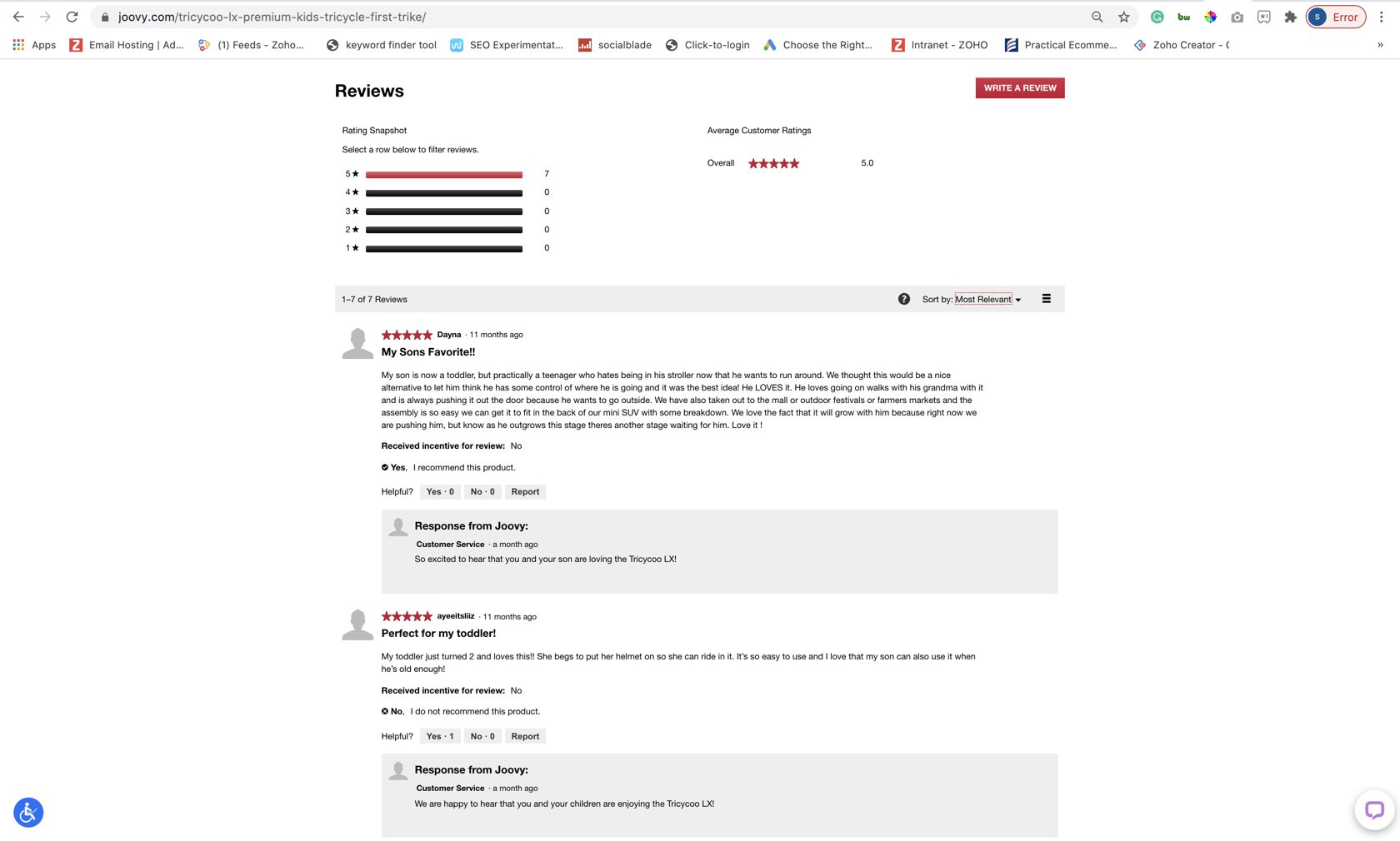
Another important factor when purchasing a product is hearing other customers who've bought it vouching for its quality. Knowing what other people think about a product and what their shopping and product experience has been builds trust in your brand. Your customers will feel more comfortable purchasing from you when they can see and read authentic, unbiased, third-party ratings and reviews.
Example: Joovy is a brand that offers cycles, strollers, and other accessories for kids. They've included a product review section below each product's landing page. This way customers read about all the features of the product along with the reviews posted by other customers.
Fast search
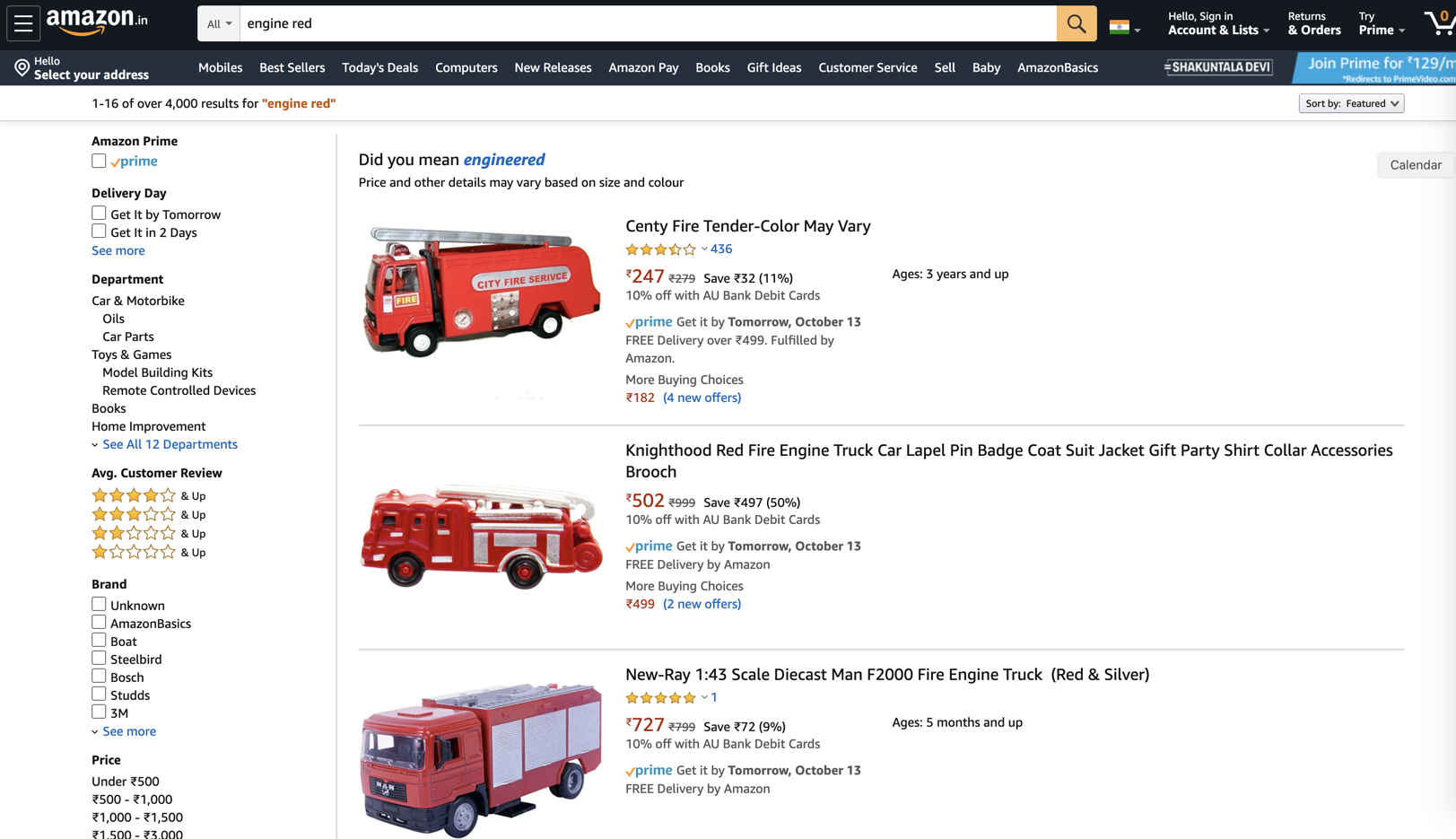
The search bar is sometimes the first place customers turn to find what they need. It should be easily located, usually on the top portion of the page. Smart features, such as an auto-complete function, simplify the experience. The important thing is to present results that match the true intentions of your customer. Whether you present results in a list or grid format, make sure to render images with prices and ratings as a sort of quick snapshot.
Example: One of the best search features belongs to Amazon. Their search bar is hard to miss. And the best part is that Amazon returns relevant results even for the most random searches. This way, they provide customers with options which helps them to buy from their website.
Personalized recommendations
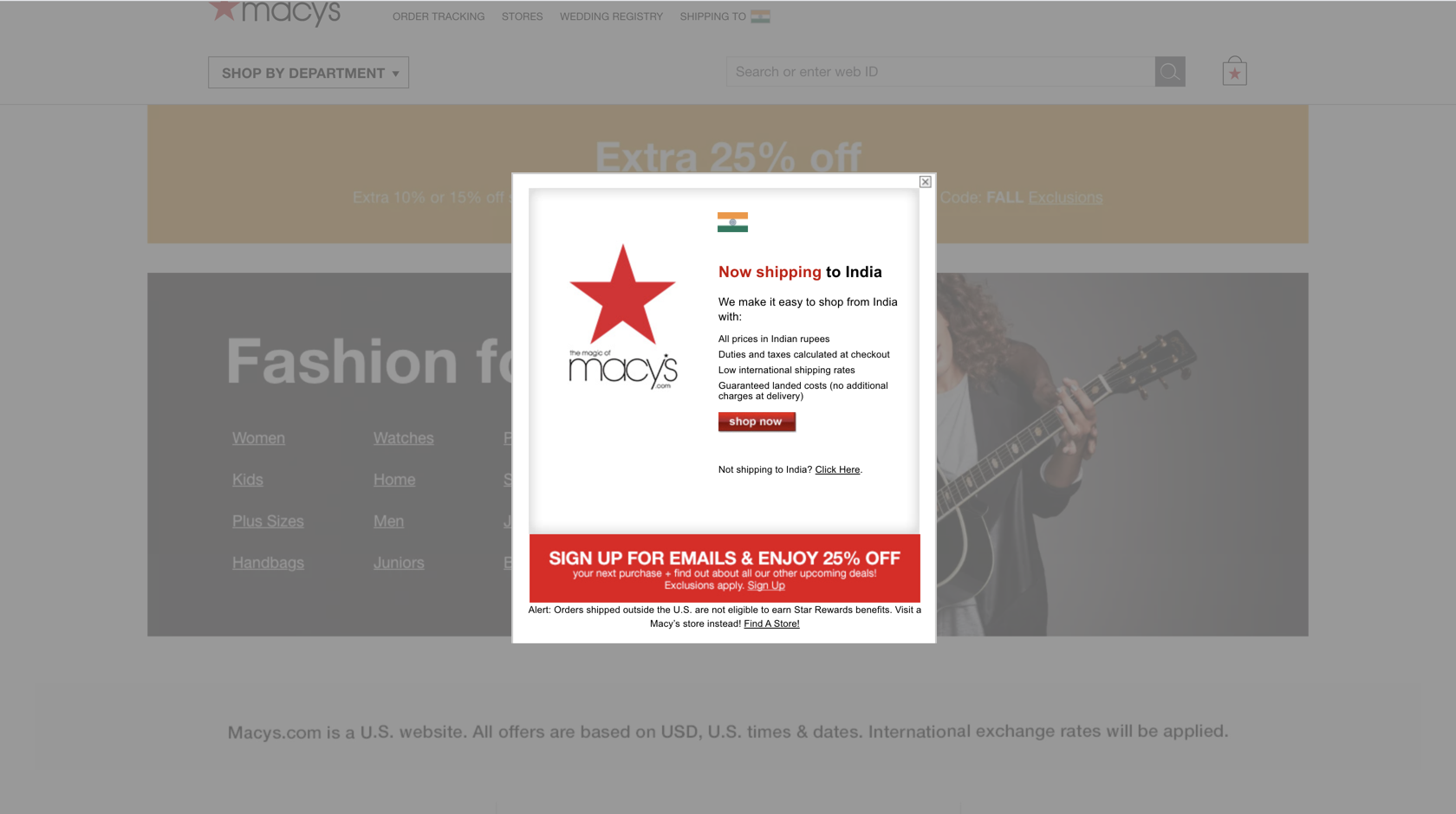
Technology has come a long way in personalizing the online shopping experience. With the right tools in place, you can leverage state-of-the-art technology that uses artificial intelligence and machine learning to put the right products in front of your customers and prompt them to make a purchase, sometimes even before they feel the need. Gartner predicted a 15% profit for businesses that focus on personalization in ecommerce. This is reason enough to pursue personalized recommendations.
Example: Macy's, an online department store, provides personalized messages based on geolocation tagging. Also, a customer's browsing history allows ecommerce stores to provide them personalized recommendations.
Pro Tip: Zoho Commerce has its very own AI bot, Zia. Zia is the mind behind our product recommendation feature and provides your personalized recommendations based on the browsing history of your customers within your store.
Customer support and online chat
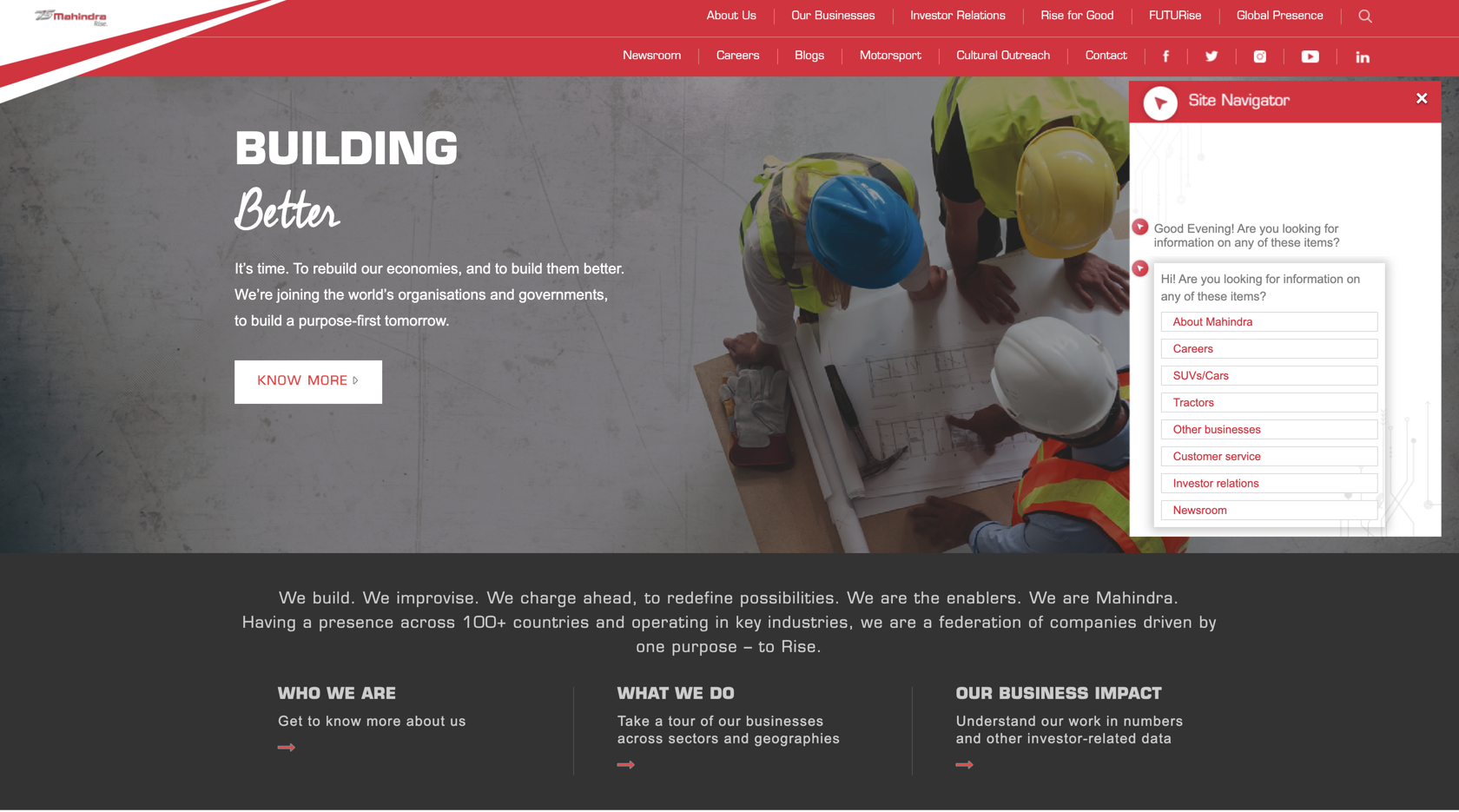
One of the biggest factors in determining whether or not you've scored a customer for life is the support you extend both pre- and post-sales. Most customers prefer having access to live chat right in their browser window to get their questions answered in real time, but you can also set up a chatbot with automated responses to help answer the most common queries.
Example: Mahindra is a renowned car brand. They use Zoho SalesIQ on their website to guide their customers with online navigation and for faster resolution of customer queries. Zoho SalesIQ will help automate your customer support via chatbots. This way, fewer employees are used while being able to provide customer support 24/7.
Shipping information and post-transaction notifications
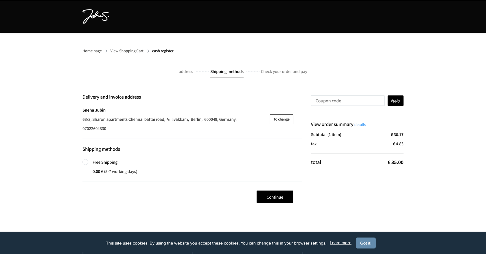
Customers make the final purchase once they're satisfied with the delivery details. Adding the perfect product to the cart, only to be told at checkout that it will take a month to deliver, is a turn-off. First and foremost, inform the customer of an accurate expected delivery date and the shipping cost. If you expect the delivery to be late, keep the customer informed. While free deliveries are the best option, if there are shipping costs, mention them upfront so that customers don't abandon their carts. Also, if there is faster shipping available, include that information.
Example: johnsparks.de is a clothing brand that caters to customers around Europe. They have live shipping rates at checkout, which helps their customers make better choices. Also, their cart abandonment rates have reduced drastically after this Zoho Commerce feature enabled their customers to anticipate shipping costs in advance.
After a customer has bought something, notify them immediately via email, message, or text about their purchase. This sets expectations about the communication channel you'll use for sending and receiving information. Send out a receipt with all the details and provide a link for tracking their order. If possible, add a more advanced feature like email and transaction updates where you can directly message customers in case of any delays or send personal messages. Your customers will greatly appreciate the proactive gesture.
Pro tip: Zoho Commerce allows you to customize your email templates. You can send personalized messages to your customers from your primary email address too. This way your customers will never miss an email from you. Pair this with Zoho Campaigns to maximize your reach and set up email campaigns for different occasions.
Customers want to feel special and enjoy the shopping experience, even if it's online. While it has brought unparalleled convenience to the world, online shopping also creates expectations that customers have for ecommerce websites. Get the design elements right, create an organized hierarchy for your product catalog, and be ready to serve the customer throughout the purchase cycle, even after delivery. A delightful experience is a surefire way to guarantee customer loyalty and business success.
Commerce Insights is a blog maintained by Zoho Commerce for ecommerce merchants. We discuss topics relating to product features, getting started with ecommerce, and marketing ideas for businesses.
We want you to be a part of this journey in building an ecommerce community. Please send us your thoughts, suggestions, and ideas at marketing@zohocommerce.com.
If you wish to publish an article on the platform, please send it to the same email.
For support-related queries, please write to support@zohocommerce.com.
