Gartner

Zoho recognized for the 3rd consecutive year in the 2024 Gartner® Magic Quadrant™ for Analytics and Business Intelligence Platforms. Read more

Rated as an experience leader in the customer experience model and a credibility leader in the vendor credibility model. Read more

BARC

91% of surveyed users would recommend Zoho Analytics, and 79% of surveyed users are satisfied with Zoho Analytics. Read more

  • 16K

    Customers

  • 3M

    Users

Key features of our pie chart maker

Drag-and-drop interface

No technical expertise? No problem. Build charts with just a few clicks. Just drag, drop, and design—it's that easy.

100% customizable

Add a legend to your pie chart and customize its position. Choose to display legends with or without values and apply your preferred color palette.

Live, interactive charts

Impress your audience with live, dynamic pie charts that automatically update when your data changes.

Share, download, or embed

Export your charts in multiple formats, embed them in websites or presentations, or share them directly with your team.

Create it and forget it

Connect your charts to live data sources, and let your chart auto-sync with scheduled data updates.

50+ visualization types

Go beyond pie charts and explore a world of data visualization possibilities. From bar charts to scatter plots, we’ve got you covered.

Create a pie chart in less than 5 minutes

Create your first live, interactive pie chart in minutes and transform the way you communicate your insights.

Import your data

Upload files or sync directly from live data sources like spreadsheets or databases.

Drag and drop your columns

Choose the data points you want to visualize.

Select your chart style

Pick from an array of stunning, professional chart designs.

Customize

Fine-tune every detail, like add titles, adjust colors, and tweak layouts.

Download, share, or embed

Export in various formats, or embed a live, interactive version anywhere you like.

Create a pie chart in less than 5 minutes

AI-powered pie chart maker: Visualize smarter, not harder

Our advanced AI features make creating pie charts and other data visuals seamless, intuitive, and insightful.

Create charts using natural language

Just type your query in plain language, and Zia, our intelligent AI assistant, will instantly generate the perfect pie chart or data visualization for you.

Example

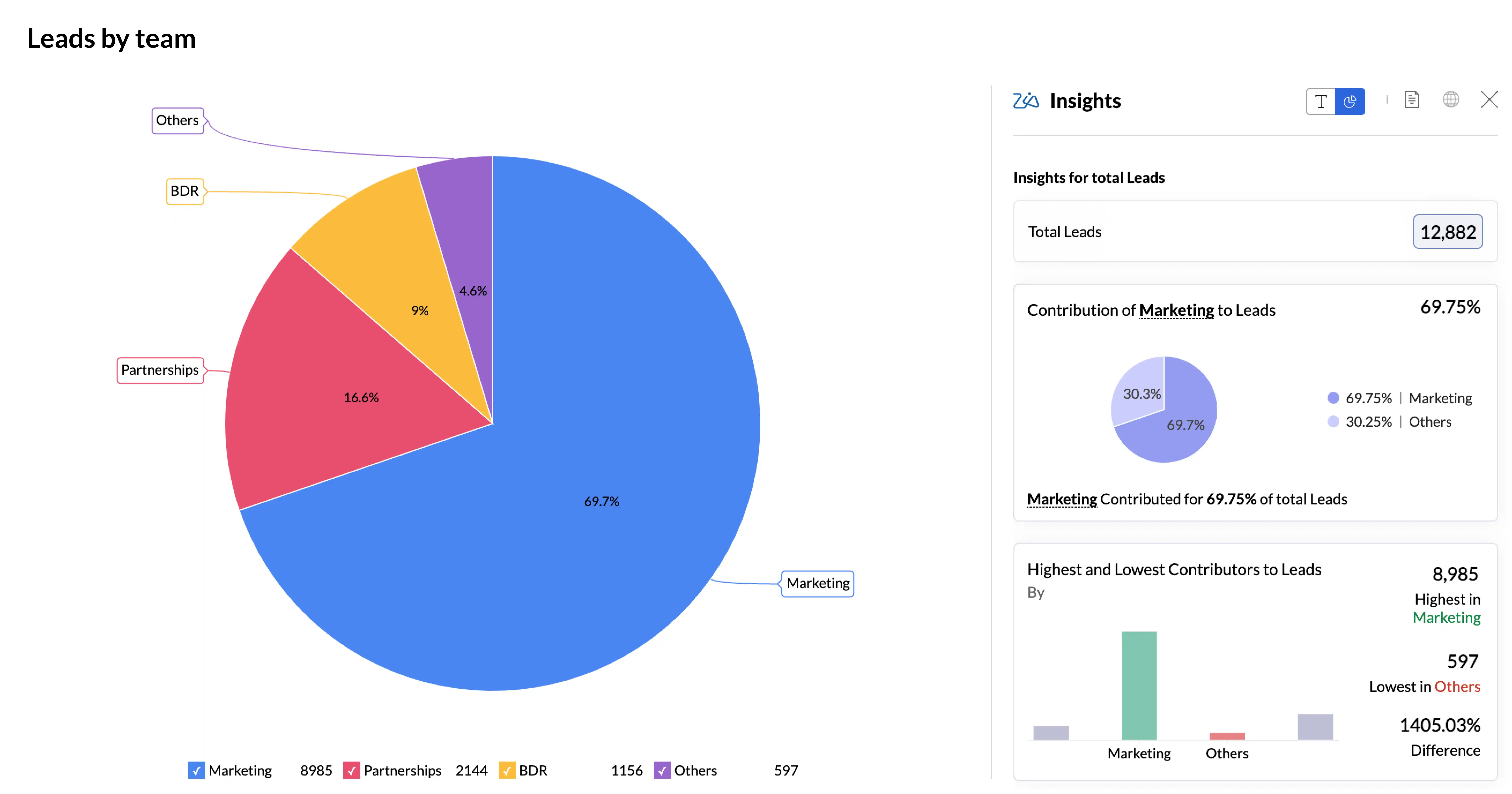
Type “Create a pie chart showing total sales by region”, and watch Zia create an interactive pie chart in seconds.

Get AI suggestions for better visualizations

Not sure which chart type suits your data best? Let Zia guide you.

Tailored visualization options: Zia analyzes your data and suggests the ideal chart type for maximum clarity and impact.

Smart recommendations: From visualization suggestions to data column selection, Zia ensures your charts are both accurate and visually compelling.

Go beyond visualization with Zia Insights

Data is more than just numbers; it’s a story waiting to be told. With Zia Insights, you’ll:

Uncover key takeaways: Get actionable insights summarized in clear, concise narratives.

Save time: Skip the analysis paralysis—Zia delivers what you need to know, fast.

Make informed decisions: Empower your team with data-driven insights they can act on immediately.

Step into the future of data visualization

Say hello to modern, interactive charts and reports. Create your live pie chart today.

Sign up for freeSIGN UP FOR FREE

Present your reports like never before.

Why you’ll love using our pie chart maker

Take a look at how Zoho Analytics stacks up against other pie chart makers

FeaturesOther tools
Zoho Analytics
Data source supportLimited to specific file uploads or requires manual entrySupports 500+ data sources
Data updatesManual updates requiredAutomatically updates with data refresh
Chart interactivityNo live or interactive chartsInteractive and live chart for real-time enagement
CollaborationNot possible to collaborate with teamsTeam members can comments and annotate
SharingNo simple sharing methodsShare charts easily via links
ExportLimited to image filesExport in multiple formats (PDF, JPG, etc.)
EmbeddingCannot embed in websites or presentationsEmbed live charts into websites, presentations, and more.

Pie chart examples, created using Zoho Analytics

Explore examples of how our pie chart maker transforms raw data into polished, insightful visuals.

Organization distribution by industry

Organization distribution by industry

Leads distribution by tags

Organization distribution by industry

NPS response rating

Organization distribution by industry

Market share comparison

Organization distribution by industry

Perfect for all your visualization needs

Business reports

Highlight trends, track progress, and communicate insights effectively.

Presentations

Make an impact with visuals that engage and inform your audience.

Infographics

Combine creativity and data to tell compelling stories.

Hear from our happy customers

See all testimonials
profile
Connor Nobert
Director of Analytics and Technology, Pulse LLC

"Zoho Analytics gives us a superior edge over Power BI and Tableau, when it comes to the aesthetics of visualization. ‌We're very happy with Zoho’s capability."

profile
Steve Dubane
Founder & CEO, Wingman Media

"Zoho Analytics created a tremendous amount of value for the agency and takes our relationship with clients to the next level. The preparedness to integrate the data, build alluring visualizations, and its shrewdness have given us the ability to retain clients.

profile
Korvi Rakshand
Founder, JAAGO Foundation

"Our main intent was to make data-driven decisions. We use Zoho CRM and Zoho Books and we wanted to precisely analyze every single data point from these apps. So we fell back on Zoho Analytics. The visualization with data precision is impeccable and we are extremely happy with the Zoho suite of products."

profile
ED Levis
Head of IT, NYC Navigator

"Data visualization is important for any BI tool. It's great to present data in a way that is meaningful to the audience, helping them quickly grasp the content. That’s where Zoho Analytics is very strong. We now analyze our sales, operations, and finance using Zoho Analytics."

profile
Daniel Franey
Director & Shareholder, Courier logistics limited

"With Zoho Analytics, the ability to visualize things became easy. Most of my managers now use Zoho dashboards and quickly create reports themselves. Its usability features, like easy drag and drop filters and drill down options, are top-notch."

profile
Ben Smith
Advisor and former COO of Sugarfina

"Zoho Analytics is the only product with the right mix of cost and value—with features like data visualization, integration, data blending, collaboration, user filters, drag and drop, geomaps, and much more at an affordable price"

profile
Maurizio Pisana
IT Manager, Caffe Moak

“Zoho Analytics—being fast, simple, yet compelling BI software—made our lives easier for importing, integrating, and analyzing data. Visualization is another plus in this product, and dashboards are very appealing"

profile
Connor Nobert
Director of Analytics and Technology, Pulse LLC

"Zoho Analytics gives us a superior edge over Power BI and Tableau, when it comes to the aesthetics of visualization. ‌We're very happy with Zoho’s capability."

profile
Steve Dubane
Founder & CEO, Wingman Media

"Zoho Analytics created a tremendous amount of value for the agency and takes our relationship with clients to the next level. The preparedness to integrate the data, build alluring visualizations, and its shrewdness have given us the ability to retain clients.

profile
Korvi Rakshand
Founder, JAAGO Foundation

"Our main intent was to make data-driven decisions. We use Zoho CRM and Zoho Books and we wanted to precisely analyze every single data point from these apps. So we fell back on Zoho Analytics. The visualization with data precision is impeccable and we are extremely happy with the Zoho suite of products."

profile
ED Levis
Head of IT, NYC Navigator

"Data visualization is important for any BI tool. It's great to present data in a way that is meaningful to the audience, helping them quickly grasp the content. That’s where Zoho Analytics is very strong. We now analyze our sales, operations, and finance using Zoho Analytics."

profile
Daniel Franey
Director & Shareholder, Courier logistics limited

"With Zoho Analytics, the ability to visualize things became easy. Most of my managers now use Zoho dashboards and quickly create reports themselves. Its usability features, like easy drag and drop filters and drill down options, are top-notch."

profile
Ben Smith
Advisor and former COO of Sugarfina

"Zoho Analytics is the only product with the right mix of cost and value—with features like data visualization, integration, data blending, collaboration, user filters, drag and drop, geomaps, and much more at an affordable price"

profile
Maurizio Pisana
IT Manager, Caffe Moak

“Zoho Analytics—being fast, simple, yet compelling BI software—made our lives easier for importing, integrating, and analyzing data. Visualization is another plus in this product, and dashboards are very appealing"

Step into the future of data visualization

Say hello to modern, interactive charts and reports. Create your live pie chart today.

Sign up for freeSIGN UP FOR FREE

Present your reports like never before.

Frequently asked questions

What is a pie chart?

  • A pie chart is a circular data visualization that divides data into proportional segments, often displayed as slices of a pie. Each slice represents a part of a whole, making pie charts ideal for showing percentages, ratios, or distributions within a dataset.

Can I create pie charts online for free?

  • Yes, you can! Zoho Analytics allows you to create professional pie charts for free. Simply upload your data, customize your chart, and download or share it without any cost.

How do I create a pie chart with live, dynamic data?

  • Creating a live, dynamic pie chart is easy with tools that sync to your data source. Upload your dataset or connect directly to a live source, and your pie chart will automatically update whenever your data changes.

What are the best use cases for a pie chart?

  • Pie charts are best used for visualizing proportions or distributions. Common applications include:
    • Highlighting market share in business reports
    • Presenting survey results
    • Showing budget breakdowns in presentations

Can I embed interactive pie charts into my website or presentation?

  • Yes, you can embed interactive pie charts directly into your website, blog, or presentation. With live chart tools, these embedded visuals update automatically as your data changes, which offers a dynamic and engaging experience for your audience.

What are the best practices for creating a pie chart?

  • Keep it simple: Use a pie chart to display data with a limited number of categories, ideally less than six slices.
  • Use clear labels: Ensure each slice is labeled accurately and clearly, either directly on the chart or in a well-placed legend.
  • Order the slices logically: Arrange slices in descending order (largest to smallest) or group smaller categories as “Others” for readability.
  • Use distinct colors: Assign contrasting and easily distinguishable colors to each slice for better visual clarity.
  • Focus on proportions: Use a pie chart when you want to highlight the proportions of a whole rather than exact values.

What are the do’s and don’ts of creating a pie chart?

  • Do’s
    • Use pie charts to represent proportions or percentages.
    • Limit the number of slices for readability.
    • Maintain a consistent style, such as uniform font sizes and legible labels.
    • Include a title that clearly explains the chart’s purpose.
  • Don’ts
    • Avoid using pie charts for datasets with many small categories or when differences are subtle.
    • Don’t use 3D effects as they can distort proportions and reduce clarity.
    • Avoid overlapping or cluttered labels.
    • Don’t use pie charts if the data is better represented in a bar or line chart.

What are some good and bad examples of pie charts?

  • Good examples
    • A pie chart showing the market share of the top five smartphone brands, with clear slices, distinct colors, and properly labeled sections.
    • A pie chart displaying the percentage breakdown of a monthly budget into major categories like rent, groceries, and entertainment.
  • Bad examples
    • A pie chart with 15 slices, making it difficult to distinguish individual segments and read labels.
    • A 3D pie chart that exaggerates proportions, which leads to potential misinterpretation.
    • A pie chart without a legend or labels, leaving the audience guessing about the data.
 

Start your 15-day free trial.

No credit card required