- HOME
- Ecommerce
- Writing Your Best Ecommerce Copy
- The Best Ecommerce Product Copy We've Seen
The Best Ecommerce Product Copy We've Seen
- 10 Mins Read
- Posted on May 17, 2019
- Last Updated on October 8, 2024
- By Lauren
Over the course of the preceding pages, we’ve dug into best practices for the copy on your ecommerce site’s product and category pages. We began with the importance of clarifying your customer persona before conducting keyword research. We discussed how to undertake that research, and what criteria to use to narrow down your keyword options. We told you exactly where to place those keywords on your product and category pages once you’ve determined what they are. We discussed general best practices for your product descriptions, and how to use psychology in your description—or elsewhere on your product pages—to increase conversions.
Along the way, we gave you some strong examples of each of those elements… but there’s nothing like seeing them come together all at once. After all, you can’t just throw a couple of well-written paragraphs up on your site and assume that your online shoppers’ psychology—or shopping experience—is the same as that of your in-store consumers. Indeed, there’s a particular set of obstacles that online shoppers have to overcome before they can be convinced to buy your product… which means you’ll have to work extra hard to get them to that purchase point. That’s why when we say “product copy” we’re talking about much more than your product description. (We even make a few references to homepages below.)
Here are some examples of ecommerce businesses who’ve got their copy game down:
Master & Dynamic
Master & Dynamic makes earphones, headphones, and other audio accessories. We discovered the company when we performed a Google search for “foldable on-ear headphones.” We scrolled past the first three search results (all from Amazon), and the next four search results (all “best of” lists). Master & Dynamic’s product page was the 8th result—and the only seller that outrivalled it was the online marketplace giant. Not too shabby, M&D: The company made a prudent decision around its product page copy by choosing a long-tail search term rather than a “head” keyword (those shorter keywords that drive high search volume but also see very high competition). Google Chrome’s Keywords Everywhere extension tells us that 9,900 people search for “on-ear headphones” every month; but only 70 search for “foldable on-ear headphones.” That’s a lower volume, for sure. But it also makes the keyword easier to rank for (indeed, the fact that M&D managed to score a spot on the first page of the SERP suggests as much), and more likely that the traffic it generates is confirmed in what it wants… and ready to purchase:

 Master & Dynamic chose a product title using keywords their prospects actually search for. And there’s no ambiguity on the prospect’s end: The title tells them exactly what they’re getting. So of course, we clicked in:
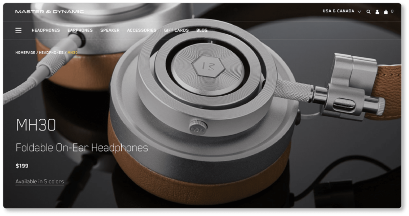
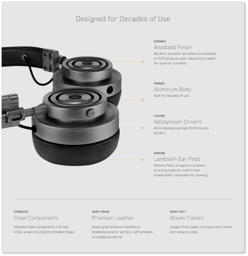
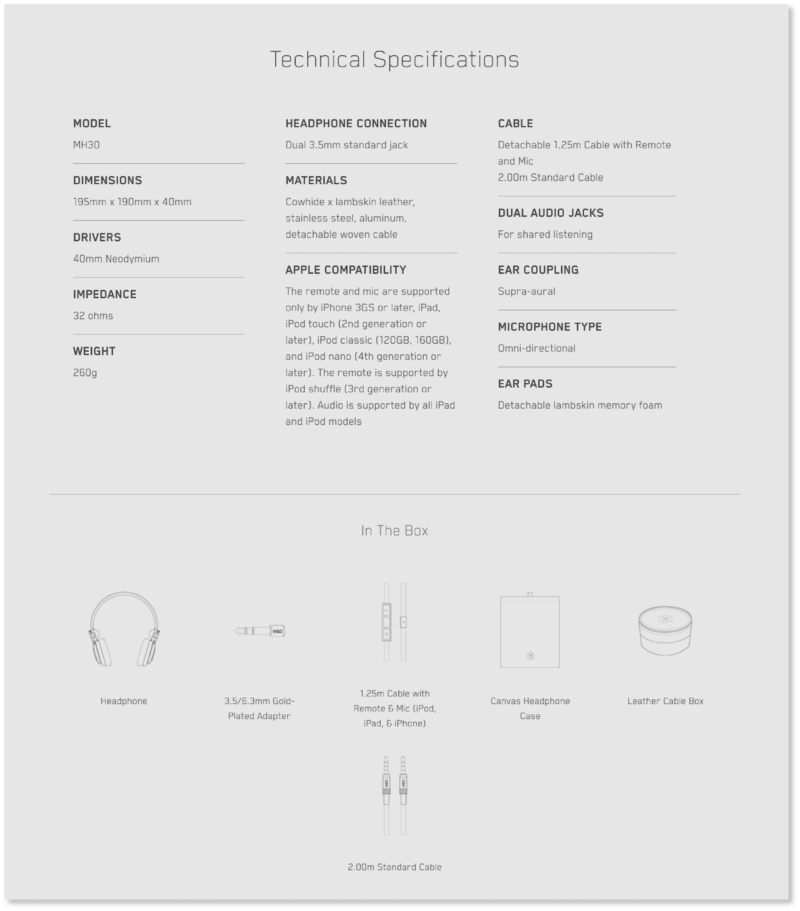 We discussed product photography in an earlier ebook; so we won’t linger here on how remarkable M&D’s images are. From a copy perspective, we’ll point out two things. The first is the company’s focus on both product features and benefits. (Remember: a feature is an objective fact about your product; a benefit is a description of how that feature adds value to customers’ lives.)
In that second screenshot, M&D offers a catalogue that includes both: A feature is the headphones’ “anodized finish”; its benefit is “superior durability.” A feature is its “lambskin ear pads”; its benefit is “superior comfort and breathability.” A feature is its “oxygen-free copper woven cables”; its benefit is “pure sound and reduced noise.” And so on. The copy brilliantly translates what each feature means for its prospects’ lived experience with the product. No visitor to this page will be left asking: “But why does that matter to me?”
The second is that the copy leaves nothing uncertain. Product dimensions, weight, materials, microphone type, Apple compatibility, and other specs—as well as exactly what will arrive “In the Box” after a prospect clicks the purchase button—are all given here. We can’t think of a single question that remains unanswered from either a technical perspective, or a “what-am-I-getting” perspective.
As we scrolled down the product page, we observed two more copy strategies worth pointing out. The first concerns social proof—here, in the form of product reviews published in recognized magazines. M&D understands the substantial value of this product page element, and they leverage it where they can:
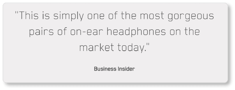
Master & Dynamic also recognizes the importance of telling a story. We touched on the importance of storytelling in product descriptions; it stimulates the primal (emotional) parts of our brains that ultimately impact buying behavior. The “story” M&D tells here doubles as a form of social proof: The company chose two artists to highlight to reinforce the importance of music—and therefore, of M&D’s product—in any creative process. (It’s worth observing that, in choosing two artists, M&D is clarifying its target audience):
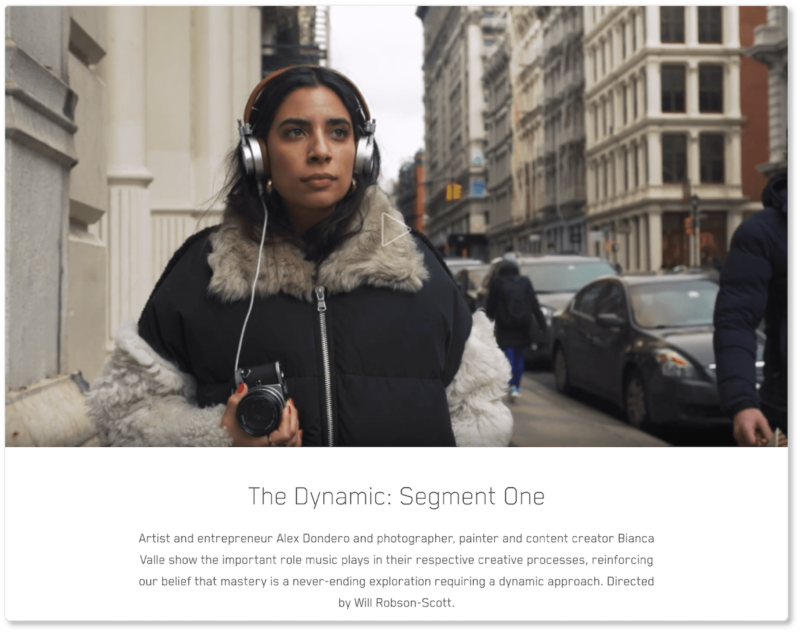 Yes, the company takes a multimedia approach here; but the copy alone is imaginative and powerful. It appeals to those creative souls seeking “mastery” in their respective mediums, inspiring a “dynamic” and ongoing “exploration” that takes all senses—but particularly the aural—into account.
Beardbrand
A Google search for “beard oil” (a competitive head keyword) surfaces Beardbrand as the second organic search result. You’ll notice that—like Master & Dynamic—the beard care company includes its primary search term in three important places: its title tag, its meta description, and the URL of the page it wants to rank for that term on:

When we click into the page, we’re confirmed in our assumption that this is a category page. We also note that the company continued to follow best practices for keyword placement by including its keyword in both the H1 (header) tag and the category page copy:
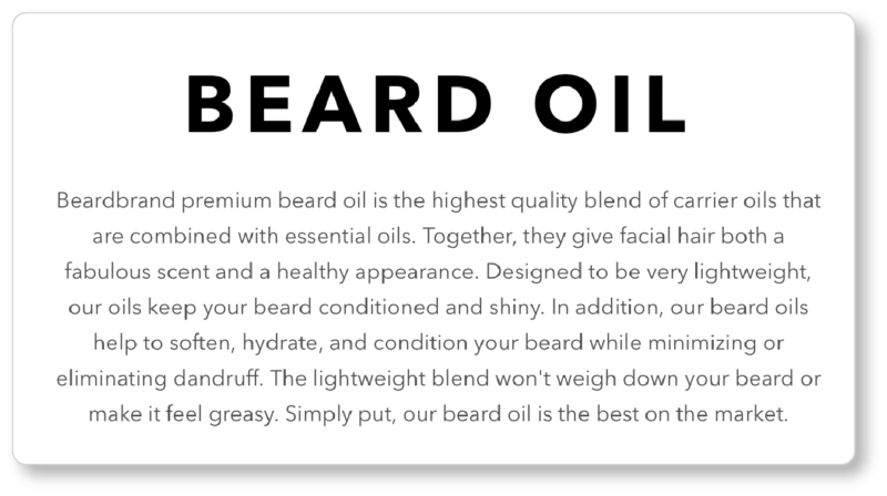
From an SEO perspective, Beardbrand’s done great work at the level of the category page. They chose a higher-level keyword they knew they could rank for (remember: more specific, longer-tail keywords will be used on your product pages), and they used it wisely both on the page and in its metadata. From the category page, we clicked into Beardbrand’s homepage to get a better sense of their copy strategies. We noticed a few remarkable things right off the bat.
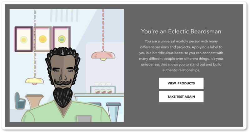
The first is that the space above the fold—where we’d typically expect to see the company’s value proposition—poses a question to site visitors. We’re trying to remember the last time we arrived on a website and were immediately confronted with a question about ourselves… and we can’t. Questions have a strong psychological impact. They place visitors into an instant dialogue with your website, even before they click in to discover the answer. Prospects will naturally pause and respond to the question internally… and will then be lured in to either discover, or be affirmed in, their answer:
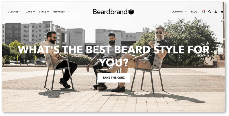
We’re lingering on this strategy because it can be used to equally great effect on your category pages… though perhaps less so on your product pages, since those visitors are already fairly deep into your funnel. Offering a question or a quiz early on in the buyer’s journey, however, gets prospects to engage, and—wittingly or not—guides them into your sales funnel.
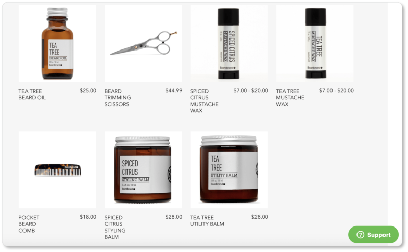
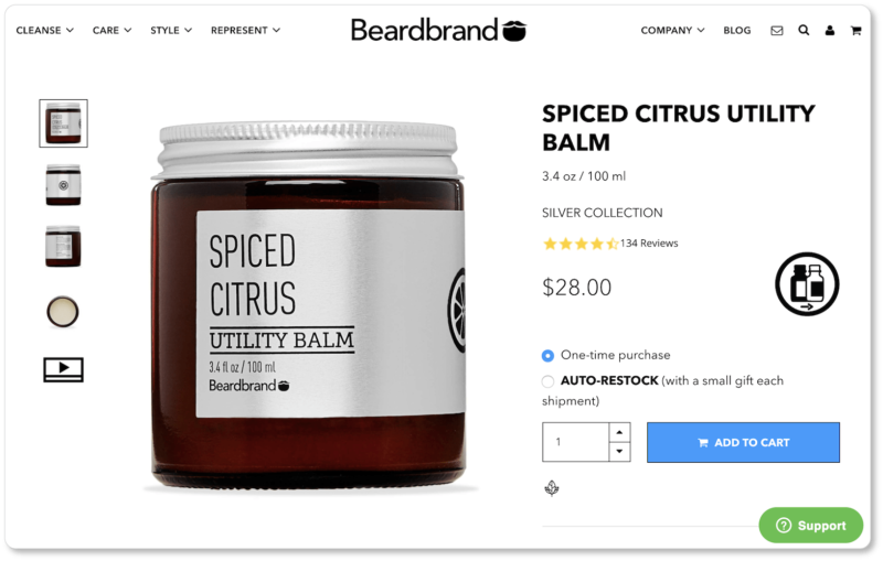
So naturally, we took the quiz. Note how the company offers links to the products we should consider based on our “type.” And suddenly we’re on a product page after the pleasure of a little diversion—and after a little flattery from the company, which has put us in good spirits (maybe good enough spirits to buy?):
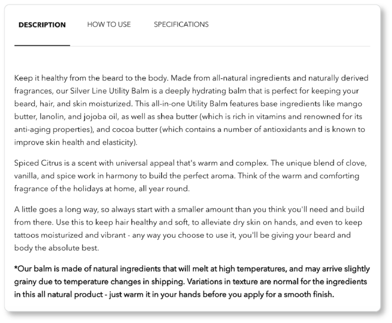
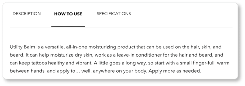 Across the board, Beardbrand offers strong product descriptions, and this example is no different. It highlights the product’s natural character and its hydrating effects, lists its ingredients, and mentions some of those ingredients’ most remarkable side effects: anti-aging, improves skin health and elasticity. (“Ingredients versus effects” is the beauty industry’s version of “features versus benefits,” by the way.) It even goes so far as to suggest it’s an all-purpose product: You can also “use it to keep your tattoos healthy and vibrant.”
Notice, too, how Beardbrand describes how to use the product in its copy. We discussed the importance of comprehensiveness earlier—answering the “5Ws” and the occasional “H.” Beardbrand answers the “H” here.
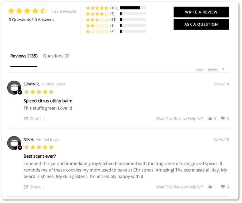
Another strong element of Beardbrand’s product page copy is that it displays customer reviews. (Customer reviews certainly fall under the category of “copy,” and they’re invaluable from an SEO standpoint. We don’t discuss them at length in this ebook; but we do discuss them elsewhere.) Beardbrand does well to include a CTA to “Write a Review”—not only because it means more in-the-moment testimonials for the company; but also because it makes the reviews that are there look all the more authentic:
 Finally—in case it wasn’t clear by the quiz that Beardbrand is considering consumer psychology—there are two other strategies the company uses on its product pages to increase conversions. You may have noted the “Auto-Restock” option near the “Add to Cart” CTA. Offering a subscription to your product (particularly if it’s one that consumers have to replenish regularly) means more than making consumers’ lives easier—though they’ll thank you for that! It also means that you aren’t risking cart abandonment each time a customer gets on your site to restock.
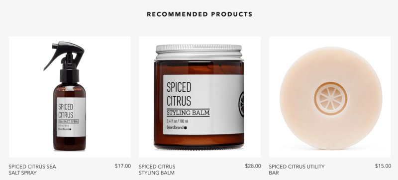
The second strategy is a “Recommended Products” section at the bottom of each product page—an up-selling strategy worth experimenting with in your own ecommerce endeavors:
TRUE linkswear
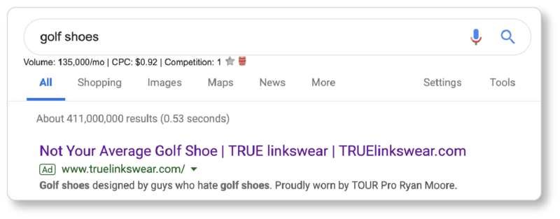
We came across the golf shoe company one day when we entered a competitive head keyword (“golf shoes”) into Google. The company had run an ad for that keyword, and it was the first thing we saw. Granted, not organic traffic… but we gave it a try:
 Because TRUE only sells one type of product, its homepage is also its “category” page. We clicked into one of the models because of its compelling product title and subtitle (“MAJOR Tour Issued Performance: Built for tour players, worn by the rest of us”):
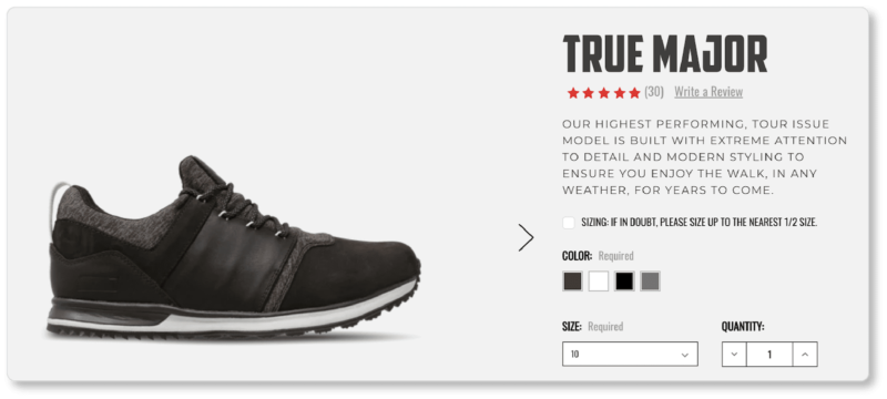
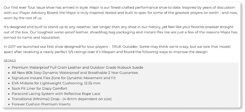 It’s difficult to speak to TRUE’s SEO strategy here; so we’ll focus on the copy instead. TRUE has done a few things beautifully:
- The small bit of copy directly beneath the product title insists upon product quality from the beginning. Not only is this model the “highest performing,” built for pros (“tour issue”), and “with extreme attention to detail”; it’s also remarkably resilient (“for years to come”).
- TRUE offers a recommendation on how to order: Notice the copy above the color options, which tells prospects that if they’re in doubt, they should “size up to the nearest 1/2 size.” This is a wise move: It preempts customer complaints and lost revenue on returns or exchanges.
- In the body of the primary product description, the emphasis on excellence continues as the company tells the story of how the product came to life through years of testing and discussions with their Player Advisory Board. If prospects didn’t already know that this company isn’t playing games, they know it now. (What other shoe companies do you know that employ an advisory board of professional players to build and improve upon their offering?) This is a brilliant backstory to add to the description.
- The final paragraph of the product description tells how the company tore their former product apart—even after it received “nearly perfect 5/5 ratings”!—because the design could be improved in a number of ways. This is a company that strives for perfection; the description ensures that its prospects know this.
What most of these observations come down to is that the company knows its target market thoroughly: golf players who aren’t pros, but play often and take the game very seriously. And not only do they take the game seriously; they also take their equipment seriously. They make careful and well-informed decisions; and they’ll choose the brand that takes them—and takes its product—as seriously as they take themselves.
TRUE linkswear’s product page goes on to discuss features and benefits at length—one if its <h> tags is even called “Features and Benefits.” And after a fair amount of dense copy for the product description, TRUE decided to let this section breathe a little:
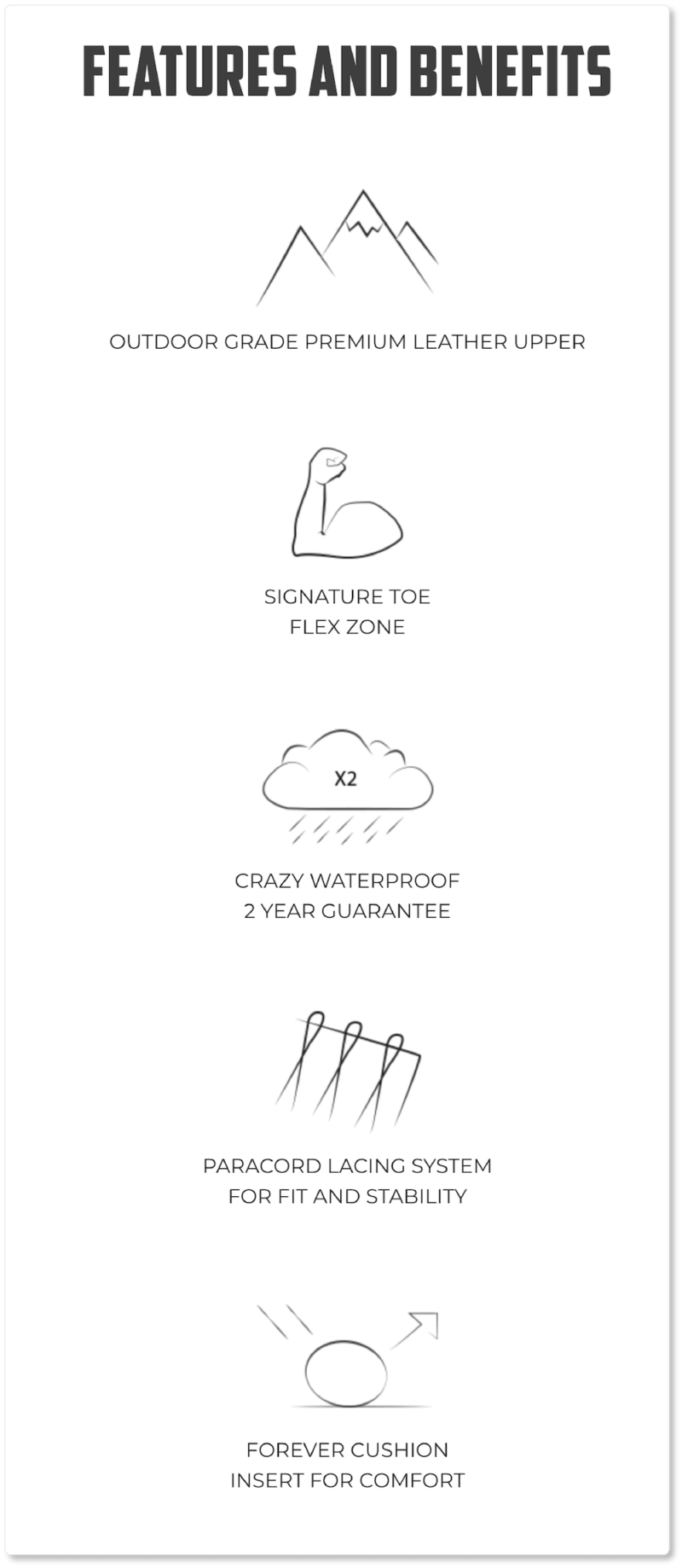
If TRUE’s prospects only skimmed the paragraphs above, they get the gist of the product all over again here—not to mention some other reasons to buy, such as the “Crazy Waterproof 2 Year Guarantee.” (If you want to preempt doubts and objections, free shipping and product guarantees are two great ways to go.) Great product page copy overall, if you ask us.
Twelve South
Twelve South designs accessories exclusively for Apple devices. They’re the seventh search result for the Google query “Apple accessories”… and get this: They’re the first result that isn’t from Apple’s website. The company homepage has a variety of product categories to click into based on device… but it also offers a section called “Trending Right Now.” We clicked into a product called PowerPic:
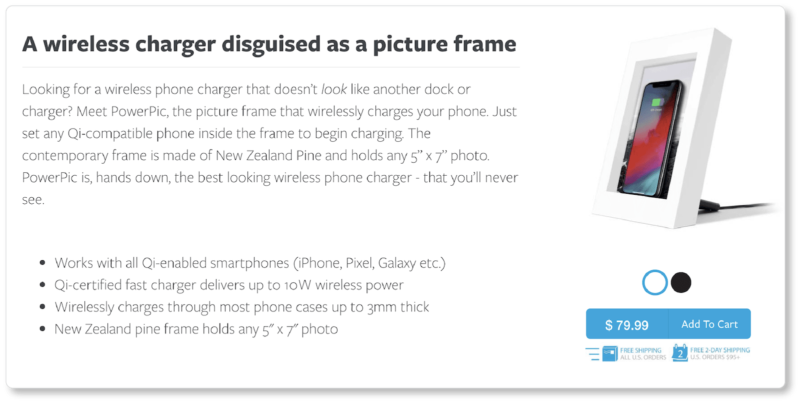
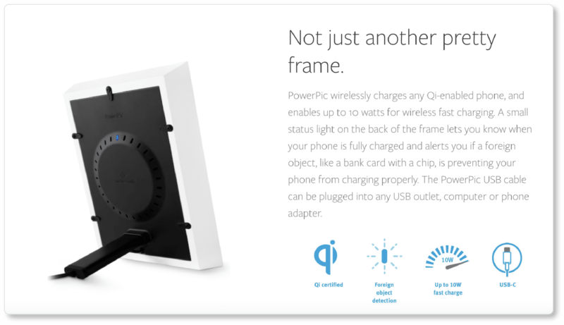 It’s a compelling product from an aesthetic point of view; and Twelve South leads with that value proposition (“A wireless charger disguised as a picture frame”). The first sentence of their product copy poses a question that brilliantly alerts prospects to a pain point they didn’t even know they had: Until we read this product copy, we hadn’t been looking for a phone charger that didn’t look like one! Now, of course, it’s precisely the thing we want.
Other things Twelve South’s product copy does well:
- It describes how easy the product is to use by beginning the sentence with a simple—but powerful—word (“Just”). The fact that the question “How do I use it?” can be answered in a single sentence certainly helps the company’s cause.
- At multiple points on the product page, the company opens up “breathing space” to make the product copy scannable. In the screenshots above, it does so through bullet points and blue icons.
- The copy answers all sorts of questions early on (What’s it made of? How big is it? How does it work? How do you plug it in? How do you know when your phone is charged?) while balancing aesthetics and functionality (“Not just another pretty frame”).
- It announces free shipping just beneath its CTA button. (Don’t underestimate the power of free shipping in consumer psychology!)
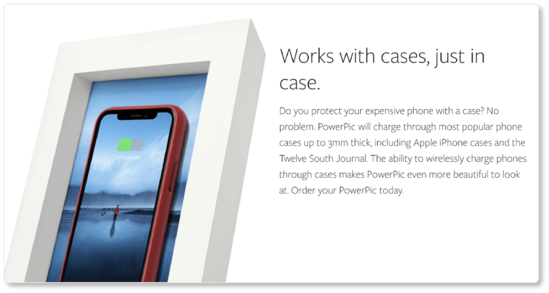
- Twelve South also recognizes the power of using product copy to preempt doubts and objections. In this case, prospects who worry that they’d have to take their phones out of their cases each time they need charging get their concerns assuaged. The charge is strong enough to work through most cases, Twelve South claims:
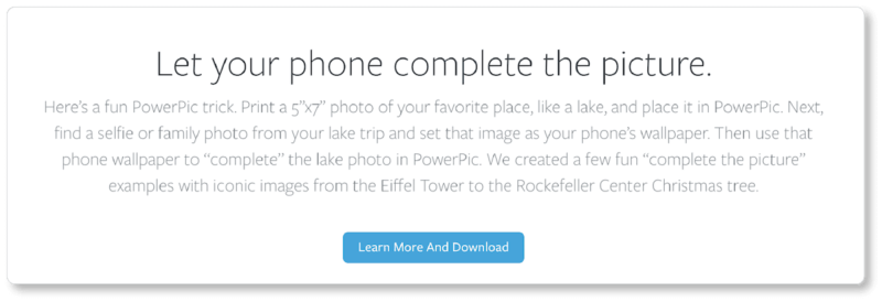
Finally, Twelve South offers a tip in the form of “a fun PowerPic trick” to get prospects excited about the aesthetic possibilities of their product:
Between these four websites’ product pages (and category pages, and homepages), most of the best practices we covered in this ebook have been exemplified. These ecommerce companies have studied their target audiences, done their keyword research, and written compelling product copy that forefronts value and customer benefits, and takes consumer psychology and behavior into account. So take your tips from them as you turn back to your ecommerce platform and get your own product pages up and running.