- HOME
- Website Building
- Homepages
- Using Images and Videos on Your Company Homepage
Using Images and Videos on Your Company Homepage
- 10 Mins Read
- Posted on April 17, 2018
- Last Updated on December 2, 2025
- By Lauren
Based on your own personal experience as an internet user, it shouldn’t surprise you to hear that the vast majority of us are visual—and that, as they continue to recognize this, businesses are moving more and more toward visual content on their websites.

It’s a trend worth following on your own site. Of course, “going visual” isn’t a matter of slapping up any old multimedia on your homepage and presuming that visuals of any kind = conversions. Visitors experience satisfaction only when the various components of a website come together to “make sense”; and your homepage images need to be as straightforward, unambiguous, and easy to read as your homepage copy is.
Remember that your homepage (like any other page on your website) is as much an experience as it is a tool to move visitors onto the next page and through their own particular conversion journey. Your homepage images, then, should offer users an experience of your company’s vision and your brand’s spirit. It should help them vicariously experience what your services will feel like, or how your product will add value to their lives.
Your images are there to complement your copy and contextualize your offering. To substantiate your value proposition. To clarify the value of your product or service.
Below, we discuss your hero image, the image types worth testing on your homepage, where to find your images, and how to optimize them once you do. Of course, these tips and tricks are applicable to all your multimedia endeavors. Regardless of where they’re positioned on your website, each visual element should check off certain boxes:
- They should be relevant to your company’s offering, or to the theme or purpose of the page.
- They should strike an emotional chord with your target audience. There are countless ways to do this; the important thing to keep in mind is that consumers often make purchase decisions as a result of emotion rather than of logic. (We’ll have more to say about this below.)
- They should be visually compelling and high-quality. This should go without saying… but now we’ve said it, just in case.
- They should be designed for contrast and readability. This is especially important for any images you intend to overlay with copy. Don’t crowd your images with other homepage elements, and make sure any overlaid typography is wholly decipherable.
- They should be easy to see on a range of devices. Consider the range of devices and screen sizes users will be visiting your homepage on… and then design for all of them.
The hero image
The hero image is that large, arresting, initial homepage image your headline and sub-headline will probably be positioned on top of. Growth marketing advisor Angie Schottmuller describes it as “a credible photo or video of a solution that encompasses relevance, context, value, and emotion to support, educate, or persuade a customer.” In other words, it plays the roles we described above: substantiating your value proposition and contextualizing your offering.
Don’t underestimate the value of a skillful hero shot. Studies continue to show that it takes virtually no time—50 millisecondsor less—for users to form a judgment about your website. That’s .05 seconds, for those of you who are counting… and in that time, many of your visitors will already have determined whether or not your site is worth their while.
Given the radical brevity of that first-impression window, we recommend that you experiment with a hero shot first. Your hero image should help prospects understand both the context and the value of your offering, and subsequently imagine the benefits it will bring to their own lives.
In the same article we referred to above, Angie Schottmuller catalogues 7 elements of persuasive hero shot images:
- They’re relevant to, and complement, your keywords
- They clarify the purpose of your site
- They support the flow of the page (reducing friction and distraction)
- They represent your company authentically
- They add value (by illustrating benefits, answering questions, and so on)
- They trigger the desired emotion in your prospects
- They depict your prospect as the “hero”
We agree wholly with those first six elements. The seventh (prospect-as-hero), however, is but one type of hero image you might consider using.
Different types of hero images
Not all businesses are the same, and neither are the ideal hero images for their websites. You can determine what kinds of images convert best for your business by running A/B tests, conducting prospect interviews, and consulting your own intuitive sense of what your customers want. But bear in mind, those answers may change as your business grows, innovates, and otherwise transforms. The key is to think deeply about your prospects, the emotions you want visitors to feel, and what your goals are. To get started picking your site imagery, let’s look at some of the most common types of hero images:
Product images
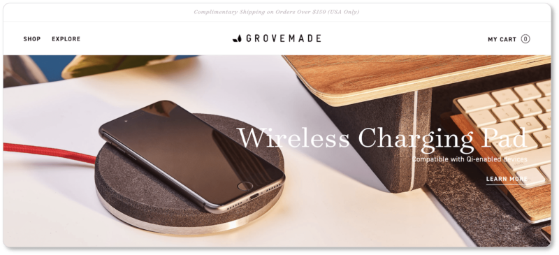
If you’re running an eCommerce site, this is probably the image type you intuitively tend toward—and for good reason. Large, high-resolution shots of your product help visitors feel as though they can take the object in hand… and, importantly, imagine owning it. Grovemade has chosen one of their currently-trending products to display as their hero image. (Of course, other high-resolution product images follow visitors down the page):
Contextual images
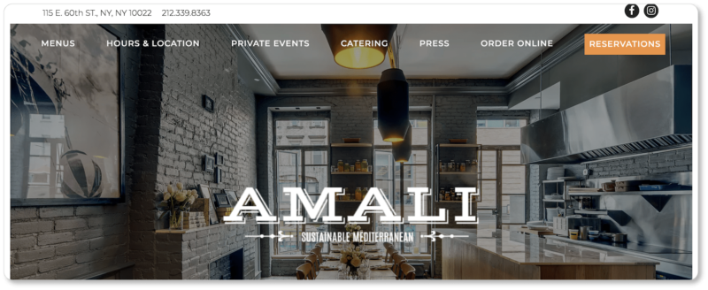
Contextual images are useful for both product- and service-based businesses. These image types might demonstrate the environment in which a product is used or the setting in which the service takes place. Here’s the contextual hero shot for the restaurant Amali:
Lifestyle content
Rather than simply displaying a product or presenting a service, lifestyle content demonstrates how that product or service helps define the customer (whether informing or indicating their values, interests, and attitudes) and contributes to their way of life. Lifestyle content allows prospects to envision themselves using and benefiting from your product or service—including an overall enhanced quality of life.
Here’s an example of lifestyle content from Hummingbird Hammocks:

Well-known business owners
These kinds of images work very well for business sites that are heavy on educational content, and whose founders (and educators) are leaders in their respective industries. Take the homepage of the prominent SEO authority, Brian Dean, at Backlinko:
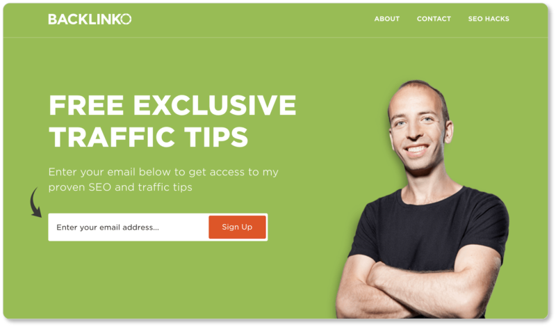
Because these kinds of websites are so content-heavy (think: blogs), their homepage images tend toward minimalism. You’ll also notice Brian’s image is juxtaposed with a CTA to join his email list. This pairing is typical for this kind of site.
Prospect-as-hero images
Okay; we’re playing with the word “hero” a little bit here—we mean it both ways. You might consider a representation of your ideal prospect in your hero image (as Hummingbird Hammocks does above)… but you might also have that prospect in your hero image literally look heroic. What better way to incite your prospects’ desire for your product or service than to show an ideal version of themselves benefiting from your offering?
Aspirational is another way of characterizing this image type. We showed Ellevest’s hero imageearlier in this content; and indeed, it’s a remarkable example of this strategy:

Illustrated hero images
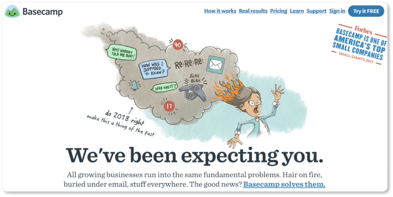
Of course, you may opt for an illustration rather than a photograph for your hero image. Illustrations give you more control than, say, stock photos do; and they’re often more unique—and thus unforgettable—from a prospect perspective. Take Basecamp’s hero image:
So there are six image types worth experimenting with—and you may come up with others as you test.
You might also use a combination of these types across your homepage. For instance, while Amali’sheroimage is contextual, the images further down their homepage are product images:
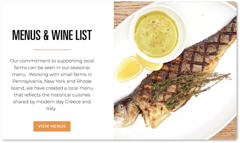
This combination of high-quality images allows Amali’s visitors not only to get a sense of the physical environment—the ambience and experience the restaurant offers—it also gives them a nearly sensory experience of their dishes.
Your homepage is an experience. Test a range of image types to ensure you’re giving visitors a visual buffet of what your company is all about.
Consider videos
But don’t stop at images! Videos can demonstrate your product in action, spell out what your business does, or introduce your team as they interact with each other in their natural habitat. Customers are asking for more video content: Four times as many prospects prefer watching a video about a product to reading about it. What’s more, 64% of site visitors are more likely to buy a product from an online shop after watching a video, and 90% of online shoppers say video is valuable in helping them make buying decisions.
Those are some impressive numbers. We wouldn’t discount them if we were you.
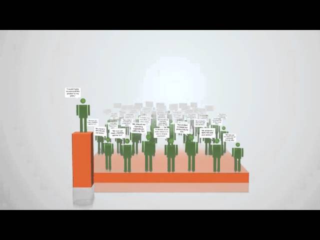
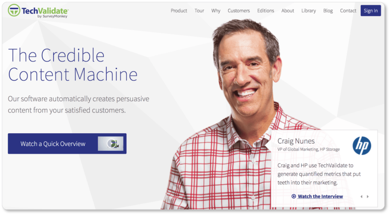
TechValidate offers a “Quick Overview” video above the fold on its homepage. The video runs for a minute and twenty seconds; but in that short space, the company invokes its prospects’ pain points, offers a solution, explains its service, and proposes next steps for its prospects:
You might also try running a video loop in place of a static image. (Most businesses who opt for this design display that loop above the fold.) The online fitness company Booya Fitness employs this strategy. Their video runs for nearly a minute before looping back to the beginning, and it allows prospects to take in a wide range of Booya’s offerings. After all, the company promises “every kind of fitness class you can imagine”; and they did well to prove their value proposition with video here:
If you do decide to offer videos on your homepage, we recommend keeping them short (3 minutes or less). Your homepage videos are there to inspire visitors to learn more about your business and your offering, not so you can unload your entire company history or break down every product’s features for them at once.
Provoke, don’t inundate. (That’s possibly what the other pages on your website are for.)
Optimizing your images
Of course, the higher-quality the multimedia you have on your homepage, the greater the chances of a slow page load time. We presume that, if you’re reading this, you’re a human with some experience on the internet, so we don’t need to remind you how quickly users get impatient with slow load times.
When Google slowed their results page load time from 0.4 seconds to 0.9 seconds by displaying more results per page, they experienced a 20% decrease in traffic and revenue. When the company reduced the size of its homepage for Google Maps (thus decreasing page load time), on the other hand, they saw a 10% increase in traffic in the first week alone.
And what better company to take a tip from than Google? Reduce the file size of your images to optimize them for users. You can resize the image yourself on Preview, Photoshop, and other applications; compress the image with an online image compressing tool; or experiment with a variety of file types (JPG v. PNG) to see what gets you the most high-quality image for the fastest page load time.
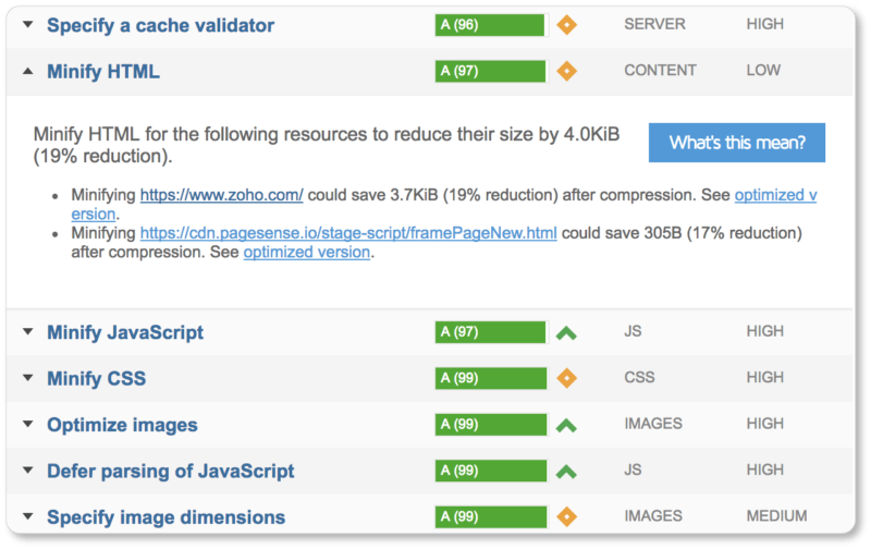
GTmetrix is a great tool for determining page load time. The platform grades various elements that contribute to page speed and offers recommendations for how to fix the elements slowing you down. Here’s what the feedback for Zoho.com looks like:
To further optimize, add alt text to all of your images (your CMS should make this task fairly simple). Alt text is convenient for visually impaired visitors because screen readers will recognize it. So will Google’s crawlers—which means it’s great for your SEO efforts, and will allow your image to rank in Google image searches. What’s more, it’s advantageous to have in case your images ever fail to load.
Where to find images
If you’ve got the capital to hire a professional photographer for your website images, we recommend this. If that’s simply not in your budget, Shutterstock offers images for purchase, while sites like Unsplash and Pixabay offer free images you can use without attribution.
Remember, first and foremost, that you’re going for authenticity. So if your budget limits you to using these sites, take time to choose the images that really resonate with your offering, your brand, and your vision.
And if you want more tips on staying legal and reflecting your brand in your website images, we have thoughts on these things in our section on blog images. (Each of those tips is just as applicable to images elsewhere on your website.)
Finally, don’t underestimate the things that are possible with a good cell phone camera, an accessory lens, a great photo app, and a little self-study.
Remember that less is more
Your homepage doesn’t exist to serve all your website’s needs: You’ve got as many pages as you want (and as many as your visitors ask for) to offer more comprehensive information—and more images—elsewhere. Your homepage exists to serve as the gateway to the rest of your site.
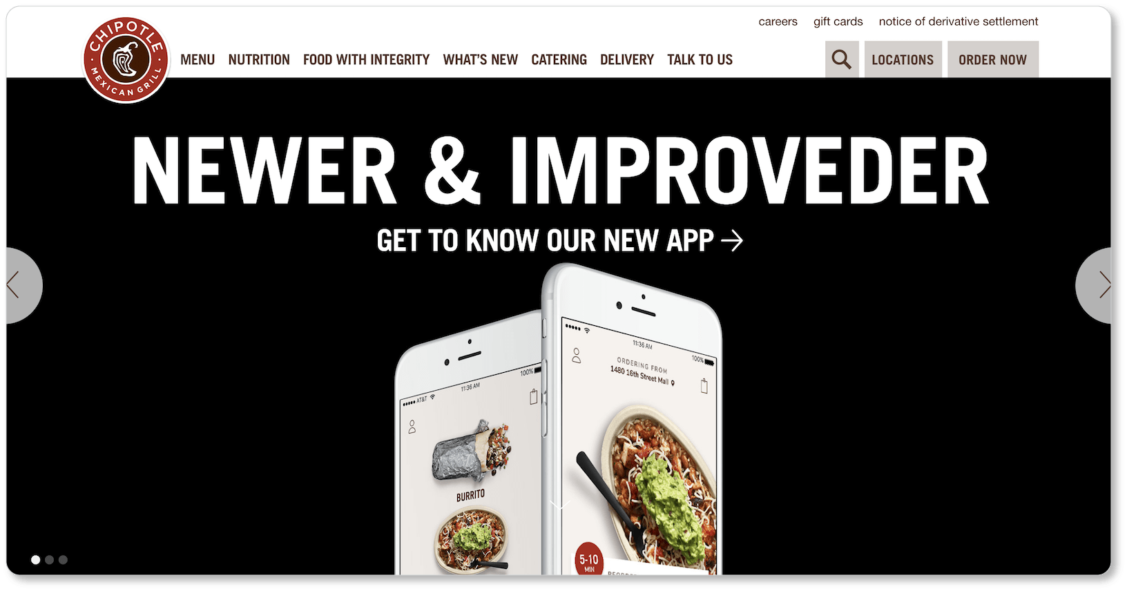
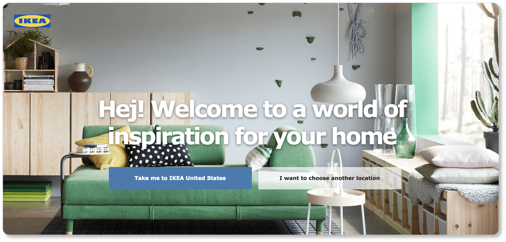
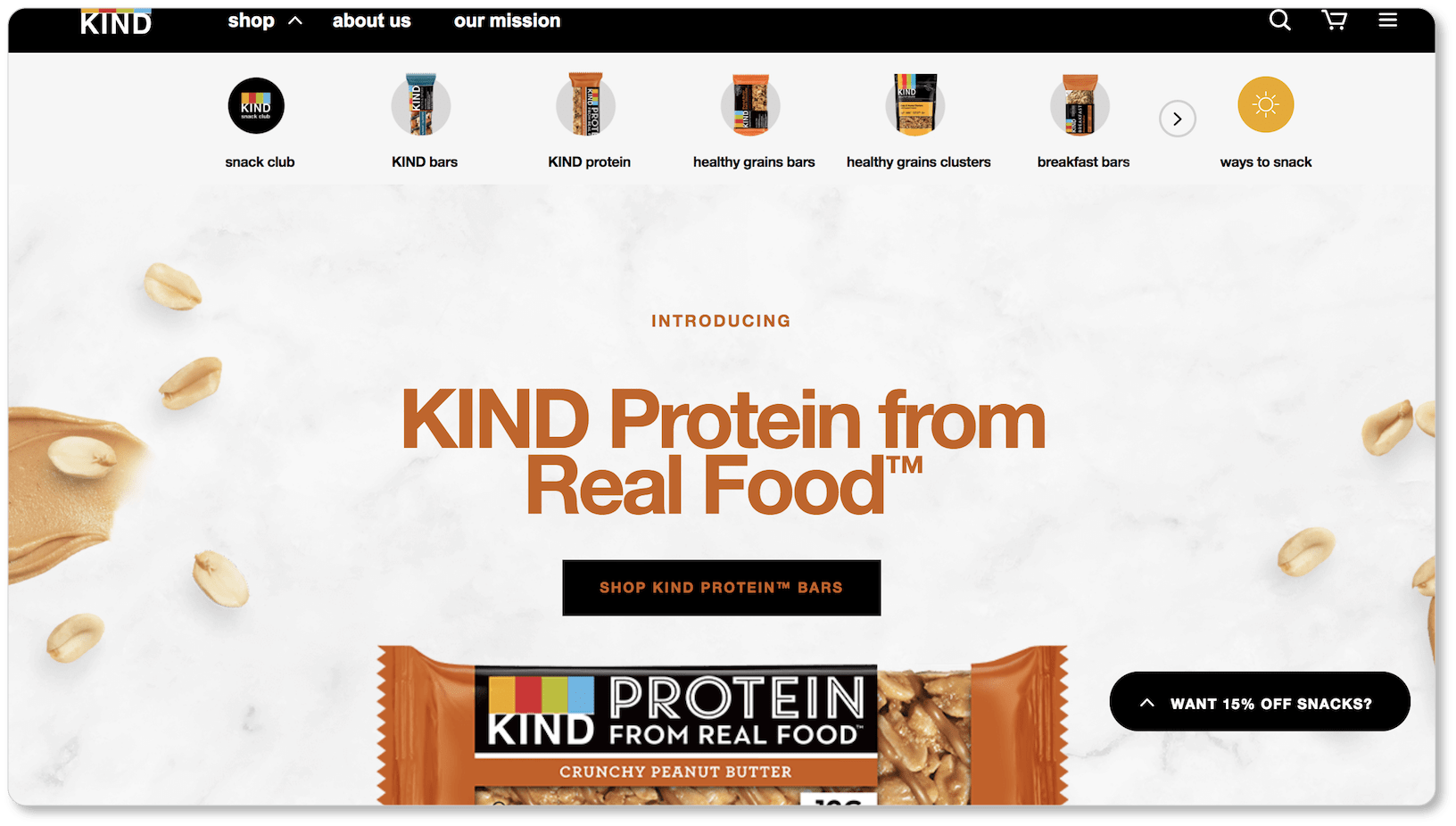
The most it needs to do is offer a few remarkable images to draw visitors further in. If you offer more than one product or have more than one promotion going on, choose one of them (your best-seller or your newest service) to feature above the fold. No visitor is going to look at that single header image and leave your site because it’s not precisely the thing they were looking for—especially if your navigation menu is conspicuous and they see other options that might be more appropriate to their needs.
So take some tips from Chipotle, Ikea, and Kind Snacks, and trust the power of a single above-the-fold image or offering. (Note that Chipotle uses image sliders with three different promotions. We wouldn’t necessarily recommend this, but it might work for you, depending on your range of offerings.)
Now it’s your turn. It’s time to start creating (or searching out) the most relevant, inspiring, and compelling images you can find to represent your business and all it offers.
While we’ve given you A LOT of tips, tricks, recommendations, and best practices in these sections, it may be helpful for you to see them all in one place. So in the next section, we’ve got a company homepage checklistfor you. Feel free to print it out and check off the elements your homepage contains (and consider the ones it doesn’t). It may very well be one of the best things you can do to round out your business website.
