- HOME
- Ecommerce
- Best Practices for Ecommerce UX
- Improving Conversions on Your Checkout Page Through Great UX
Improving Conversions on Your Checkout Page Through Great UX
- 14 Mins Read
- Posted on June 3, 2019
- Last Updated on December 2, 2025
- By Lauren
Although an online shop offers a huge opportunity to increase revenue, business owners shouldn’t assume that their experience in driving brick-and-mortar sales will translate perfectly to their online efforts. For example, you probably aren’t accustomed to 70% of your in-store shoppers walking away from items they’ve already put in their shopping carts. But in the online shopping world, that’s a huge issue. To get a better idea of what’s causing so many people to think twice before clicking “Purchase,” let’s look at Baymard’s 2017 statistics on checkout abandonment:
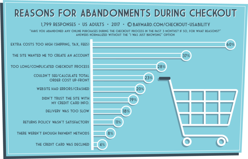
Baymard’s findings are pretty consistent with other checkout abandonment studies. Shipping costs are typically the top reason for abandonment. Long and complex checkout processes, concerns about security, and bad site navigation all make the majority of these lists.
The good news is that most of the reasons given for checkout abandonment can be rectified through better UX. Indeed, BI Intelligence estimates that about 63% of the revenue lost to cart abandonment can be recovered by “savvy online retailers.” So, you see, there’s hope.
The mantra you should be repeating as you design your checkout pages is “user speed and ease.” In other words, you want to reduce friction as much as possible… and this doesn’t just mean easy navigation. It also means eliminating psychic friction. Don’t confuse your users and don’t slow them down—but also don’t surprise them.
Of course, the reasons your users abandon their shopping carts may vary; but the studies linked to above help clarify checkout page best practices. You’ll A/B test to optimize your own checkout according to your product, your price point, your industry, and your demographic. (Not to mention that the elements you can implement will be determined by your ecommerce platform.)
Some of these best practices are carry-overs from our product page recommendations, so we won’t linger on them. Just know that, like your product pages, your checkout page should be up-front about delivery options, shipping costs, returns policies, and payment options; they should also display trust badges and security symbols.
Below, we share the other elements of high-converting checkout pages. As you’ll note, not every page below has every element we recommend. That’s because each business’s customers and prospects will ultimately determine what its checkout page should look like.
Consider the timing of account creation
Imagine this scenario (it won’t take much; we know you’ve been there): After browsing an online store, you’re on a virtual shopping roll. Ready to make your purchases and get on with your day, you click into your cart to review the items you’ve picked. It all looks good, so you click the “Checkout” CTA.
But suddenly you’re stopped in your tracks. Are you a new or returning customer, the website wants to know? You don’t remember which? Click on this link. You do remember having been here before? What’s your password, then? Nope, that’s not it. Want to check out as a guest, then? Oh, sorry; we already have you in our system. What’s your password?
How you handle account creation or user registration on your checkout pages can make or break your conversion numbers. Most commerce platforms—including Commerce Plus—will give you a variety of options and let you determine your own approach. The format you choose will depend upon what your business decides to prioritize.
Prioritizing user options and flexibility in your checkout
On Charlotte Russe’s site, new users can either checkout as guests or create an account, while returning users can log in or sign in with social:
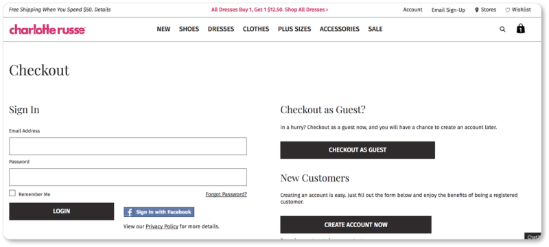
This is a typical three-option approach. It allows new users to choose whether they want to create an account, rather than forcing them into one before they can complete the purchase. Notice, too that the size of the CTA buttons places all three possible next steps together on equal footing: There’s no hierarchy here.
Pro Tip: Remind prospects of the benefits of having an account with you: faster checkout, personalized shopping, free shipping, discounts, etc. Even better, give them something in return for registering, such as a discount on that first purchase. After all, you’d prefer that they create an account rather than check out as a guest; so why not make that option more appealing?
Prioritizing sales in your checkout
You may find, however, that giving new customers two options creates hesitation and ultimately decreases conversions.
In this case, you might take a tip from Threadless, which takes users directly to the shipping address form—essentially defaulting to guest checkout. Once there, returning users looking to sign in and new users looking to create an account are given links to those options at the top of the page:
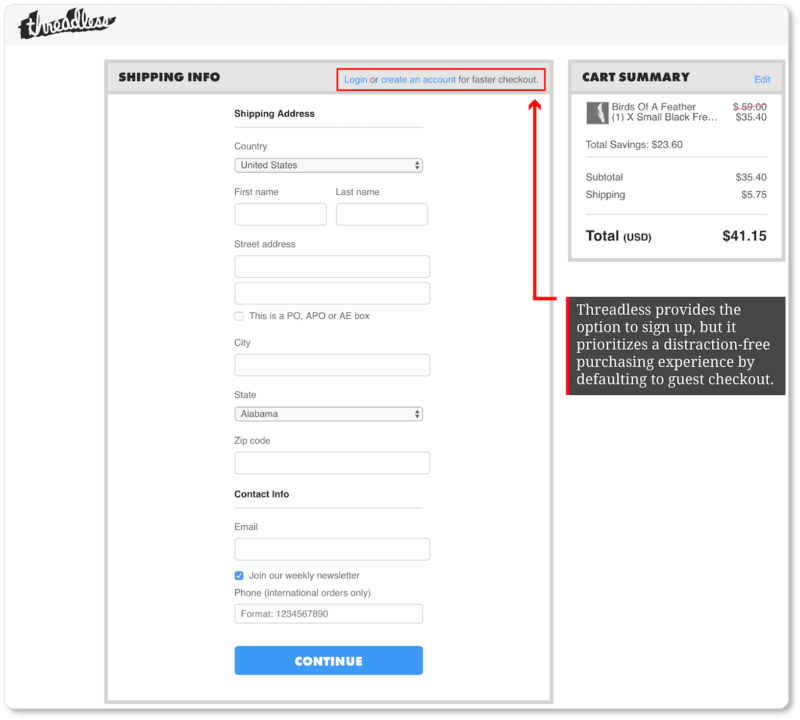
De-emphasizing account creation may very likely mean more conversions for your company; this format is worth experimenting with if direct sales is your primary concern.
Prioritizing long-term customer relationships in your checkout
You might also offer two options (one for returning customers and one for new customers), as the cycling company Wiggle does:
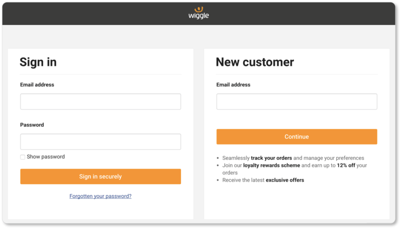
Wiggle’s “Continue” button leads to an account creation page: There’s no guest checkout here. And while some users may feel they’ve been tricked into creating an account, others will decide on a password and fill out that form, since they’re already on to the next step in the process. (Plus they’ve already read the benefits of registering in the copy below the “Continue” CTA.)
Eliminating the guest checkout button may be the right call for your company if more complete data from fewer customers is more important to you than sales numbers. It’s a way of prioritizing longer-term relationships with those who’ll be willing to go through the account-creation process early on. This may also depend upon details such as your product’s price: Prospects are typically willing to fill out a form if they’re making that more expensive purchase. But A/B testing will tell you this with more certainty than we can.
Not sure which of these formats to test first? Here’s our take on it:
Don’t force registration before checkout (enable guest checkout)
We know: Getting a prospect’s contact information is an enormous boon for your business. But forcing that information up-front is one of the biggest obstacles to customer conversion (the second-biggest obstacle, according to Baymard). So ask yourself: Is collecting that data more important than closing the sale?
Indeed, depending on whom you’re asking, you risk losing up to 41.9% of your total customers by forcing them to sign in before checkout even begins. The clothing retailer Asos saw 50% more conversions when they stopped making new users create accounts on their checkout page. And this is just one example among many.
Again, you might discover through A/B testing (as Wiggle possibly did) that forcing account creation is the most practical move for your company. But keep in mind that forcing a new prospect to register before they buy means asking them to make a psychological commitment that many of them will not be prepared—or willing—to make.
Allow users to register after they’ve made their purchases
When users are trying to accomplish a task on a website (in this case, completing a purchase), making another demand may be frustrating for them, and fruitless for you. But putting something in front of them after they’ve completed that task increases the likelihood that they’ll engage.
So if there’s a “sweet spot” for account creation, it’s on the confirmation page. Users who’ve just had a good checkout experience and plan on returning will be all the more likely to sign up. And because they’ve completed the purchase, you’ve got their information, so most of the work is done. One or two clicks (their chosen password and permission to create the account), and you’ve got yourself a new registrant.
Pro tip: Assure prospects and customers that you won’t use the email addresses they give you for excessive marketing, and that you won’t sell or share their contact information. (Indeed, with the General Data Protection Regulation (GDPR) now in effect, you’ll be held accountable for this by law.)
Enclose your checkout
An enclosed checkout is a little like tunnel-vision: Everything on the periphery appears fuzzy or nonexistent, while the “object” at the center of the field of view—the sale—stands out with perfect clarity. In website terms, this means ensuring there are no “peripheral” distractions for your prospect, from the moment they click into their cart until the moment they click that “Purchase” CTA.
Here’s what happens when we hit the “Checkout Now” CTA on Crate & Barrel’s cart page:
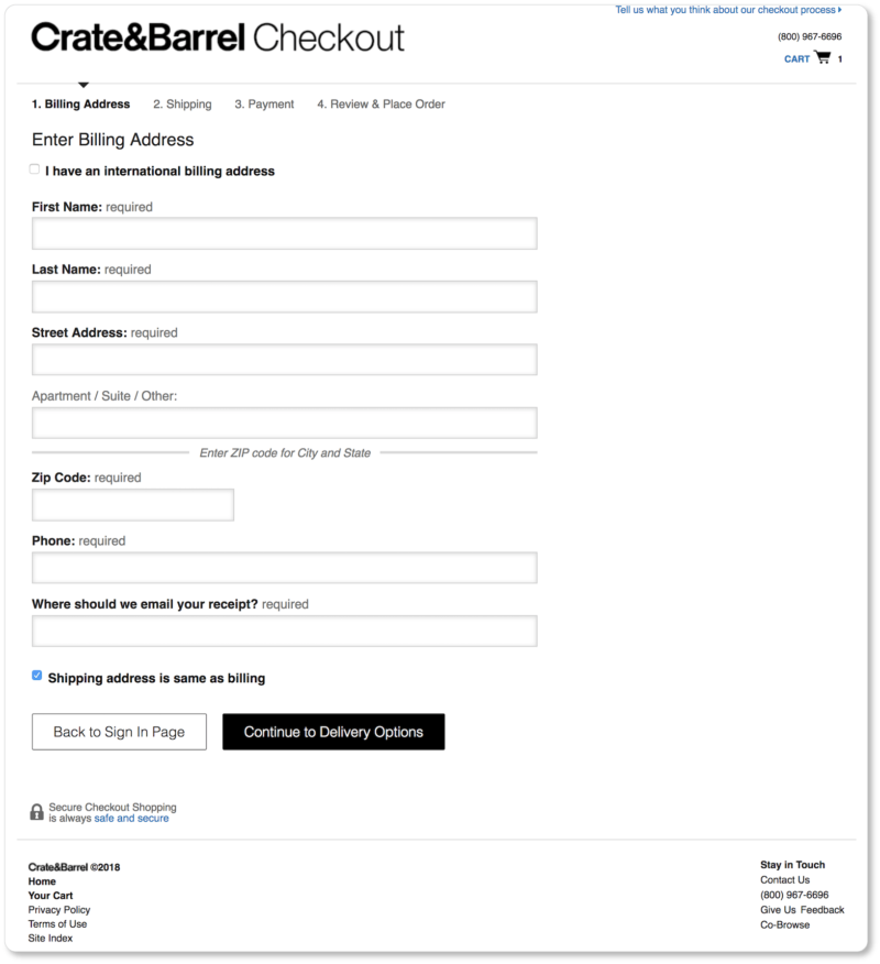
Crate & Barrel doesn’t offer images or cart details during checkout, which is something we recommend… though perhaps A/B testing and customer feedback determined this is the best route for them. (Did you notice that link to “Tell us what you think about our checkout process” in the top right corner? This is a brilliant move on the company’s part.)
The point is that there’s just about nothing that can get in the way of a prospect completing a purchase at this stage in the game: no menu to distract users with more product options; nothing users might accidentally click on to take them out of the purchasing journey. What’s more, there’s a clear progress indicator to let users know exactly how many steps they have left to complete their purchase.
If the cart does need to be revised, users can click on the “Cart” link in the top right corner to make adjustments. Enclosed checkout isn’t about trapping users; it’s about removing unnecessary distractions: dispensing with the header and footer, as well as with those elements that are so valuable on other pages—social sharing buttons, testimonials, recommended products, etc.
Those elements can go on your Thank You page. Here, it’s all about focus.
Don’t make coupon codes prominent
One common way that online shops break the enclosed checkout process is with coupon codes. For an example of this, take a look at the 5th and final step on Banyan Botanicals’ checkout page:
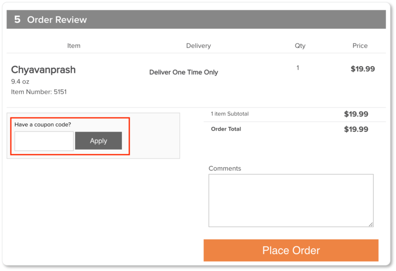
We’re on the verge of hitting that “Place Order” CTA when we see that conspicuous box that suggests there’s a coupon out there, waiting to be redeemed. So we open a new tab in our browser and go searching…
Are we out of the purchasing funnel? You bet. In this case, we found one and came back to use it; but we certainly found some other great deals for similar products that we could easily have grabbed instead.
Keeping a prominent coupon field makes prospects without a coupon feel like they’re missing out on something, or like they’re less special than your other prospects. It sends them on a coupon hunt; and 8% of them will abandon their carts altogether when they can’t find one. Rather, try one of these three strategies:
1. Include a coupon or promo link that displays an input field only once it’s clicked on, like Couture Candy does:
Prospects who have a coupon code will be looking for the link; prospects who don’t may not even notice it. That’s a win-win for everyone.
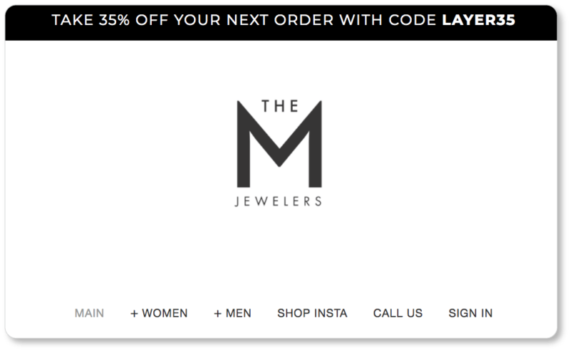
2. Put your latest promo codes directly on your website, like The M Jewelers does. The company displays a banner with its promo code throughout the entire shopping experience:
 3.Only show coupon fields to users who arrive on your site from marketing emails or affiliate links. This is a more complex option, and will require some backend communication between your CMS and your email marketing service; but it may be well worth your efforts.
Include contact information and offer a live chat
Support is one of the most crucial elements you can offer prospects at this stage—and live support takes the cake. We’ll dive more deeply into best practices for live chat shortly, but here’s a quick summary: Be sure your prospects can contact you directly from the checkout page! Otherwise you risk them hitting the back button… and backwards is not the direction you want them to move.
Backcountry displays a toll-free number and links to live chat on its checkout page. After a few seconds, the chat even pops up to help prospects who may be at a friction point in the checkout flow:
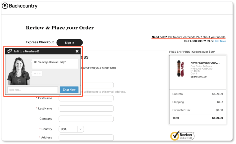
You may have prospects who discover, halfway through the checkout process, that they’re more comfortable finishing their order with you on the phone. Don’t deny them that option. While email is valuable, real-time support means prospects can get ahold of you while they’re still in the checkout funnel.
Pro tip: For your mobile users, be sure the number on your checkout page is a click-to-call link, so that prospects can simply tap the number and dial your company.
Including a link to your FAQ page (or, better, a modal window with your FAQs) is another way to keep users on the page and in the funnel, while easing shopper anxiety.
Try modal windows or accordion interfaces rather than external links
Another reason prospects leave the checkout flow is to remind themselves about shipping and return policies. Don’t send them to a different page for this information: You only risk losing a conversion.
There are two ways to let users access these details directly from your checkout page without making the page feel cluttered, or the user feel overwhelmed.
One is through a modal window or pop-up, like the one Zappos uses. Just below the CTA to “Place Your Order” are links to Zappos’ privacy notice and conditions. We clicked on “privacy notice,” and a pop-up appeared with Zapppos’ privacy policy. Meanwhile, our checkout page stayed visible:
Another way to keep prospects in the funnel is to have hyperlinked text open into an accordion interface, as Fossil does with the FAQs on its checkout page:
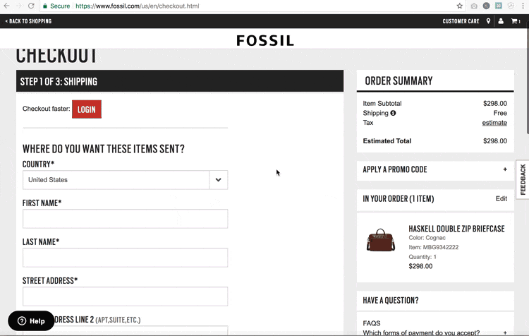
Either of these designs will let you keep your checkout enclosed. We recommend you offer your returns policy, shipping policy, privacy policy, FAQs, and secure shopping link this way.
Make your forms as simple as possible
Within milliseconds of landing on your checkout page, your prospect will have formed a perception of how long the process will take. Naturally, you want them to perceive the light at the end of the (very short) tunnel before they’ve even begun the process.
Because let’s be honest: This is bound to be the least exciting step in your users’ shopping experience. That’s why we’re going for ease and speed. Here’s how:
Keep your form to one page… or display a progress indicator
We’re not here to tell you whether a one-page checkout or a multi-page checkout experience is best. Studies have gone both ways on this; and the forms on your mobile checkout may look different than those on your desktop checkout anyhow. All this will be a matter of testing.
What matters is the perceived amount of time the checkout will take, as well as the prospect’s sense that they’re making progress. Two great examples of one-page checkouts we’ve seen are Bellroy’s and Couture Candy’s:

Both pages give the user a bird’s-eye view of the process. Bellroy uses vertical page segmentation, while Couture Candy opts for an accordion style (this is a great strategy for mobile); but the point is that the user sees all the steps at once. In other words, there won’t be any surprises here; and users will be comforted by that perception.
If you do opt for a multi-page checkout process, give users a progress indicator. In lieu of the bird’s-eye view, the progress indicator lets prospects predict how long the process will take, providing reassurance, patience, and a sense of control—three important emotional states from a usability perspective.
We mentioned the progress bar on Crate & Barrel’s checkout page; Schuh displays one as well:
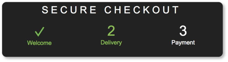
Both sites let the user know what step they’re at in the process, either through a color indicator or an arrow. You also might consider checkmarks or other icons that symbolize completion, giving users a sense of satisfaction for finishing each subsequent step.
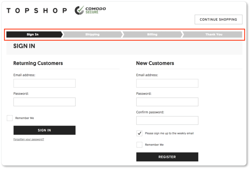
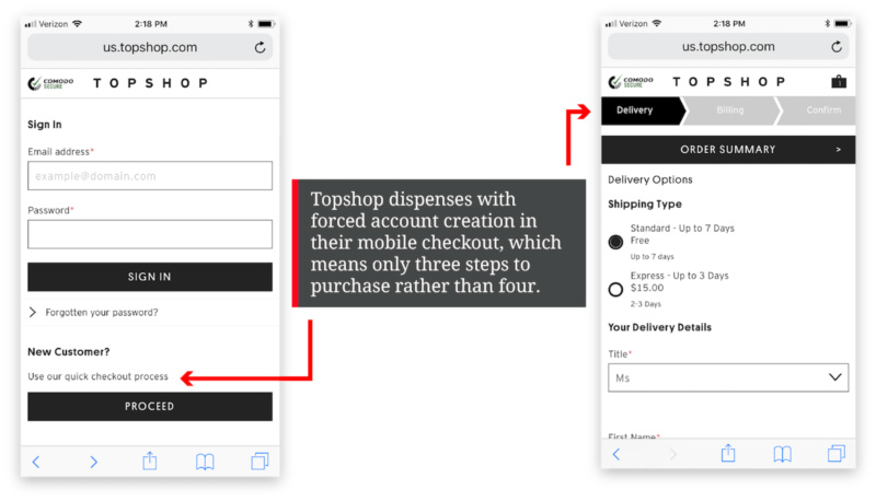
Topshop is a great example of a progress bar (and a checkout process) that takes the psychology of mobile users into account. On desktop, users either have to sign in or register for an account, so the progress bar contains four steps. On mobile, however, users get to skip the account-creation step (which was probably a conversion killer for the company), so the progress bar only contains three steps:
Include time-saving elements on your forms
We offer a list of tips and tricks for form UX elsewhere, so we won’t go into those here. Key takeaways from those sections applicable to your checkout page are:
- Eliminate all unnecessary form fields
- Use labels above the fields rather than placeholder text inside the fields
- Clearly communicate user errors
- Use on-screen validation
- Use drop-down lists and/or auto-fill fields
- Display information buttons that explain what goes into the field—and why
Each of these things will save your users precious time in completing the checkout form. So will these additional features:
- A check box to auto-populate the shipping address with the billing address
- An address finder OR a feature that auto-populates the city and state fields when a user enters their zip code
Don’t forget to display a confirmation page
Congratulations: Your prospect has clicked on that “Place Order” CTA and has become a customer! But your work isn’t finished yet. There’s one more “checkout” page you should offer these customers: the confirmation page (or the thank-you page).
The copy on your confirmation page will take a tone that’s in line with the tone of the rest of your website: It may say something cute or amusing, or it may stay formal. The point is that it put your customer at ease by verifying the order that was just made… and maybe by expressing a bit of gratitude for their purchase.
The confirmation page should include:
- The details of their order. Include the products’ names, colors, sizes, number of items, etc.
- An estimated delivery time. This should also have been available during the checkout process—and, even better, on the product pages themselves.
- Other details about what’s next. Is a separate confirmation email on its way to their inbox? Will they receive a follow-up email when the order has been shipped?
- The option to print the confirmation. Your customers may need a hard copy for any number of reasons.
The thank-you page is also an excellent place for (relevant) cross-selling and up-selling. And it’s a great place to offer new customers a chance to create an account, join your loyalty or rewards program, subscribe to your newsletter, or share what they’ve just purchased on social media.
Give them every reason to come back
In an ideal world—and on an ideal page—the entire checkout process should take no longer than a minute (especially with whatever auto-fill and auto-complete features you enable on your form). And at that point, it should feel to your prospect more like a formality than a chore. If you do this well, customers will be more than willing to check that box asking if they want you to save their information for future purchases.
After all, you’ll not only have offered them a remarkable checkout experience. From the moment they landed on your homepage or product page, they’ll have had a series of well-designed user experiences, including spectacular product imagery, compelling product descriptions, intuitive navigation, and exciting microinteractions. In short, you’ll have offered them a site that has carefully attended to their needs, desires, and preferences, at every step of the shopping experience.
So of course they’ll be back… and when they do come back for that next purchase? Their checkout time will be even shorter.
At this point, we’ve gone through the stages of a “typical” buyer’s journey—considering UX on your homepage, product pages, shopping cart, and checkout. In the next section, we turn to a website element that should be available across these pages: live chat.