- HOME
- Website Building
- CTA Buttons
- Button Design: Making Your CTA Pop
Button Design: Making Your CTA Pop
- 7 Mins Read
- Posted on April 19, 2018
- Last Updated on October 8, 2024
- By Lauren
When we say “button design,” we mean the look of the button itself, as well as how it relates visually to the page it sits on: size, shape, color, dimensionality, responsiveness, and the images it may (or may not) include. While these elements may seem insignificant (after all, a button is just a button, isn’t it?), they have a surprisingly significant impact on customer behavior.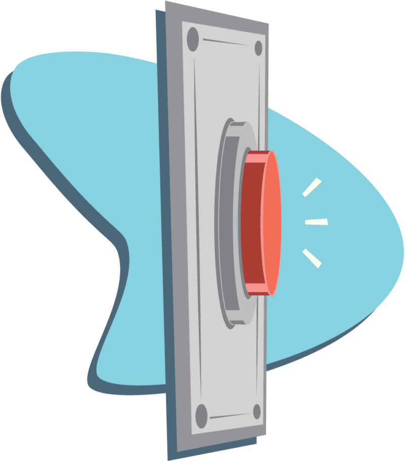
We use the word “button” for a reason: Your CTA button really is a button. Think of it as the digital version of a doorbell. We intuitively know that a doorbell is “clickable” and that it will produce a result—in the form of a sound, and then of a person who answers the door. (We also intuitively know where to look for one when we’re standing at the front door of a house; but we’ll have more to say about CTA placement later.)
What this means for you is that your CTA button should not be the place to test out some radical new direction in the world of conversions. When we humans see a button, we know what to do with it. We’re accustomed to how they work in both the real and virtual worlds, and we’d be confused if your website offered us something other than a button when we were looking to subscribe or make a purchase.
So for goodness sake, give us a button.
Make it look three-dimensional
Try adding depth to your button by giving it shadows or gradients, like these:

If your button looks like it’s rising from the page and ready to be pressed, it’s more likely that it will be. You (or your designer) can add these effects through CSS.
Make it responsive
Consider what happens when you walk into an elevator and press the button for your floor. It lights up, right? This is how you know the elevator has “recognized” where you want to go. And there’s a particular satisfaction you get in seeing its response.
On a website, this kind of micro-interaction would be considered an example of good user experience (UX). So consider having your CTA button provide some kind of visual feedback when clicked. (This, too, can be done through your website builder with CSS.) This feedback can range from a color change to an animation of the button actually being pressed down.
You might even consider adding a “hover state” to your button, so that when users roll over the CTA, either the button or the cursor displays visual feedback. If users still aren’t sure about your button’s clickability, this will clear up any remaining doubts.
Choose a color that stands out
If you’ve done any research on CTA buttons prior to now, you’ve probably noticed that just about every color on the spectrum has been claimed “the most optimal” when it comes to increasing conversions.

In 2009, Unbounce declared that the future of marketing was in the BOB (big orange button). Three years later, they found that changing a CTA button from green to yellow resulted in a 14.5% increase in conversions. In the meantime, Google was testing 41 shades of blue for their CTA. Then HubSpot discovered that a red CTA button outperforms a green one by 21%.
Notice a pattern here? Exactly. There isn’t one.
The truth is that there is no universal “best color” for conversions. If you look at the studies conducted by Unbounce and HubSpot (and at similar experiments by conversion optimization pros like the folks at Wider Funnel), you’ll notice that the buttons that convert the best have one thing in common: They’re the buttons that contrast most strongly with the other colors on the site.
So while cultural and psychological takes on color are indeed fascinating to consider (red means danger but it also means dominance; white is the color of death in China; and so on), they’re really not so helpful from a conversion perspective.
Draw attention with contrast
Marketing advisor Angie Schottmuller reminds us of this basic biological fact: “If our eyes are inundated with a specific color, they’re built to seek out the complementary color.”
So rather than asking what’s the best color for your CTA, you should be asking what’s the best contrast. If your site’s color scheme contains various shades of blue, then blue is the last color you’ll want to use for your CTA (even if it’s a completely different shade of blue), because visitors will be less likely to notice it.
And your visitors can’t click on your CTA if they don’t notice it.
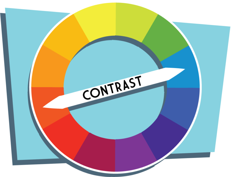
One common suggestion is to use a color wheel, and choose the color for your CTA that’s directly opposite the dominant color on your page. (Opposite colors on the wheel are called “complimentary colors.”) If your page is primarily blue, then your CTA would be orange; if red-violet, then your CTA would be yellow-green.
But the color wheel should only be a starting point; it’s hardly a rule. Indeed, if your site is green, you may not want a red CTA as the color wheel suggests, lest your site look perpetually Christmas-themed. And given the prevalence of red-green color blindness, this particular set of complimentary colors may not be your best bet.
So play with it. The goal is to have your CTA jump out at your visitors without clashing with your site’s overall design. Take a look at Smartsheet’s homepage:
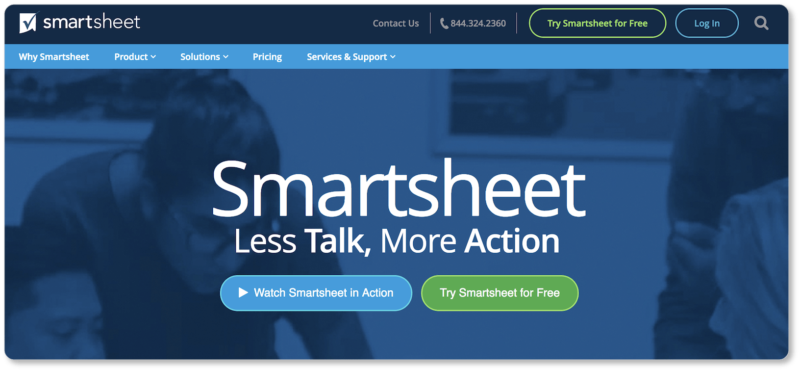
The bright green on dark blue (and alongside the blue of Smartsheet’s secondary CTA) makes their primary CTA virtually impossible to miss… but it’s also not gaudy or over-the-top. On the other hand, here’s a demo sign-up from Salesforce:
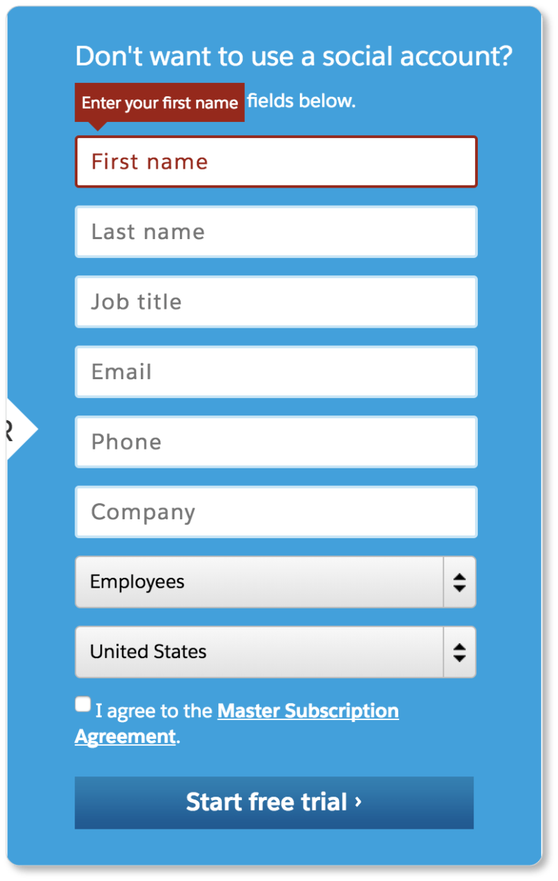
There’s not much contrast here between the form itself and the CTA button at the bottom. And if nothing on the page pops for us, it probably doesn’t pop for Salesforce’s prospects, either.
Try that super-innovative process called the “squint test”: Step back a few feet from your computer screen, squint your eyes, and see if your CTA still stands out from that distance and with diminished vision. Sites like buttonoptimizer.com and Da Button Factory allow you to create as many buttons as you want, so you can see what best grabs your attention from afar.
But while both the color wheel and the squint test are useful, A/B testing will always be the final word on color. (Indeed, A/B testing will be the final word on every feature of your CTA, including size, copy, and placement.)
Be consistent
Once you’ve chosen your CTA color, be consistent with it across your site. A visitor only needs to see your CTA button once, and they’ll associate that color with that action from then on. If your “Add to Cart” button is red, don’t confuse your visitors by using red for non-action items or other text that isn’t clickable.
Don’t use it for different calls-to-action, either. If your prospect can take more than one action on a page, attribute a different color to each action. This will keep your visitors from accidentally taking an action they didn’t intend to take. Not to mention that consistency creates a good user experience—another plus for your conversion rates.
Use icons (but keep it simple)
We pretty much know at this point that an arrow pointing downward is a visual cue for “Download,” just as we know that the icon of a shopping cart means “Add to Cart.” Here’s Amazon’s unmistakable “Add to Cart” CTA:

Despite the fact that the cart icon is by now universally recognized, Amazon still includes the word “Cart” in their CTA copy. While it may seem superfluous, do as Amazon does. Remember, you want your users to have to do as little work as possible. Unmistakable icon + clear copy = virtually no mental labor for your prospect. These kinds of largely-intuitive icons can help increase your conversion rates:
![]()
That said, too many (or overly-complex) CTA icons are overkill. Your icon isn’t there for ornamental purposes. It’s there to indicate with absolute clarity what will happen when your visitor clicks on your CTA. So stay basic… otherwise you risk confusing your prospect, rather than clarifying what’s on the other side of the button.
Size it sensibly
The “squint test” works as well for size as it does for color: If you step back a few feet from your screen and can no longer see your CTA, it’s a good indicator that your button needs to be bigger. Your CTA button should be impossible to miss.
However, “bigger is better” is only almost the rule. You don’t want your CTA to overwhelm the design, or look obnoxious or threatening on the page, or cause your prospects to completely ignore the page copy you’ve labored over. Your prospects shouldn’t feel pressured to carry out an action that the button is inviting them to take. Nor do you want them to miss the very text that may draw them from prospect into customer.
So let go of your desire to slap a grotesque neon-orange beast of a button on your page. Go for unmissable, yes; but also make your button welcoming.
“Statistically significant improvements”
Studies have shown that approximately 30% of SMBs that do A/B testing focus on CTA buttons in their tests. CTA buttons are, in fact, the most tested webpage elements. (Headlines come in second at 20%, and layout third at 10%.) While only 1 in 7 of these test campaigns produces a statistically significant improvement in CTA buttons, the ones that do improve significantly see a 49% increase in conversion rate.
This mass experimenting—and that scale of improvement—should indicate to you the importance of the CTA. So take a hint from these numbers, and get started on that testing!
In the next section, we look at best practices for button copy. Learn to choose the words that go on (and beside) your CTA button wisely—to make “the click” utterly irresistible to your prospects.